Epidemic Curves and Homicide Counts in Baltimore
One of the tools that we use in the investigation of outbreaks is the epidemic curve, or, as we say in the biz, the “epi curve.” An epidemic curve is a simple graphical representation of the number of cases per a unit of time over a span of time. For example, you could graph the number of new cases of diarrhea when you’re investigating an outbreak of cholera. You’d be able to see when the epidemic began, if it has peaked, and in which direction is it heading… Is it ending or continuing.
Epi curves are also useful in helping epidemiologists understand what kind of outbreak they’re dealing with. For example, the epidemic curve below is a point source epidemic, where the source of the infection was one single source. The cases had one exposure to the causative agent, and the agent was somehow removed from the environment and did not cause any more cases.
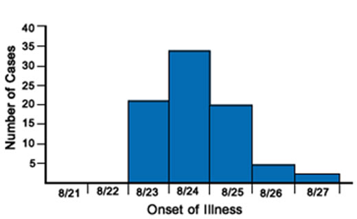
Image courtesy of CDC.
As you can see, the epidemic started on August 23, peaked the next day, and it was over by August 27. The size of the time categories in the x-axis (in this case it was one day) depends on what you’re looking at. If the disease takes a while to manifest itself from exposure to onset, you’d use longer intervals, like weeks (e.g. influenza) or months (e.g. tuberculosis) or even years (e.g. HIV/AIDS).
Another epi curve is the propagated source epidemic. In this type of outbreak, the initial exposure infects a group of people shown in the first peak of cases. Those cases go on to infect others, shown in the second peak. Then the secondary cases go on to infect even more people, shown in the third peak… And so on. One good example of this type of outbreak is a measles outbreak. One person with measles can infect a large number of secondary cases, and those could infect another large number themselves. (Lucky for us, the MMR vaccine has altered these dynamics to the point that measles outbreaks in the United States look more like a point-source epidemic or even an intermittent source epidemic.)
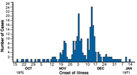
Propagated source epi curve, courtesy of CDC.
In an intermittent source epidemic, the number of cases falls back to zero before more cases pop up. This could be because the incubation period is particularly long for the infection, so one case that is infected today takes weeks to show up. Or because the source(s) of the epidemic leaves the population only to come back again.
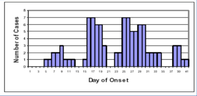
Also from that CDC place…
The final epi curve looks at the continuous source epidemic. In a continuous source epidemic, the source stays in the population and doesn’t go away. The cases don’t drop to zero. The number of cases per unit of time may go up or down a little bit, but they’re very much, well, continuous. These kinds of epidemics keep going until you remove the exposure or there are no more susceptible people left to infect.
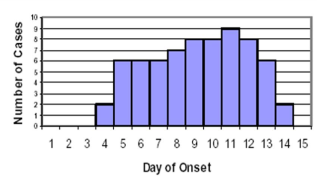
Continuous source epidemic… Can’t stop, won’t stop, until the source or the susceptibles are removed.
So now that you know what epidemic curves are, what they look like for different types of outbreaks, and what information they tell us… What does the following curve look like?
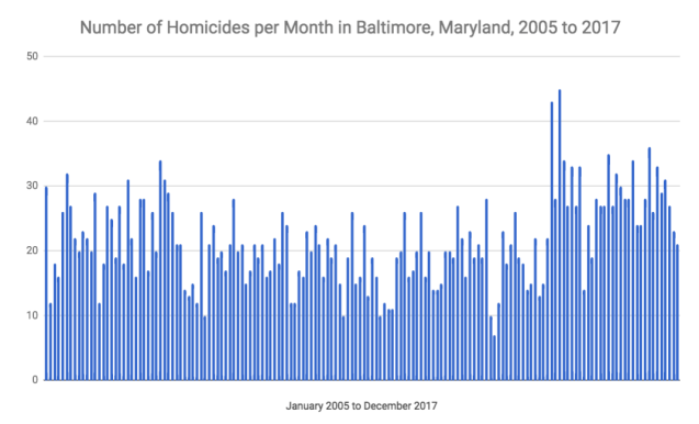
HINT: It’s not a point-source epidemic.
It’s a continuous source epidemic, right? As I told you above, the epidemic continues until the exposure is removed or there are no more susceptible subjects. The source of the epidemic is pervasive in this case. It’s always there… And, here’s the kicker… The source may actually be sources, plural.
In the case of homicides in Baltimore, it’s hard to graph a proper epidemic curve. There is no set incubation period for homicide. It’s not like you get exposed to violence on day 1 and are expected to commit a homicide (or be the victim of a homicide) by day 21, like with measles. But there are surely some events that trigger homicides, like the arrest of a drug kingpin that leads to a turf war between the underlings within the kingpin’s organization and/or between organizations.
Now, look at the last couple of years. There has been a significant increase in the number of homicides. (Even when adjusted by population, the rate has been epidemic.) So what is happening? If we remove the “expected” homicides from the graph, what will the epidemic curve look like? How do we determined what is expected? (You probably compare to a city of similar size, or the average number of homicides in all cities of a similar size… Taking into account the socioeconomic or demographic identity of those cities. Baltimore is definitely not like El Paso, Texas, though they are similar in size.)
My bet is that a graph that has the expected homicides removed will have something closer to a point-source epidemic occurring every few years. There was a violence epidemic in the 1990s, then another one in the early 2000s, and now this one since 2015. Or it could be a propagated outbreak if the circumstances are just so. One person getting killed by a rival gang leads to retribution (contagion of violence) that could take out two more people. Then the retribution of those two might lead to three homicides, and so on.
This is mostly an artform, though. It would require answering — or developing a way to answer — questions about what is the expected number of homicides for Baltimore, what is an “exposure” that would trigger a homicide, what the incubation period (time from exposure to symptoms) would be with regards to violence, or what a susceptible person looks like. Your answer could be different than mine, and my answer could be different than yours. After all, politicians say that one homicide is too much… And they’re right, from a certain point of view.
