The Thing About Hotspots

No, I’m not talking about wifi hotspots that help you connect to the internet so you can watch cat videos. I’m talking about the symbology used on maps in order to emphasize an area (or areas) where there is a lot of something going on. For example, in infectious disease epidemiology, I might use a map to show where there are a lot of cases in a relatively small area, or where the number of cases observed has exceeded the number of cases expected.
You know, something like this:
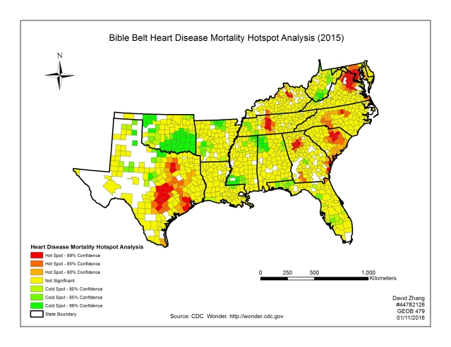
This map was created using a geographic information system (GIS) and data from the Centers for Disease Control and Prevention (CDC). It took incidence of deaths from heart disease and mapped them out, then broke down the data to show where there were increased levels of heart disease deaths, where there were the expected levels, and where there were the lower levels (aka “cold spots”). As you can see, Texas has a big problem. (Then again, Texas always has some big problem or another.)
But there are hotspots and then there are hotspots.
The map above doesn’t tell us the whole story. The higher incidence in the DC Metropolitan area might be due to social, environmental and genetic conditions different than those in Texas or South Carolina. The “cold spot” in Oklahoma might be indicative of something at play there that is completely the opposite of what is going on in Texas or DC. This is where epidemiology comes in.
This is where we ask the questions.
And that right there is the problem with these maps. Taken out of context, they might be misused. For example, what do we know about heart disease and deaths from it? Well, we know that a bad diet and sedentary lifestyle can contribute to obesity and heart disease. We know that lack of access to primary healthcare can also contribute to heart disease complications. And we know that some people are just more predisposed to heart disease based on how their bodies process saturated fat and cholesterol and deposit those compounds on their arteries.
If you make the mistake of thinking that the hotspot in Texas is due to one thing and not the other — or a combination of things — and you try an intervention, you might fail miserably. Or what if you implement the same intervention in Texas that you did in DC but get completely different results? Again, you might be wasting resources. So you need to understand the context of the hotspot analysis that you’re performing.
To understand the context, you need to ask questions of person, place and time. Who is dying from heart disease? What are their ages? What are their genders? What are their racial/ethnic profiles? What are their socioeconomic profiles?
While the map answers some of the questions about place, we need to be a little more analytical and find out if those counties showing the hotspot are poorer/richer than their neighboring counties, or if the people dying are dying at a hospital or at home. Are they dying in particular neighborhoods or buildings?
And, when it comes to time, are the deaths happening with any kind of seasonality? Is there a variation in the time of day? Are these hotspots new, or have they been there for several years or across generations?
Yes, I know these are a lot of questions to ask, but they’re the kinds of questions that help inform the stakeholders on what needs to be done about the hotspots that have been detected. It is not nearly enough to just present the map and walk away. You have to tell the story of what is going on so you can one day tell the story of how it was fixed, and to guide the response(s) toward fixing things.
After all, the world is much simpler when you’re fixing things. I know it is for me.
Photo on Foter.com

Then, there are confounding factors, such as stimulant abuse skewing some reports on cardiovascular related deaths.
Of course, then there are politically motivated or pet theory motivated interventions which are a bit less successful.
Like a certain pump handle being reinstalled in London, as Cholera was obviously caused by miasma and not some water borne “substance”…
Or the fine advice of the Philadelphia health department during the 1918 influenza pandemic to keep one’s bowels loose.
LikeLiked by 1 person
Oh, man, do I have stories about bad and politically-motivated interventions…
LikeLiked by 1 person
Heh, the stuff of many a PhD dissertation, I’m sure!
LikeLiked by 1 person