The Places Where People Are Not Exercising For Some Reason
In early January, I took a drive to one of Baltimore’s most disadvantaged neighborhoods. It was there that the first homicide of the year had happened. I wanted to see where it had happened and get a better feel for the kind of environment where a homicide would happen. Yes, I took every precaution to not stand out like a sore thumb. I didn’t take expensive cameras with me, and I didn’t linger around like a tourist at an archaeological dig. Still, there were those who asked me why I would ever want to go to “a place like that.”
Don’t Go There
Someone on Instagram commented that it is precisely that attitude of “don’t go there because it’s too dangerous” that further isolates those communities from the rest of the world. It’s true. If no one goes there, then that place doesn’t exist in the minds of the people and — most importantly — the policymakers. The problems that happen in “a place like that” are believed to be contained in “a place like that” when all the evidence shows us that violence doesn’t really respect artificial boundaries much.
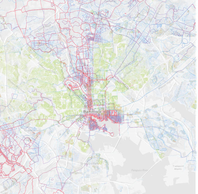
If you’ve ever seen a map of Baltimore, you probably have heard of the “butterfly pattern” seen on the map when you overlay socioeconomic measures like crime and poverty. There are very wealthy neighborhoods to the north, but a swath of low-level indicators spreads out from the downtown area and into the east and west. Like this:
You can see that the homicide rate is highest in the east and west, but the central north is relatively quiet with regards to homicides. The same pattern can be seen with poverty, urban blight, even cancer rates. Look at life expectancy, where the lighter colors mean lower life expectancies:
It’s the same pattern. Higher life expectancies in the central north and downtown, but lower spreading out from downtown into two “wings” over east and west. Believe me when I tell you that a lot of these indicators correlate perfectly with poverty. But let’s look at something else…
Let’s go for a run?
Strava (Strava.com) is a health tracking app that is available on major phone platforms like Android or iOS. You turn on the app and allow it to track you via GPS. As you walk, run, bike, or do some other exercise, the app tracks your location and gives you a summary of where you were when you worked out. The distance traveled and the time also give you the speed and intensity of your workout.
As it turns out, Strava compiles the location data into a “Heat Map.” The Heat Map basically shows where Strava users have been exercising. In the past, the Heat Map made news when it was found that some members of the military were uploading their location data with their workout data, so places where they were and which were supposed to be secret were found out. Oops.
Anyway, let me take you on a jog in St. Louis, Missouri. Here’s the heat map:
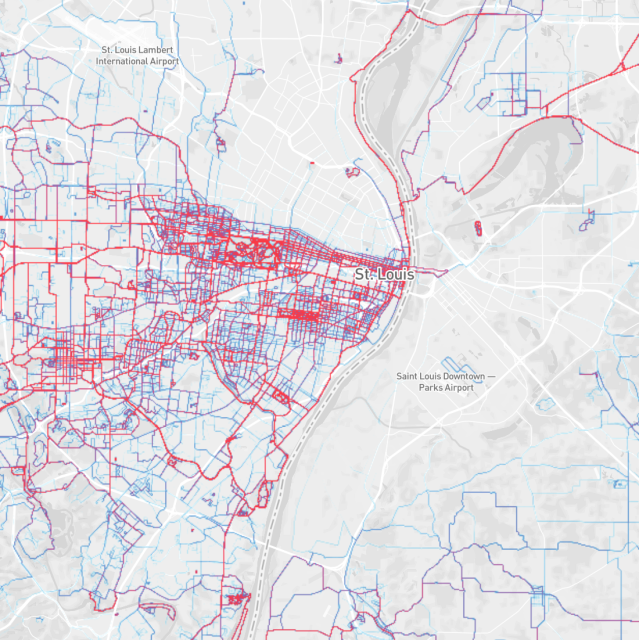
I want you to notice the area in the north of St. Louis, to the southeast of the St. Louis Lambert International Airport. The red and blue lines show where people run or bike using the Strava app. The area I pointed out is almost devoid of any kind of activity. Now, look at this map:
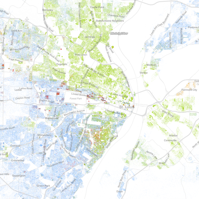
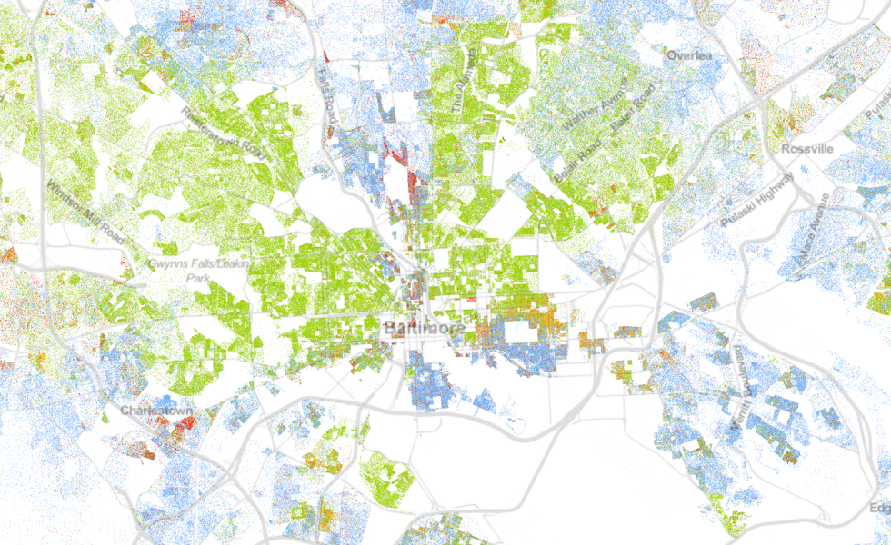
This map aggregates data from the US Census Bureau, from the 2010 Federal Census. The blue dots are White residents. The green dots are African American residents. Does the map look familiar? Let’s lay them one on top of the other:
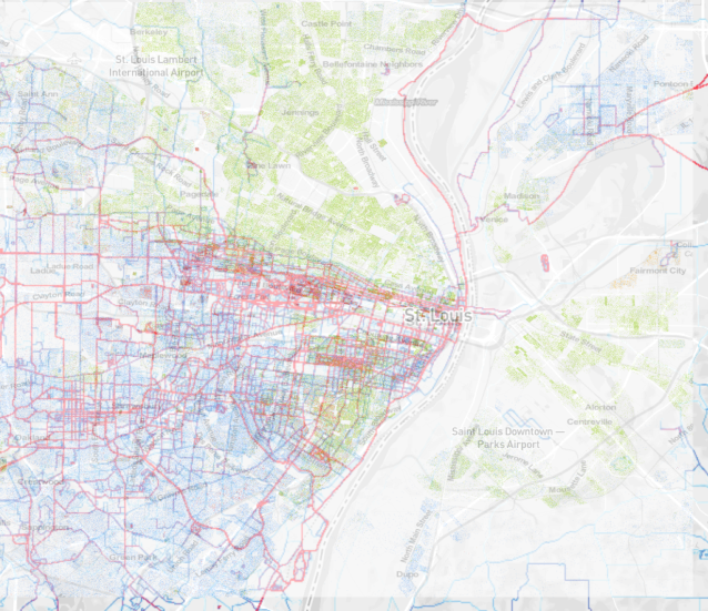
Can you see where the areas with green dots (African American residents) don’t have as many people working out (red and blue lines)? Do you think it’s a coincidence?
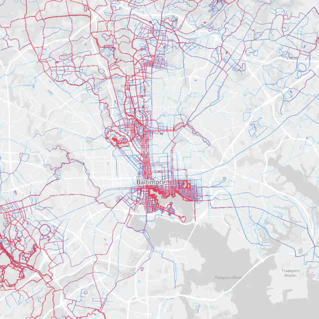
So let’s go for a jog in Baltimore. This is the Strava data around Baltimore:
And this is the US Census data on race in Baltimore in 2010:
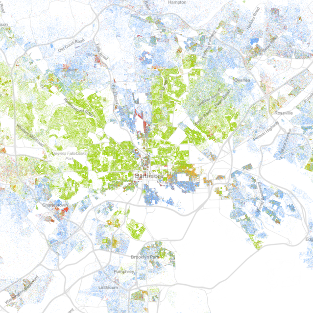
Look familiar? Does it show the butterfly pattern as above, and, also, does it show a decreased use of the Strava app for workouts in primarily African American areas? Yes and yes. Let’s overlay again:
I don’t have full access to the Strava data to do an analysis of my own, but I’m willing to bet that there is a statistically significant pattern with regards to where people work out and where they don’t.
Now, some of you epidemiologists out there might be thinking of theories of why this pattern arises. Do African Americans workout less as a group than whites? Do they have less access to tracking apps? Do they not like to use GPS tracking? Or are the places where African American’s live simply not conducive to exercise because of a variety of reasons? Do public spaces and big streets/avenues just draw everyone away from tightly-packed neighborhoods?
For a clue, let me show you something…
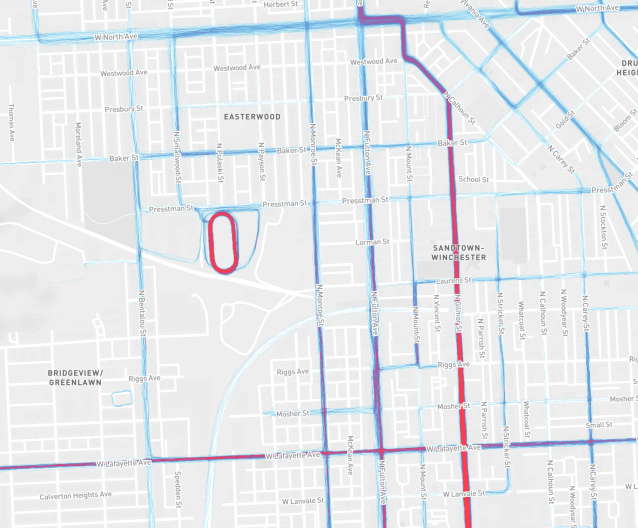
When you zoom in on Baltimore, particularly near the Sandtown-Winchester and Easterwood neighborhoods, you see that people do exercise with the app. It’s just that they’re numbers are much less than in Baltimore as a whole. Gilmor Street and the nearby track at Carver Vo-Tech are hotspots of running and cycling activity. So there is some exercise going on, but it’s much less than in the rest of the city, especially when compared to the areas where residents are primarily white.
Using some geostatistical analyses like the ones I did for my doctoral dissertation, we could figure out some of the answers for this disparity. So who’s with me?
(Hat tip to Dr. Hojoon Lee for pointing out the heat map and how it looked in Baltimore.)
