R Programming and the New Epidemiologists
When I started working as an epidemiologist at a state health department, one of the most often used tools was the Microsoft Office Suite of programs. I used Excel for data analysis and visualization, Access to create and manage databases, Power Point to create presentations, and Word to create reports. Nevertheless, I’ve always been an early adopter when it comes to technology. As soon as something came about that allowed me to do my work better, I tried it.
The problem was that the office where I worked as kind of risk-averse and not really inclined to innovate. For example, it took about a year of back-and-forth discussions to get the citizen-sentinel surveillance for influenza system set up in 2008, just in time for the 2009 pandemic. Nowadays, things like Flu Near You are not that rare and widely accepted as suitable sources of public health information.
So I was stuck with MS Office for doing just about everything, especially data-wrangling. As most of the data we managed was private or confidential, there was a real aversion to using any software outside of “official” software to manage it. It would be a few years before I was able to use SAS, a statistical software package that can wrangle data, create charts and graphs, and produce some neat reports. I used it when went to school for my MPH. The problem with SAS is that it can be a little expensive, especially if you’re working for a cash-strapped organization (as most public health agencies were during the Great Recession.)
Once I started working on the DrPH, I was introduced to STATA, another software package that does a lot of things well. It’s a lot like SAS, in my opinion. From understanding data to performing statistical analyses, it was what I used for my doctoral dissertation. For both SAS and STATA, there is plenty of online help and examples that got me through all I wanted to do. The other piece of software I used was ArcGIS, which is the premiere software for geographic analysis. It can also cost a bit, especially if you’re trying to deploy it to a lot of computers at a big institution. Though the prices have come down considerably since they’ve gone to more of a subscription model and more an more people are using their services.
See, that’s the thing: You need to know what you want to do. This is where there is currently a divide between public health and data analysts. You see some graphic on the number of homicides in Baltimore, for example, but you can come up with the wrong conclusions if you don’t know how biases and confounders work. You might think that you are at high risk of getting shot or killed in Baltimore when the evidence states otherwise. (It’s actually African American men between the ages of 15 and 35 who are at highest risk, and only then if they are located within the poorest neighborhoods in the city. A tourist of any socioeconomic class, visiting the Inner Harbor, is not really at that much risk.)
I’ve decided to try and bridge the gap between data analysis and visualization and epidemiology that I see out in the world. The best way to do this is to teach epidemiology to people who are really good at data analysis and visualization… Or to teach data analysis and visualization to people who are good at epidemiology and other public health fundamentals. Because I’m already an epidemiologist, I decided to learn more about data analysis and visualization. But, because I’m doing consulting/freelance work right now, I need to keep costs down.
With that in mind, I decided to learn to use the R programming language. R is an open source coding language that has been around for a while, is very robust in what it can do, and there is a ton of help online on how to use it. It’s easy to learn, and it can do what SAS and STATA can do for my work. The best part? It’s free. All you do is download R and get coding. I use RStudio to write the code and look at the results.
The reason I’m liking R so much is the fact that it is open source and free to use. The amount of help and examples on how to do different things is phenomenal. The community of people using it is very varied. And the syntax of the language is very natural.
For example, let’s say that you ask me some questions about violence in Baltimore in 2017. First, I downloaded the list of non-fatal shootings and homicides in Baltimore from the Baltimore Open Data portal. (There is a lot of data there that I can’t wait to get my hands on.) Then I got to work…
How many homicides were there in Baltimore in 2017? 342. How many non-fatal shootings? 703. That translates to a homicide rate of 55.6 homicides per 100,000 residents. To get that in R, all I had to do was write this:
hom_rate  342/6.14664
[1] 55.64015
But what if we wanted to know how many non-fatal shootings and homicides there were every week? A simple bar plot will do:
plot4 <- ggplot(data = crimes4, aes(x = factor(weeks), y = Value, fill = Value)) +
  geom_bar(stat = "identity") +
  ggtitle("Number of Shootings and Homicides per week in 2017 in Baltimore City") +
  labs(x="Week of the Year", y="Number of Homicides") +
  scale_fill_gradient(high="Red",low= "Yellow") +
  guides(fill=guide_legend(title="Scale")) +
  rotateTextX() +
  removeGrid() +
  scale_y_continuous(expand = c(0, 0),
                     limits = c(0, 10),
                     breaks = c(2, 4, 6, 8, 10)) +
  theme(
    axis.line =  element_line(color = "black"),
    axis.text.x = element_text(color = "black", angle = 90, hjust = 1),
    axis.text.y = element_text(color = "black"),
    axis.ticks.length = unit(.25, "cm"),
    panel.grid.major = element_blank(),
    panel.grid.minor = element_blank(),
    panel.border = element_blank(),
    panel.background = element_blank()
  ) +
  facet_grid(type ~ ., labeller=labeller(type = labels))
Yes, it looks very complicated, but you just have to look at the code and know how the package “ggplot2” works. The first line creates a plot named “plot4” where we will put the plot from the dataframe (aka dataset) “crimes4”. The “aes” are the aesthetics of the plot. On the x-axis, we will plot “weeks” while we will plot “Value” (the counts of incidents) on the y-axis. And we fill in the bars of the bar plot based on the level of “Value.”
Line two says that we’re going to create a bar plot, and the plot will be based on the counts of data for the categories we mentioned in the x-axis on the previous line. The package ggplot2 allows you to create all sorts of plots.
Line three labels the title. Line four labels the axes. Line five tells the program to fill the bars with color based on the “Value” (the count of incidents), with yellow as the lowest color and red as the highest. The rest of the code has to do with the formatting of the axes, the legend, etc. And the last line splits the bar chart into two one on top of the other, one for non-fatal shootings and one for homicides.
This is the result:
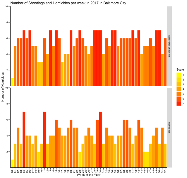
Neat, right? Here is another type of chart, called a “heat map,” that displays the same information:
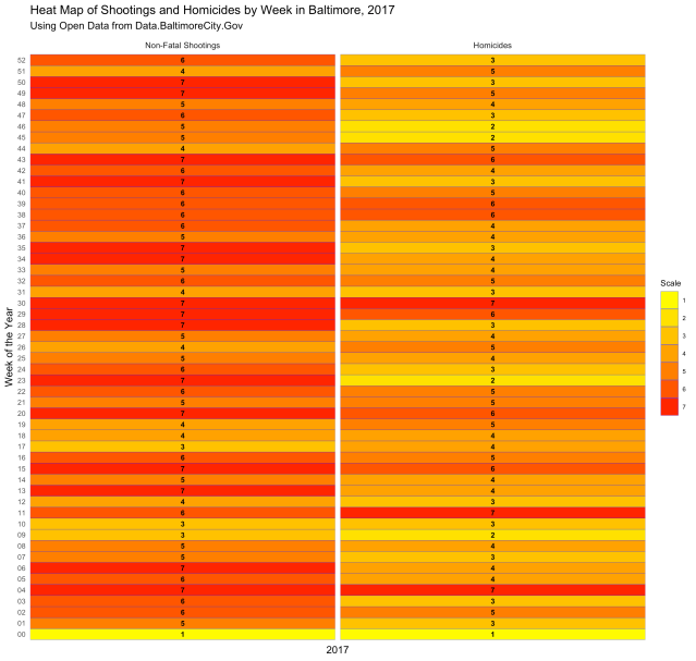
Both are displaying the number of incidents per week, and both give you a visual of how each week compares with the weeks next to it and the weeks overall. But what if you want to know which days of the week had the most incidents? The following code gives us the chart below:
heatmap3 <- ggplot(crime_year,aes(x=year, y=dow, fill=Value)) +
  geom_tile(colour="blue",size=.1) +
  scale_fill_gradient(high="Red",low= "Yellow") +
  guides(fill=guide_legend(title="Scale")) +
  theme_minimal(base_size = 10) +
  removeGrid() +
  rotateTextX() +
  ggtitle("Heat Map of Shootings and Homicides by Weekday in Baltimore, 2017",subtitle = "Using Open Data from Data.BaltimoreCity.Gov") +
  labs(x="2017", y="Day of the Week") +
  theme(
    plot.title=element_text(hjust=0),
    axis.ticks=element_blank(),
    axis.text=element_text(size=7),
    legend.title=element_text(size=8),
    axis.text.x = element_blank(),
    legend.text=element_text(size=6),
    legend.position="right") +
  geom_text(data = crime_year, aes(year,dow,label=Value,fontface="bold"),colour="black",size=2.5) +
  facet_grid(~ type, labeller=labeller(type = labels))
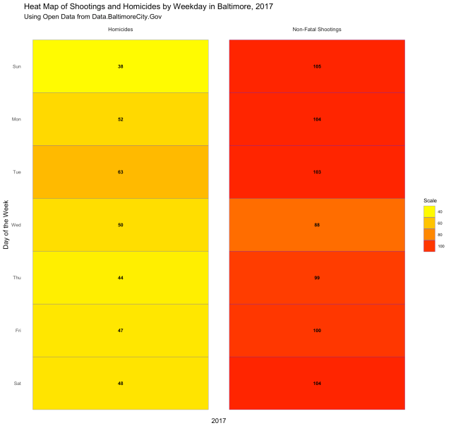
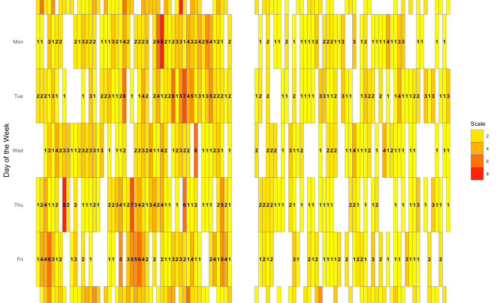
There was some data-wrangling done before the code for the plot, because I had to calculate how many incidents there were by day for the whole year. But we know that there is a bit of a seasonality to violence, with hotter months having more incidents. So let’s look at incidents per day of the week per month in 2017:
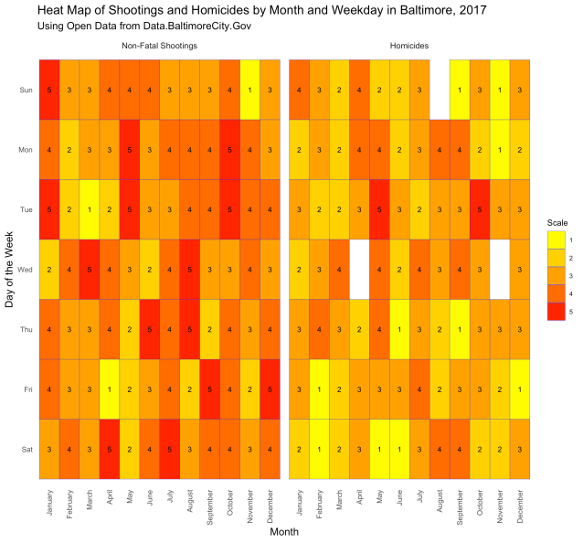
As you can see, some weekdays in some months had more shootings, while there were some weekdays in some months that had no homicides. There were no homicides on Wednesdays in April, Sundays in August, or Wednesdays in November. Fridays in April had only one shooting, while Saturdays in April had 5.
Finally, let’s put it all together and make a heat map of the whole year by week and day of the week:
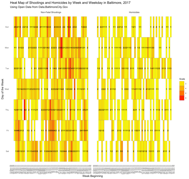
This one is kind of crowded, but you can see the images in the “img” folder on this project’s Github page. As you can see, there were plenty of days without shootings or homicides in 2017. Then there were days, like Thursday in the week beginning February 20, 2017, when there were 8 non-fatal shootings. Or the Saturday in the week beginning May 1, 2017, when there were 5 reported homicides.
I did all this in a couple of hours the other night. It still needs a lot of polishing, but this is basically what someone with a few weeks of R programming training (like I have), an idea, and some data (of which there is plenty). Can you imagine if the new epidemiologists were trained to do all this along with their public health and epidemiology training?

Data analytics has always been part and parcel in tracking and halting epidemics. Starting way back with one pump handle.
The trick is to find a way to have the data tell you what you need to know and then, create a report that policy makers can comprehend to address mitigation efforts.
LikeLike
To have the data tell me what I need to know… An “enhanced interrogation” of sorts?
LikeLike
In a far nicer kind of way. It avoids potentially torturing the data to produce incorrect results. 😉
Or have one snowed in by extraneous data, which can confuse or even mislead (or potentially, spot something not previously considered that is important).
Hence, why someone with epidemiological training train anyone dealing with software processing the data. Or having an epidemiologist actually perform the coding. 😀
Each, to his or her own competencies, for not every epidemiologist is a good programmer and pretty much no programmer is a competent epidemiologist.
LikeLike