A Web-Based Application to Visualize Homicides in Baltimore City Between 2005 and 2017
“How many African American women were killed by firearm in the Cherry Hill Community Statistical Area of Baltimore in 2016?” None. I was able to answer this question for you quickly because I have a dataset on homicides in Baltimore between 2005 and 2017.
The dataset is the result of data from 2005 to 2016 collected by The Baltimore Sun and data from 2017 collected by me. I then took a random sampling of about 20% of those cases and verified that they matched up to what was published about the cases. I also cross-checked the counts of homicides per year with what the Baltimore Police Department reports to the FBI’s Uniform Crime Reporting.
So the data are publicly available, and I plan to release the dataset — once it’s all cleaned up and I’ve created a codebook for it — for others to use. Right now, you can go to the Baltimore City Open Data Portal and look at more general data on crime and other indicators.
Anyway, back to the app…
The top portion of the screen has a little bit of a description of the app and a section where you can filter what you want to see.
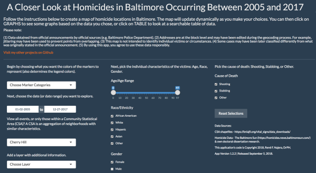
First, you can filter what the markers will show. When you first load the app, the markers are all black, indicating all the homicide locations. You can choose to have different colors represent different race/ethnicity categories, different genders, or different causes of death.
Next, you can choose what date range you want to look at. The default is all data from January 2, 2005, to December 27, 2017. (These are the earliest and latest dates in the dataset.)
Next, you can choose to restrict the results to just one Community Statistical Area. (I’m working on a way to choose different CSAs, but that part of the coding gets tricky because the CSAs are all coded as strings… Hmmm?)
Because just throwing points of a map without some sort of context is kind of non-informative (or even misinformative), I also give the user the ability to select some layers to display on the map. You can choose to see the average yearly homicide rate by CSA. (This was calculated by taking the count of homicides for the 13 years — 2005 to 2017 — and dividing it by 13, then dividing that quotient by the population of the CSA according to the 2010 US Census.) Or you can choose to see the proportion of families living under the poverty level (a good indicator of poverty) according to the Vital Signs 16 report from the Baltimore Neighborhood Indicators Alliance.
I’ve also included a layer to show the 1935 Home Owners’ Loan Corporation ratings for Baltimore. These are the ratings people refer to when they’re talking about “redlining” or “red districting” neighborhoods, something that is still affecting the socioeconomics of Baltimore today. Finally, I have a layer showing median household income, also from the BNIA report and another indicator of poverty.
Yes, you guessed it, poverty and crime go hand-in-hand, and in a very complex way.
In the middle section, you can choose the personal attributes of the victims you want displayed on the map, starting with age. The age range defaults to the age range in the dataset, 0 to 97 years. (Zero years is for infants under one year of age.) Then you can choose the race/ethnicity, and, finally, the gender of the victims.
In the far-right section (or the bottom, if you’re looking at the app on your phone), you can choose the cause of death from three categories: Shooting, Stabbing or Other. I chose these categories because they make up the bulk (in that order) of homicides. The “Other” category includes things like blunt force trauma, asphyxiation, or arson.
Finally, if you want to reset everything back to the original choices, there’s a button to do that. So what do you get in the end?
As you make the choices, the back-end code automatically filters the dataset based on what you’re choosing. That is then automatically sent to create the map, some graphs, and a datatable. These three presentations of the data are then rendered below the choosing area through tabs.
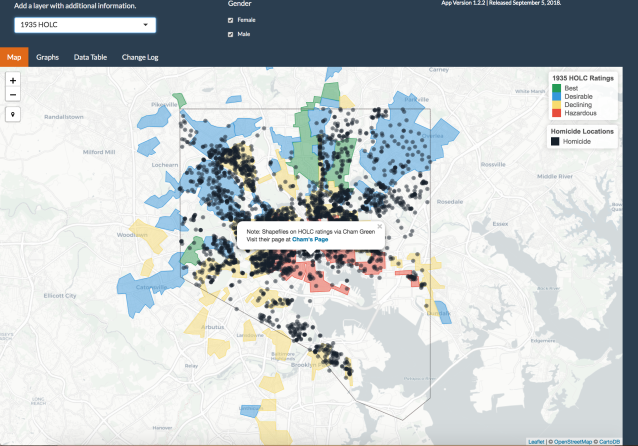
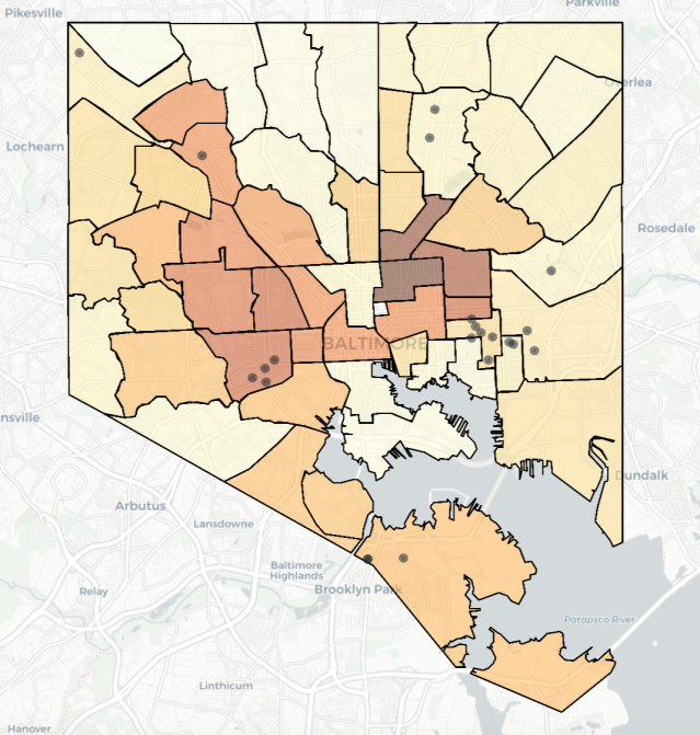
App showing the first tab with the 1935 HOLC layer.
The first tab is the map, and it’s what a lot of people like to see. The second tab has graphs:
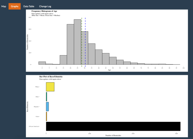
In that tab, you can see a frequency histogram of ages of the victims. If you look at different epidemiological segments (e.g. African American men versus African American women), you can see that the age distributions are different. You can also see some bar plots of counts of homicides by race/ethnicity, gender, and cause of death. The last graph shows a count of homicides per day, displayed by cause of death, for the time range you choose above.
The final tab has a data table of the data you asked for. Future functionality for that will be the ability to download the table as a comma separated values (CSV) file.
So let’s do a quick video walkthrough to answer the question, “How many Hispanic men over the age of 18 were killed in all of Baltimore between 2010 and 2015?” (There is no audio.)
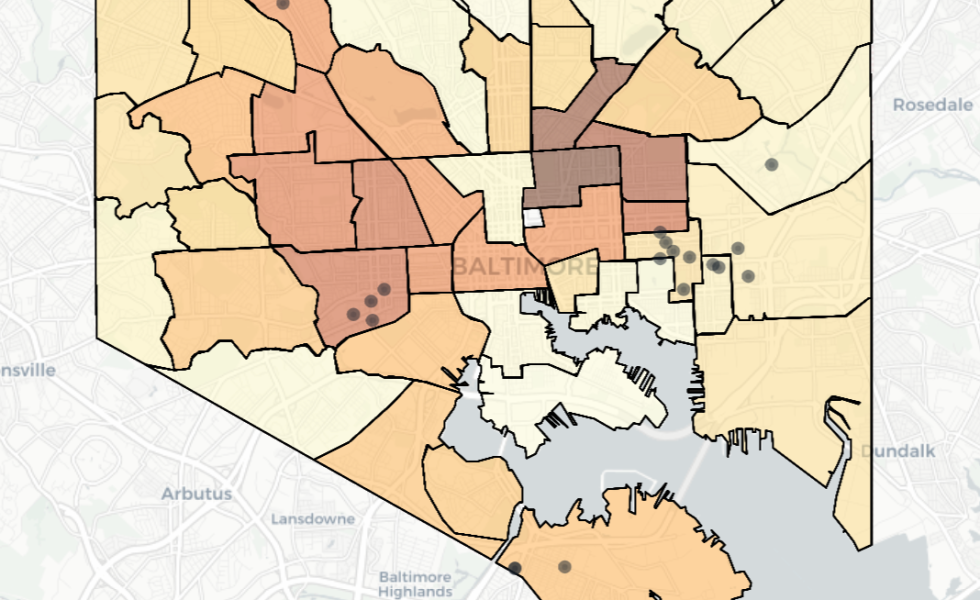
There you have it. Twenty-two Hispanic men were killed in that time. Do you think it’s interesting that they show a couple of clusters?
Location of homicides of Hispanic men over the age of 18 between 2010 and 2015.
So these are the kinds of questions you can have answered using the app. Of course, in public health in general and epidemiology in particular, answering some questions leads to the asking of others. For example, in the map directly above, are those homicides happening there because there are more Hispanic people living there? Or is there something else at work?
There are, of course, some technical things that I did to make the app work, but those are better left for a discussion on how to use the R programming language and the Shiny Apps package to create it. I’ll do that at a later time.
For now, please feel free to play with the app and let me know if you see something that could be a bug. I try to correct those as soon as they’re discovered. (The fourth tab is a change log of the app.) Also, the app is hosted on a free server, so there are limitations to how many people can see it operating at the same time, and how many hours it can be see through the month.
You can find the app here: https://rfnajera.shinyapps.io/homicide_app/
