How Many Guns Were Within 1,000 Feet of Schools in Baltimore in 2018?
According to the Gun-Free School Zones Act of 1990, people may not posses a gun within 1,000 feet of a school if that gun traveled across state lines to get there (since Congress can regulate guns by regulating interstate commerce) and if the person carrying the gun is not licensed to do so. With that in mind, I got curious about how many homicides by firearm happened in Baltimore. It was part of my dissertation, but it had to be cut from the dissertation and the presentation because of content and time constraints.
My data analysis for the dissertation only went up to 2017, so I’ve been curious to see what happened in 2018. So how about we take a look and use R to see what happened? (Please note that a firearm homicide or shooting within 1,000 feet of a school may not have necessarily been done with an unlicensed gun.)
The Data
First, we get data on the firearm homicides and shooting in Baltimore in 2018 from the Baltimore City Open Data portal:
This gives me a list of 5,343 incidents in which a firearm was used and where there was a location noted. They boil down to this. (Note: These are all crimes reported. The actual number may be different.):
| Type of Crime | Count |
| Aggravated Assault | 1,474 |
| Homicide | 273 |
| Robbery – Carjacking | 337 |
| Robbery – Commercial | 533 |
| Robbery – Residence | 121 |
| Robbery – Street | 1,928 |
| Shooting | 677 |
With that in hand, including the longitude and latitude, we throw them on a map to see where they happened. To create that map, I used the shapefiles of the Community Statistical Areas (CSAs) from the city’s Open Data portal.
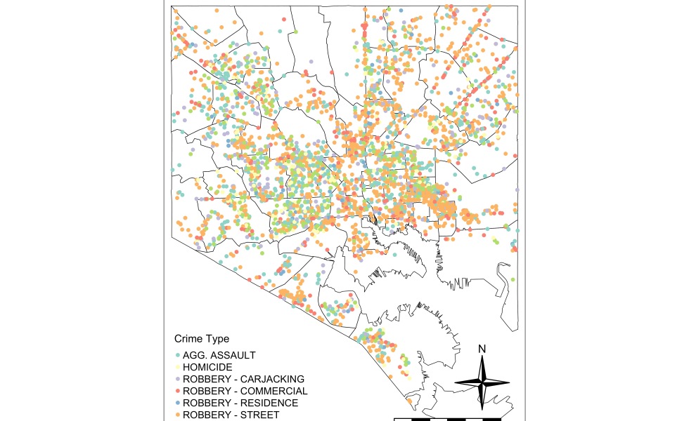
Of course, I could have done all this in QGIS or ArcGIS, and it would have produced a map like this:
It’s very crowded because there were that many firearm-related crimes. The thing about doing this in QGIS and other programs with point-and-click interfaces is that you’re not exactly recording what you just did. You’d have to take the time to write a how-to manual to replicate this map above exactly. That, or you’d do a screen recording.
This is where programs like R come in. With it, you’re literally writing the how-to manual as you write your code. Well-commented code allows for the next person to grab your code and replicate your results exactly, with little effort to figure out what you did and how you did it. So let’s replicate the map above in R, and even get some statistics on which school had the most number of firearm crimes.
The Code
First, we’re going to load some libraries. I’ve commented the use of each library.
# Load the required libraries ----

library(rgdal) # To manage spatial data
library(tigris) # To manage spatial data
library(tmap) # To create the maps
library(tmaptools) # To add more functionality to the maps created with tmap
library(raster) # To manipulate spatial data
library(sp) # To manipulate spatial data
library(rgeos) # To manipulate spatial data
library(sf) # To manipulate spatial data
library(spatialEco) # To join the layers
library(dplyr) # To manage data (make tables and summarize values)
Now, let’s bring in the data.
# Import the data and make it readable ----

crimes <-
  read.csv("data/gun_crimes_2018.csv", stringsAsFactors = F) # Import gun crime data
crimes <-
  as.data.frame(lapply(crimes, function(x)
    x[!is.na(crimes$Latitude)])) # Remove crimes without spatial data (i.e. addresses)
csas <-
  readOGR("data", "community_statistical_area") # Import Community Statistical Area shapefiles
schools <- readOGR("data", "bcpss_school") # Import Schools
Now, let’s turn crimes from a dataframe into a proper shapefile, and give it the right projection.
# Create point shapefile from dataframe ----

coordinates(crimes) <-
  ~ Longitude + Latitude # Assign the variables that are the coordinates
writeOGR(crimes, "data", "guncrimes", driver = "ESRI Shapefile") # Write it as a shapefile
guncrimes <- readOGR("data", "guncrimes") # Read it back in
proj4string(guncrimes) <-
  CRS("+proj=longlat +datum=WGS84 +unit=us-ft") # Give the right projection
A simple line of code to look at the number of firearm crimes by type.
table(crimes$Description)Next, because we’re going to be putting layers on top of each other, we need to make sure that they all have the right projection (Coordinate Reference System).
# Fix the projections of the other layers ---

pro <- sp::CRS("+proj=longlat +datum=WGS84 +unit=us-ft")
csas <- sp::spTransform(csas, pro)
schools <- sp::spTransform(schools, pro)
With all the layers on the same projection, let’s build our first map using tmap.
# Create map of Firearm Crimes ----

tmap_mode("plot") # Set tmap to "plot" (instead of "view")

baltimore1 <-
  tm_shape(csas) + # Adds the Community Statistical Areas layer
  tm_borders("black", lwd = .5) + # Makes those borders black and thin
  tm_shape(guncrimes) + # Adds the layer of gun-related crimes
  tm_dots("Dscrptn", # Creates a dot for each gun-related crime, color-coded by type of crime
          title = "Crime Type",
          size = 0.1) +
  tm_compass() + # Adds the north star compass
  tm_legend() + # Adds the legend
  tm_layout( # Controls the layout of the different elements of the map
    main.title = "Map of Firearm Crimes in Baltimore, 2018",
    main.title.size = 1,
    legend.position = c("left", "bottom"),
    compass.type = "4star",
    legend.text.size = 0.7,
    legend.title.size = 0.9
  ) +
  tm_scale_bar( # Adds the scale bar
    size = 0.5,
    color.dark = "black",
    color.light = "white",
    lwd = 1
  ) +
  tmap_options(unit = "mi") # Makes sure the scale bar is in miles

baltimore1 # Let's look at the map

tmap_save(tm = baltimore1, # Saves the map
          filename = "Maps/baltimore1.bmp", # File name of the image
          dpi = 600) # Resolution of the image saved
This is what we create:
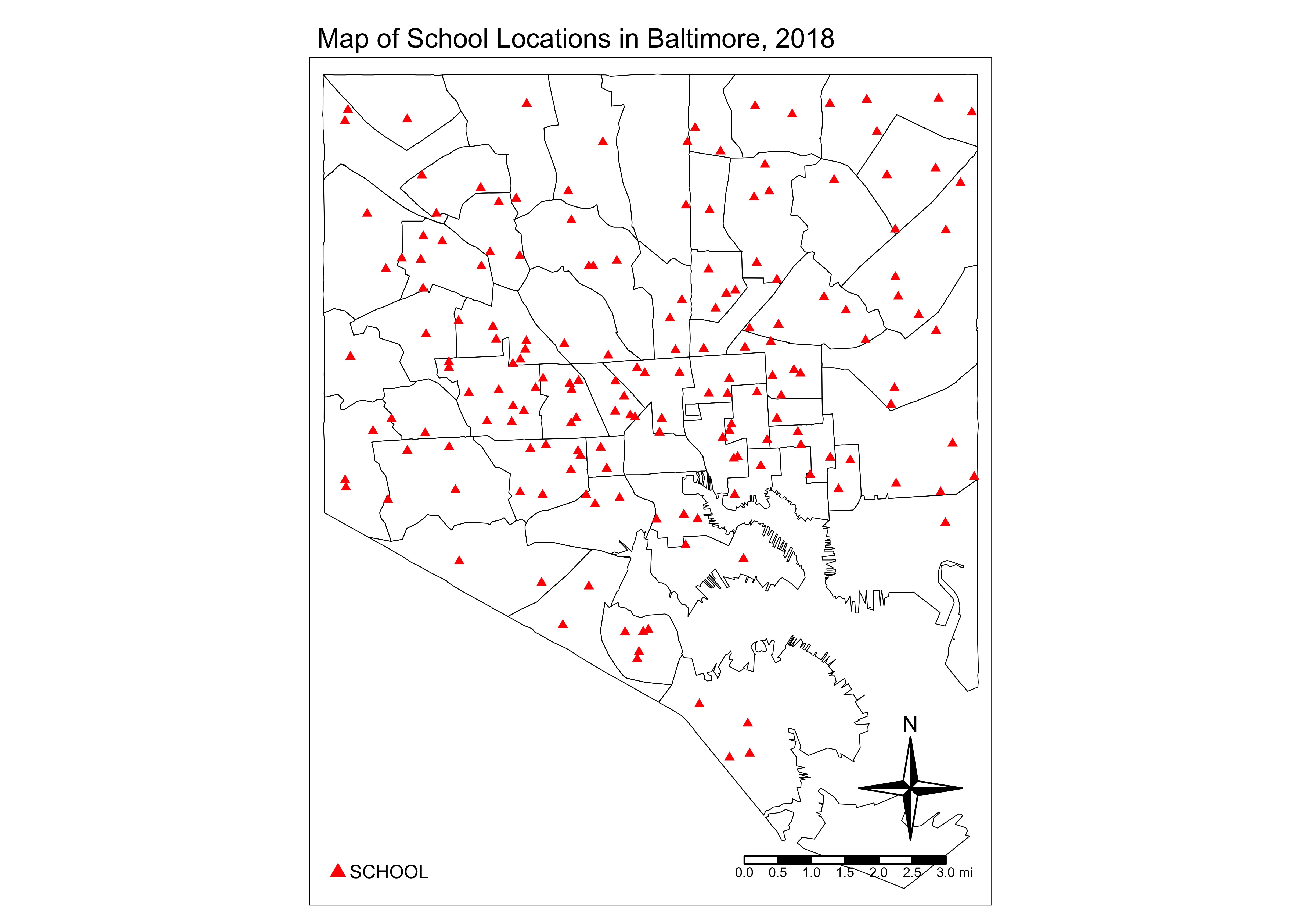
Let’s build a second map of school locations. (Here, I don’t have as many comments because it’s a replication of the first map above.):
# Create map of School locations ----

baltimore2 <-
  tm_shape(csas) +
  tm_borders("black", lwd = .5) +
  tm_shape(schools) +
  tm_dots(
    "CATEGORY",
    shape = 17,
    size = 0.1,
    title = "School Type",
    col = "red",
    legend.show = T
  ) +
  tm_legend() +
  tm_compass() +
  tm_layout(
    main.title = "Map of School Locations in Baltimore, 2018",
    main.title.size = 1,
    legend.position = c("left", "bottom"),
    compass.type = "4star",
    legend.text.size = 0.7,
    legend.title.size = 0.9
  ) +
  tm_scale_bar(
    size = 0.5,
    color.dark = "black",
    color.light = "white",
    lwd = 1
  ) +
  tm_add_legend(
    "symbol",
    col = "red",
    shape = 17,
    size = 0.5,
    labels = "SCHOOL"
  ) +
  tmap_options(unit = "mi")

baltimore2

tmap_save(tm = baltimore2,
          filename = "Maps/baltimore2.jpg",
          dpi = 600)
This is what we get:
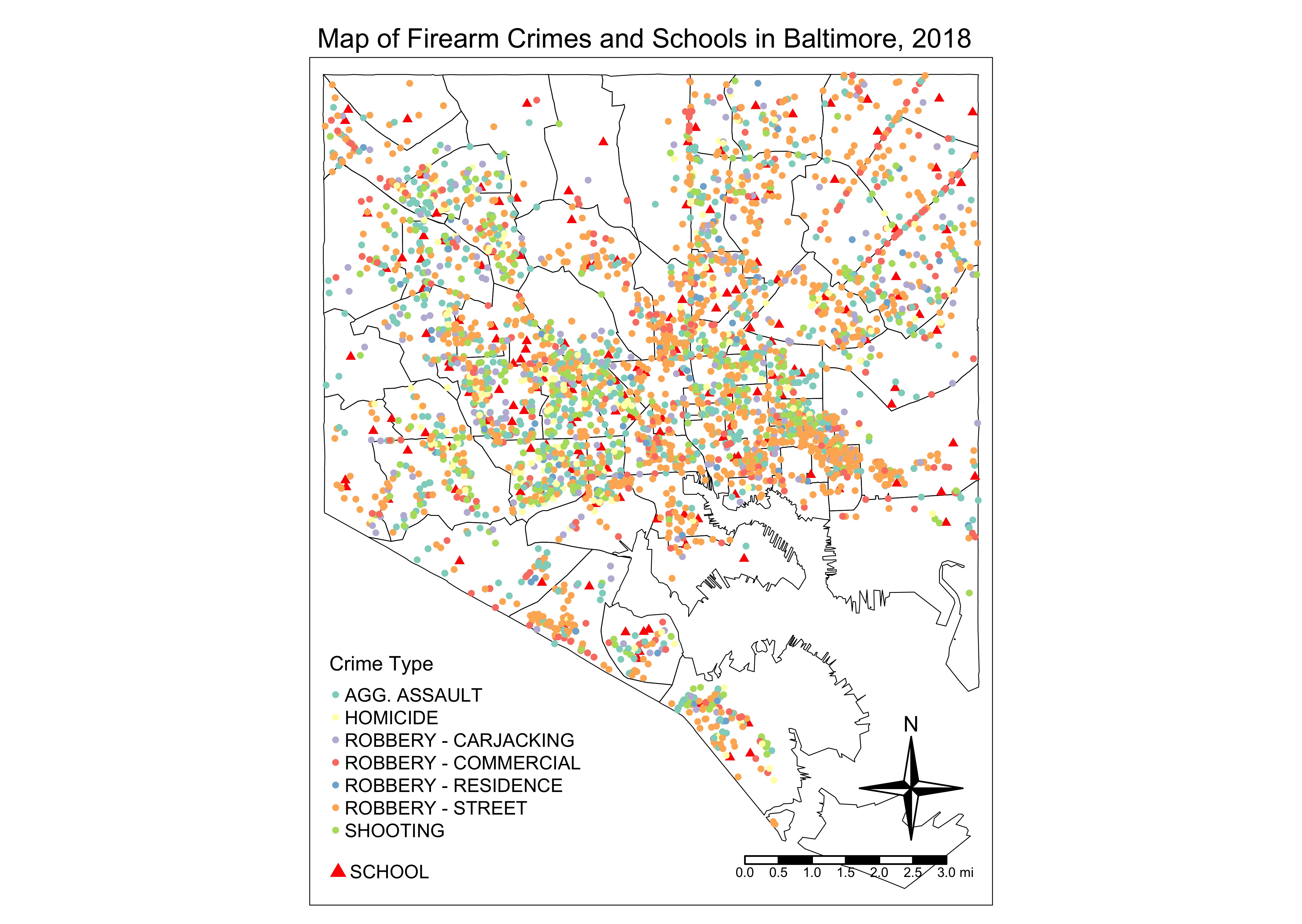
Now, let’s create a map of firearm-related crimes and school locations:
# Create map of school locations and firearm crimes locations ----

baltimore3 <-
  tm_shape(csas) +
  tm_borders("black", lwd = .5) +
  tm_shape(schools) +
  tm_dots(
    "CATEGORY",
    shape = 17,
    size = 0.1,
    title = "School Type",
    col = "red",
    legend.show = T
  ) +
  tm_shape(guncrimes) +
  tm_dots("Dscrptn",
          title = "Crime Type",
          size = 0.08) +
  tm_compass() +
  tm_layout(
    main.title = "Map of Firearm Crimes and Schools in Baltimore, 2018",
    main.title.size = 1,
    legend.position = c("left", "bottom"),
    compass.type = "4star",
    legend.text.size = 0.7,
    legend.title.size = 0.9
  ) +
  tm_scale_bar(
    size = 0.5,
    color.dark = "black",
    color.light = "white",
    lwd = 1
  ) +
  tm_add_legend(
    "symbol",
    col = "red",
    shape = 17,
    size = 0.5,
    labels = "SCHOOL"
  ) +
  tmap_options(unit = "mi")

baltimore3

tmap_save(tm = baltimore3,
          filename = "Maps/baltimore3.jpg",
          dpi = 600)
This is the map:
Now, we’re going to create a 1,000-ft buffer around the schools:
# Create a 1,000-foot buffer around the schools ----
# https://www.rdocumentation.org/packages/raster/versions/2.8-19/topics/buffer

buf <- buffer(schools, # Layer for buffers
              width = 304.8, # Buffer in meters
              dissolve = F)
plot(buf) # Take a look at the result
Make sure you convert your feet to meters, and make sure to verify that what you’ve created is what you were looking for.
Now, let’s see those buffers around the schools on a map:
# Create map with buffers and schools only ----

baltimore4 <-
  tm_shape(csas) +
  tm_borders("black", lwd = .5) +
  tm_shape(buf) +
  tm_borders("blue", lwd = .5) +
  tm_shape(schools) +
  tm_dots(
    "CATEGORY",
    shape = 17,
    size = 0.1,
    title = "School Type",
    col = "red"
  ) +
  tm_compass() +
  tm_layout(
    main.title = "Map of 1000-ft Buffers Around Schools in Baltimore, 2018",
    main.title.size = 1,
    legend.position = c("left", "bottom"),
    compass.type = "4star",
    legend.text.size = 0.7,
    legend.title.size = 0.9
  ) +
  tm_scale_bar(
    size = 0.5,
    color.dark = "black",
    color.light = "white",
    lwd = 1
  ) +
  tm_add_legend(
    "symbol",
    col = "red",
    shape = 17,
    size = 0.5,
    labels = "SCHOOL"
  ) +
  tm_add_legend("line",
                col = "blue",
                size = 0.1,
                labels = "1000-ft Buffer") +
  tmap_options(unit = "mi")

baltimore4

tmap_save(tm = baltimore4,
          filename = "Maps/baltimore4.jpg",
          dpi = 600)
Here is what it looks like:

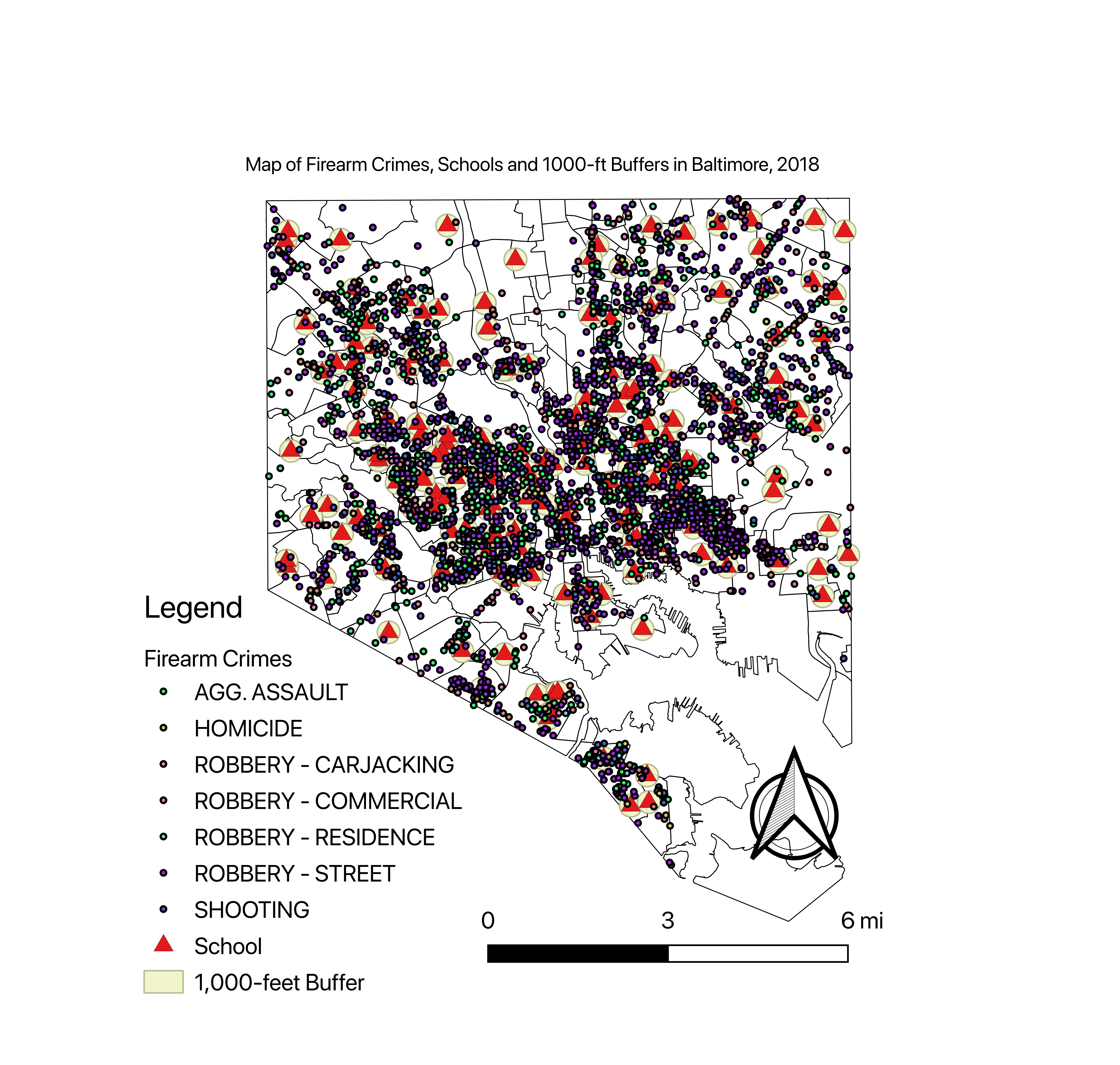
And now, let’s create the final map:
# Create map with buffer, schools and crimes. This is the final map. ----

baltimore5 <-
  tm_shape(csas) +
  tm_borders("black", lwd = .5) +
  tm_shape(buf) +
  tm_borders("blue", lwd = .5) +
  tm_shape(schools) +
  tm_dots(
    "CATEGORY",
    title = "Schools",
    shape = 17,
    size = 0.1,
    col = "red"
  ) +
  tm_shape(guncrimes) +
  tm_dots("Dscrptn",
          title = "Crime Type",
          size = 0.08) +
  tm_compass() +
  tm_layout(
    main.title = "Map of Firearm Crimes, Schools and 1,000-ft Buffers in Baltimore, 2018",
    main.title.size = 0.8,
    legend.position = c("left", "bottom"),
    compass.type = "4star",
    legend.text.size = 0.7,
    legend.title.size = 0.9
  ) +
  tm_scale_bar(
    size = 0.5,
    color.dark = "black",
    color.light = "white",
    lwd = 1
  ) +
  tm_add_legend(
    "symbol",
    col = "red",
    shape = 17,
    size = 0.5,
    labels = "SCHOOL"
  ) +
  tm_add_legend("line",
                col = "blue",
                size = 0.1,
                labels = "1000-ft Buffer") +
  tmap_options(unit = "mi")

baltimore5

tmap_save(tm = baltimore5,
          filename = "Maps/baltimore5.jpg",
          dpi = 600)
And this is what that looks like:
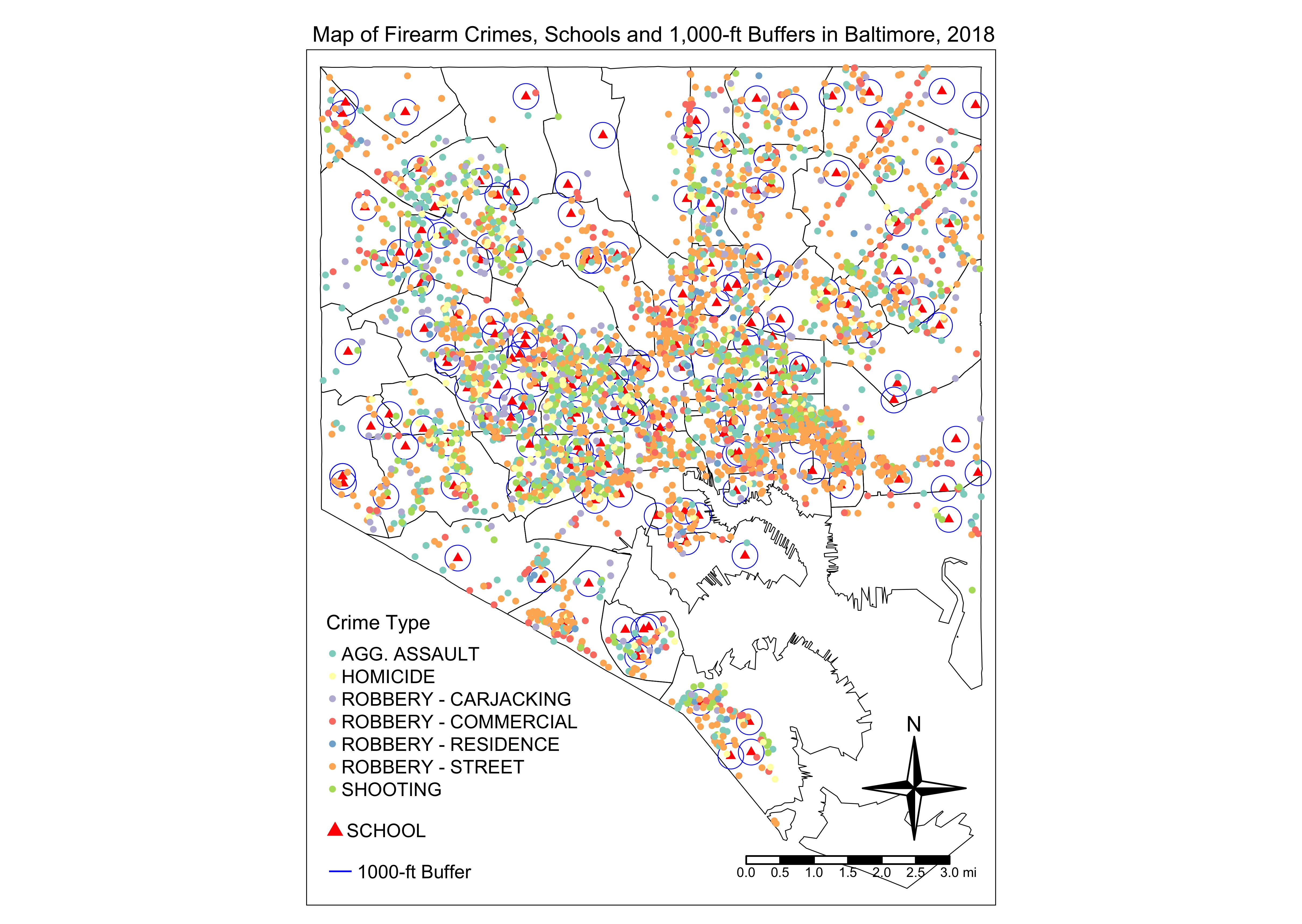
Does that look like the map created in QGIS? Absolutely. Just some tweaking to what the markers look like — and their sizes — and we get two similar maps.
The good thing about tmap is that it allows you to create an interactive map with just a quick line of code. (The other R package, leaflet, does something similar, and might even be a little more “robust,” in my opinion.)
# View the final map in interactive mode ---

tmap_mode("view") # Set the mode to view in order to create an interactive map
baltimore5
tmap_mode("plot") # Return to plotting if further maps are going to be made
Now, for analyzing the data, let’s create a dataframe by joining all the points into the buffer zones.
# Now to create a dataframe of the gun crimes within the buffer zones ----

crimespoints <- as.data.frame(point.in.poly(guncrimes, # Points
                                            buf)) # Polygons
crimesbuffer <-
  subset(crimespoints, NAME != "NA") # Creating a dataframe of only the points inside the polygons (NAME is not NA)
If “NAME” is NA (not available), then that means that the point is not inside a buffer. I subsetted that into “crimesbuffer” where I will do the analysis of the 182 schools with at least one (1) gun-related crime within 1,000 feet, and I could even do an analysis of the 2,485 crimes that happened within 1,000 feet of a school.
# Finally, let's see which school had the most gun crimes within 1,000 feet from it ----

table <-
  count(crimesbuffer,
        NAME,
        sort = T) # Create a table of names and numbers and sorts it descending
sort(table$n,
     decreasing = T) # Sorting the table
table # View the table
hist(table$n) # Histogram of crime counts (Notice a distribution?)
sum(table$n)
From this, I found that the school with the most firearm-related crimes within 1,000 feet of it was William Paca Elementary at 200 N Lakewood Ave.
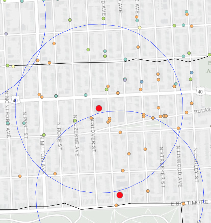
That school had 81 firearm-related crimes within 1,000 feet from it.
Further Analysis?
From here, the types of analyses you can do are only limited by your data and your imagination. You can extract socioeconomic data from the CSA shapefiles and do a regression to see if anything is predictive of the number of firearm-related crimes within 1,000 feet of schools. (Remember that you’re dealing with count data, so you’ll need to use the Poisson distribution or maybe even a negative binomial regression. Also remember to deal with spatial autocorrelation.)
At the very least, you can now go to policymakers or the parent-teacher associations and tell them which schools are at higher risk of having firearm-related crimes close to them. If you’re really ambitious, you could use the time codes on the crime data and compare crimes during school hours versus crimes after hours. Finally, you can expand or reduce the buffer to something that is significant to your audience.
The Full Code and Data
As with all of these mini-projects of mine, the full code and data can be found by clicking the button below. Please remember to link back to this blog post or my blog home page and to give proper attribution for this within your code or in your write-up. The code is licensed under the Creative Commons Attribution 4.0 International (CC BY 4.0).
And please do let me know if you have ideas on improving this in any way. I’m all ears when it comes to collaboration.
