Looking at Unmet Health Needs in Chicago, 2013
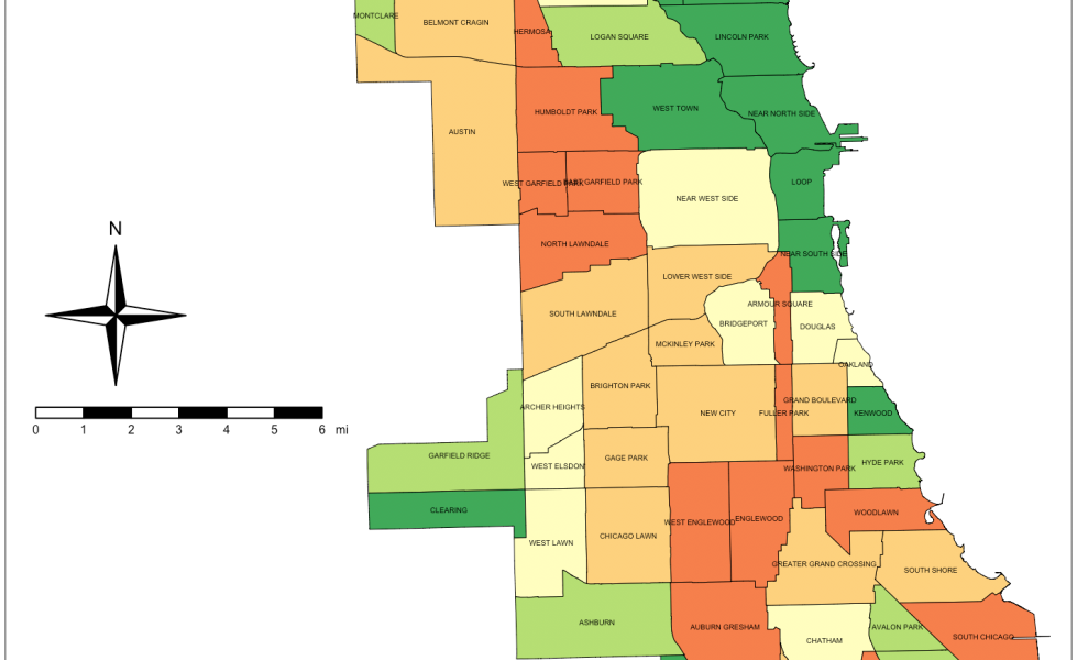
Look at this map of Chicago.
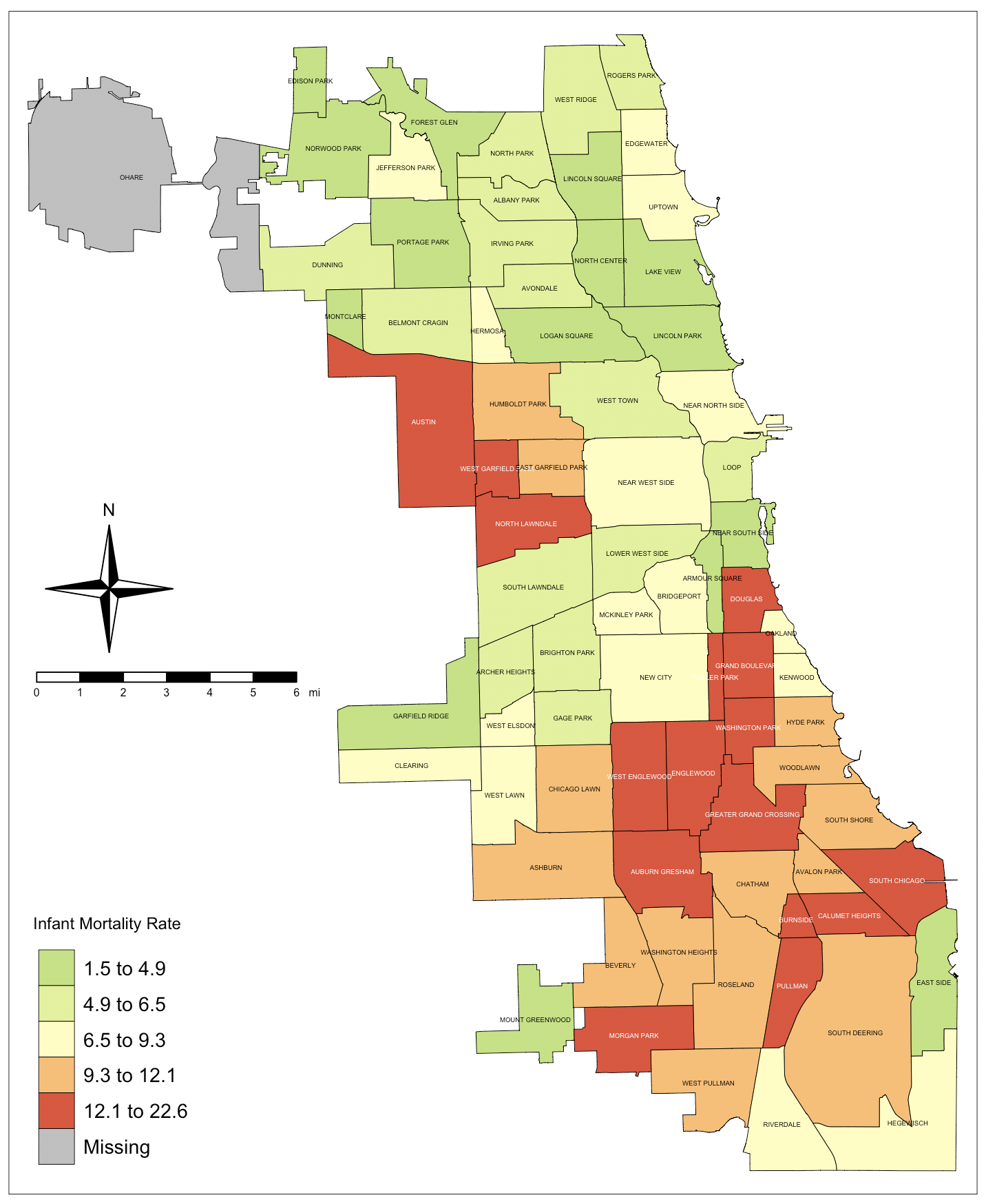
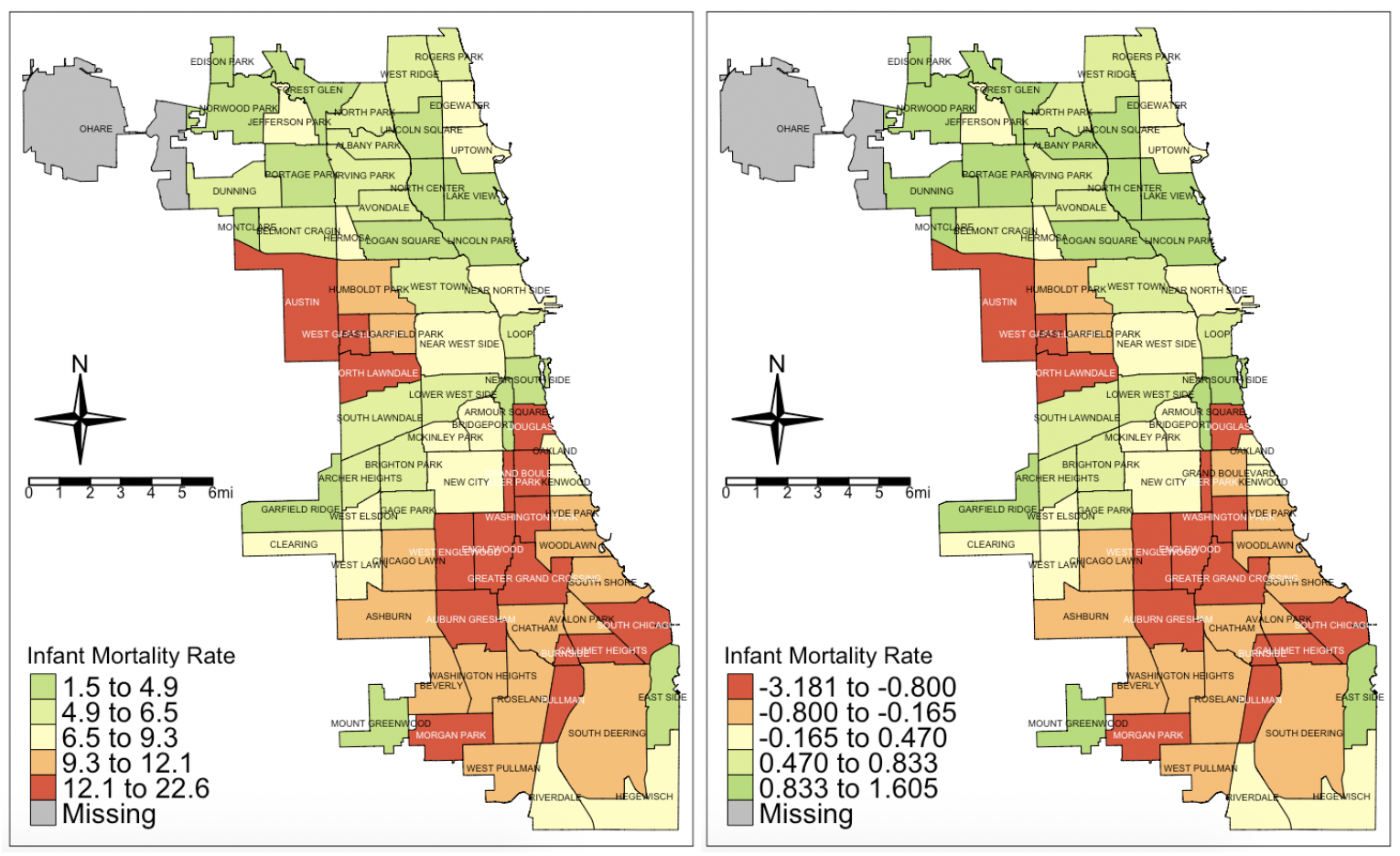
This map shows the infant mortality rate in the 77 different communities (except O’Hare, which is the airport area) in Chicago. As you can see, there are some very marked disparities. Armour Square, on the city’s east side, has the lowest infant mortality rate at 1.5. Right next to it is Douglas, and it’s infant mortality rate is 13.4. Interesting, right?
(All the data for this blog post come from Chicago’s Open Data portal.)
You would think that maybe socioeconomics has something to do with this, and you’d be partially right. However, the per capita income in Armour Square is $16,942. In Douglas, it’s $23,098. The percent of people living under the poverty line in Armour Square is 35.8%. In Douglas, it’s 26.1%.
So, if I were to show you only the map of infant mortality, I would not be informing you completely on the disparities between Armour Square and its neighboring community, Douglas. So maybe I’ll show you a second map, that of per capita income:
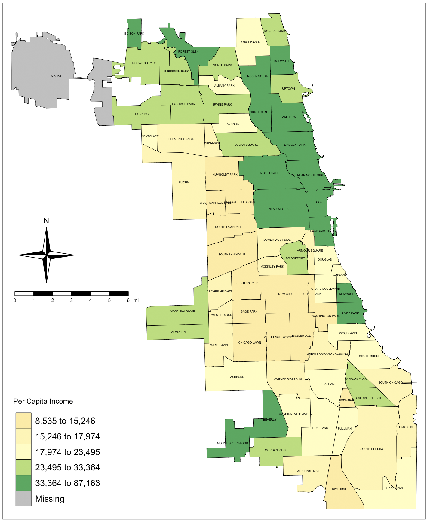
Ah, now we see that Armour Square and Douglas are on the lower end of the ladder when it comes to per capita income. The higher-income communities show clearly in green. However, if I show you only this map, or even these two maps, I’m still not giving you the full picture of Chicago communities’ health, am I?
To fully do this, we in applied epidemiology use a technique to come up with a “Healthy Condition Index.” The HCI takes health indicators from five domains and standardizes them. (More on that in a second.) The five domains are: Demographics, like percent of an underserved minority living in a community or the proportion of people without a high school diploma; Socioeconomics, like per capita income; Mortality, a measure of how much death is happening in a community, like infant mortality rate; Morbidity and risk factors, like a disease or condition happening in the communities; and Coverage and Health Services, like the number of women getting timely prenatal care or the proportion of children being screened on time for lead poisoning.
We take one indicator from these five domains and make sure that they’re not too collinear, meaning that the level to which one rises or falls given a predictive variable is not exactly the same level as which another one rises or falls. If they’re too collinear, they’re giving us the same information, so we wouldn’t need both. (For this example, I’m assuming the variables I picked are not collinear enough to cause a problem, but you should definitely do this check if you’re doing an actual evaluation of a city’s unmet health needs.)
Next, because the different variables are not on the same scale (some are percentages from 0% to 100% and others are money from $0 to infinity), we need to standardize them. It’s a bit complicated to explain in a blog post how we do standardization — and exactly why — so I’ll let the good folks at Crash Course – Statistics give you the full explanation:
Finally, we add up the Z-scores for each variable and use that as the HCI. (Disclaimer: My thesis advisor and doctoral school mentor, Carlos Castillo-Salgado, MD, MPH, DrPH, is one of the developers of the index.) That HCI number is more indicative of the true condition of the neighborhood/community in relation to another. It gives more information all in one time instead of having to compare two or more communities based on one variable at a time.
Let’s Look at It in R
So let’s dive in and do this analysis in R. You’ll need your favorite R programming environment, the public health statistics data from Chicago that can be found here, and the shapefiles for Chicago’s 77 communities that can be found here. I’ve created a function in R that will do several things as you’ll see in the code:
- Extracts the names (characters) of the communities and saves them to use later
- Extracts the variables (numbers) from the data and saves them to do the next set of operations
- Calculates the Z-score for each variable (just like the video above describes)
- Multiplies variables that you choose by negative one (-1) in order to make sure the directionality of the vector is correct. (More on that in a second.)
- Sums all the Z-scores into the HCI
- Creates a data frame by reincorporating the community names into the file along with the Z-scores and the index values
At the end, you’re left with a dataframe that you can match to your shapefile and throw on a map.
Why negative one? Suppose that you’re looking at per capita income and infant mortality. The scale for per capita income is basically “larger is better,” right? The more per capita income, the better the community is in that respect. The scale for infant mortality rate is the opposite. It is “smaller is better.” The lower the infant mortality rate is, the better the community is in that respect. To make the two be heading in the right direction, once the Z-score is calculated, we multiply any variable whose direction is “lower is better” by negative one to flip its directionality. That way, negative Z-scores become positive, or “higher is better.”
Alright, so let’s do some programming. Fire up a new script, and pull in your data and do some clean-up:
# Import the data

chicago <- read.csv("data/chicago_public_health_stats_2013.csv",
                    stringsAsFactors = T)

# Get rid of community area number

drops <- c("Community.Area")
chicago <- chicago[,!(names(chicago) %in% drops)]

# Choose your five indicators and keep them along with the Community Area Name
# For this example, I will choose the following from their respective domains...
# Demographics: No.High.School.Diploma, lower is better*
# Socioeconomics: Per.Capita.Income, higher is better
# Mortality: Infant.Mortality.Rate, lower is better*
# Morbidity and Risk Factors: Tuberculosis, lower is better*
# Coverage and Health Services: Prenatal.Care.Beginning.in.First.Timester, higher is better

keeps <- c(
  "Community.Area.Name",
  "No.High.School.Diploma",
  "Per.Capita.Income",
  "Infant.Mortality.Rate",
  "Tuberculosis",
  "Prenatal.Care.Beginning.in.First.Trimester"
)
chicago <- chicago[keeps]
Note that I marked in the comments which variables are “lower is better” in their directionality. Next, we’re going to apply the function I created, “uhn.index” (UHN meaning “unmet health needs”):
# Now, we create a function "uhn.index" that will do several things
# noted in the code:

lower.better <- c("No.High.School.Diploma",
                  "Infant.Mortality.Rate",
                  "Tuberculosis")

uhn.index <-
  function(x, y) {
    # x is the dataframe we're using, y are the "lower is better" variables
    chars <-
      x %>% select_if(negate(is.numeric)) # Extracts the names of the community areas
    x <- x[, sapply(x, is.numeric)] # Extracts the numeric variables
    x = scale(x) # Calculates the Z scores of teh numeric variables
    myvars <- y # Incorporates the variables in y above as the ones
    x[, myvars] <-
      x[, myvars] * -1 # Multiplies the "lower is better" variables by negative one
    index <- rowSums(x) # Sums all the Z scores into the index score
    x <-
      data.frame(chars, x, index) # Creates the dataframe from the names, the Z scores and the index
    x <-
      x[order(index), ] # Sorts the index variable from smallest to largest
    return(x) # Returns the resulting dataframe
  }

# Now we apply that function to the Chicago dataframe

chicago.uhn <- uhn.index(chicago, lower.better)

# Let's see our final product

view(chicago.uhn)
At the end, you will have a dataframe named chicago.uhn that will have the names of the communities, the variables you selected from the five domains (noting that the original file had 29 variables).
Next, we import the shapefile:
# Import the shapefile for the community areas of Chicago

chicago.map <-
  readOGR("data/chicago_community_areas", "chicago_community_areas")
Next, join the data you created and the original numbers. There was a little problem here because the original data had the community names in upper and lowercase. The shapefile had the names all in uppercase. So I had to do some manipulation before the join:
# Joining our chicago.uhn data with the shapefile

# First, we sort by Community.Area.Name

chicago.uhn <- chicago.uhn[with(chicago.uhn, order(Community.Area.Name)),]

# Next, because the community names in the shapefile are all in capitals...

chicago.uhn <- mutate_at(chicago.uhn, "Community.Area.Name", toupper)
chicago <- mutate_at(chicago, "Community.Area.Name", toupper)

# Now, the join...

chicago.data <-
  geo_join(chicago.map,
           chicago.uhn,
           "community",
           "Community.Area.Name",
           how = "left")

# And another join for the original data

chicago.data.o <-
  geo_join(chicago.map, chicago, "community", "Community.Area.Name", how = "left")
That’s it. You can now create your maps. For sake of simplicity, I will give you the code below for mapping the index:
# Let's map the Index of Unmet Health Needs

index <- tm_shape(chicago.data, unit = "mi") +
  tm_basemap("OpenTopoMap") +
  tm_fill(
    "index",
    title = "Index of Unmet Health Needs",
    midpoint = 0,
    style = "quantile",
    palette = "RdYlGn" # The minus sign before "RdYlGn" takes care of the direction of colors
  ) +
  tmap_options(legend.text.color = "black") +
  tm_borders("black",
             lwd = .5) +
  tm_compass(position = c("left", "center")) +
  tm_layout(
    compass.type = "4star",
    legend.text.size = 0.9,
    legend.title.size = 0.9
  ) +
  tm_legend(
    position = c("left", "bottom"),
    frame = F,
    bg.color = "white"
  ) +
  tm_text("community",
          size = 0.3) +
  tm_scale_bar(
    size = 0.5,
    color.dark = "black",
    color.light = "white",
    lwd = 1,
    position = c("left", "center")
  )

index # Look at the map
So let’s look at the maps of the variables first. Side-by-side, we’ll have the original data on the left and the standardized (Z-scores) values on the right:
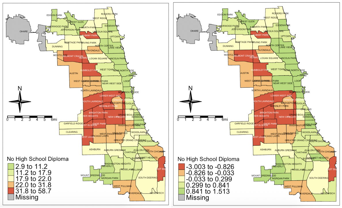
They look basically the same, and that’s okay. What Z-scores do is that they tell us which communities are above average (positive Z-scores) or below average (negative Z-scores) and by how much. So that’s “No High School Diploma.”
Per capita income:
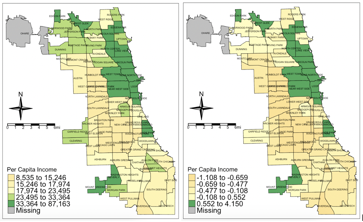
Note here that some of the communities in green on the left map become yellows on the right. This is because, although they are wealthy, they are not that far above the average for wealth. Remember that averages are very much influenced by extremes, and there are several communities in Chicago that are very low in per capita income. (Riverdale at the most south end of Chicago is an astounding $8,535 while Near North Side is $87,163.)
Infant mortality rate:
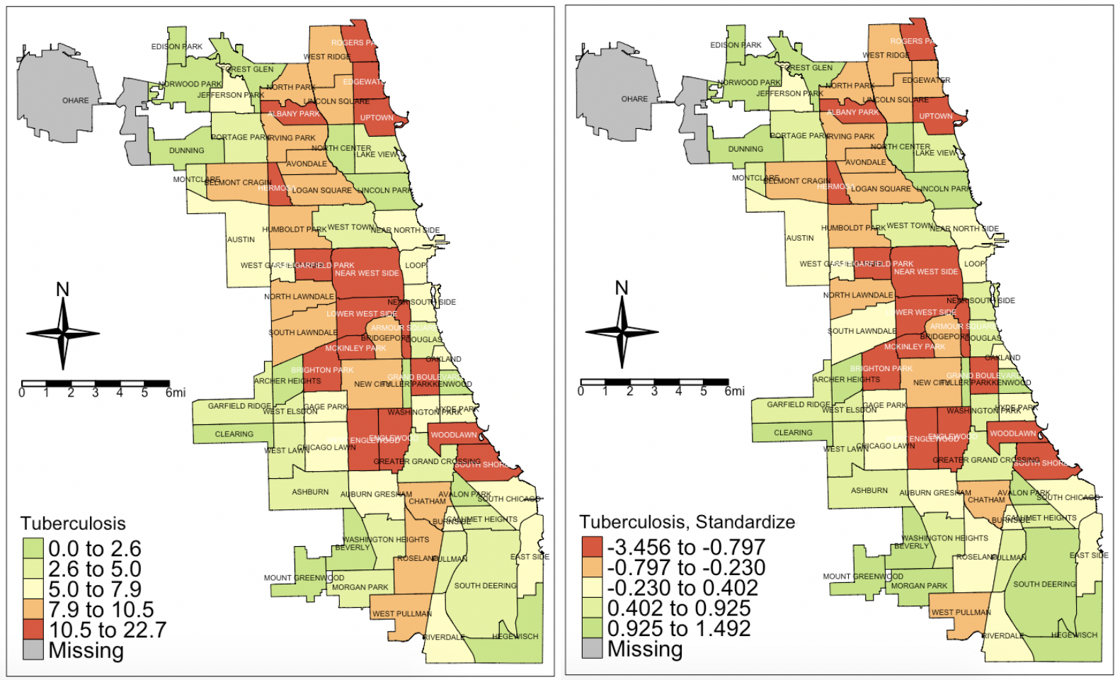
Tuberculosis:
Prenatal care:
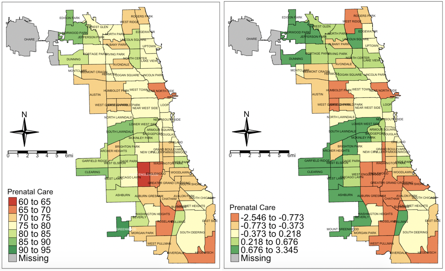
This one was interesting. Note how some of the communities that are relatively wealthy fare below the average when it comes to prenatal care. This is why giving only one map as information on the health status of a city can be misleading. Here, we have many places where prenatal care is around 60%, and very few where it is above 90%. Even when standardized, the number of communities below average (Z-score below zero) are distributed into even the more wealthier communities in the northeast part of the city.
Finally, the index…
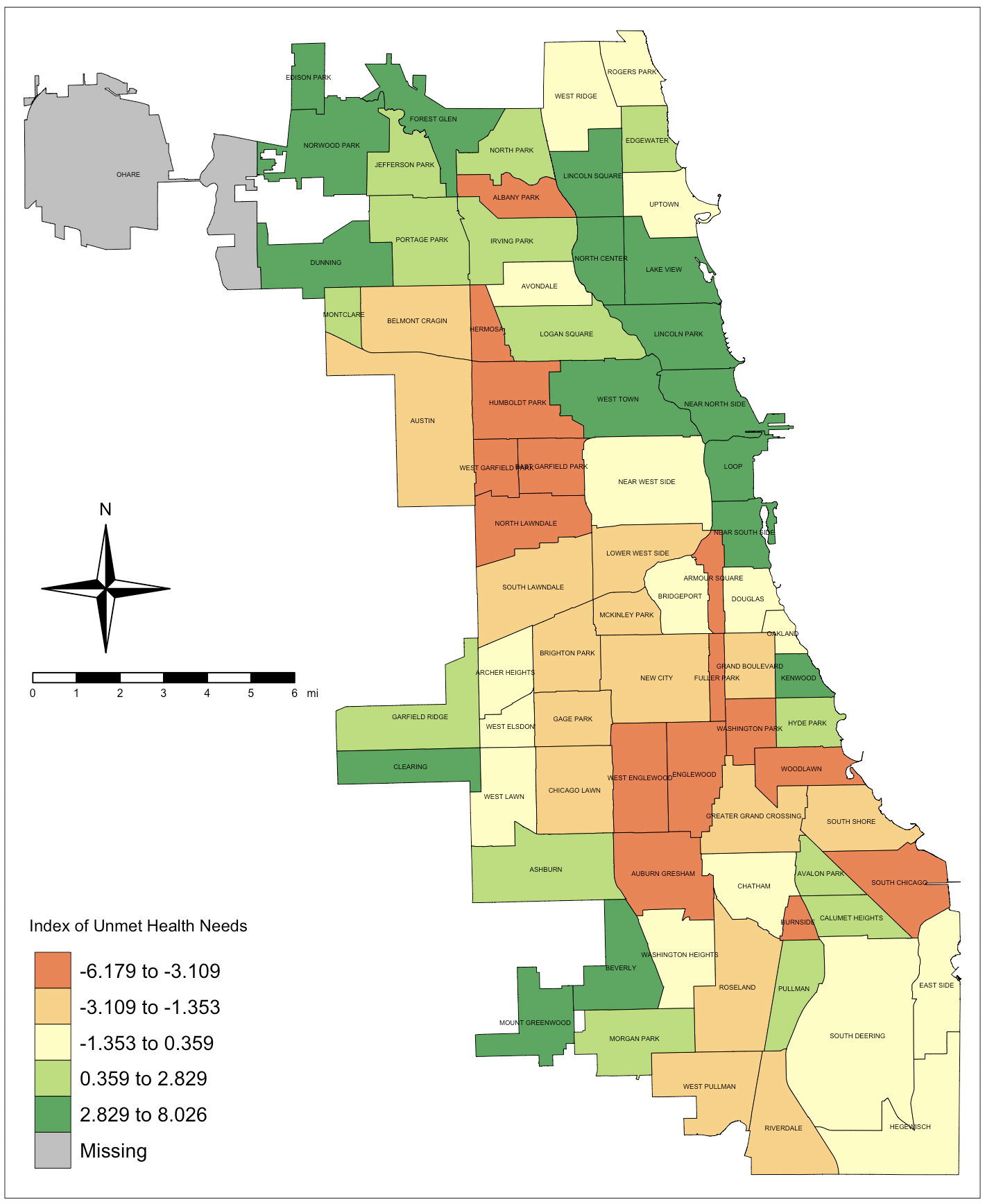
This index is aimed at giving a clearer picture of the gradation of health needs in the city of Chicago in 2013. Remember that it is the sum of the Z-scores for the other indicators, so it kind of evens out the differences in the indicators’ distributions from one community to the other. Now you can identify the communities that have the most needs across different domains.
Of course, there are other ways to standardize and account for the differences in the scales of the variables and the differences in the variables between communities. The main takeaway is that one variable, presented on one map, may not be giving the full picture of what is going on. Even two variables on two maps may not do the trick. The best thing to do is to get variables from different domains and standardize them so you’re comparing apples to apples.
