Local Indicators of Spatial Association in Homicides in Baltimore, 2019
Last year was yet another record year for homicides in Baltimore with 348 reported homicides for the year. While this number was the second-highest in terms of total homicides, it was probably the highest in terms of rate per 100,000 residents since Baltimore has been seeing a decrease in population. (The previous record was in 2015 and 2017.) The epidemic of violence and homicides that began in 2015 continues today.
When we epidemiologists analyze data, we need to be mindful of the spatial associations we see. The first law of geography states that “everything is related to everything else, but near things are more related than distant things.” As a result, clusters of cases of a disease or condition — or an outcome such as homicides — may be more a factor of similar things happening in close proximity to each other than an actual cluster.
To study this phenomenon and account for it in our analyses, we use different techniques to assess spatial autocorrelation and spatial dependence. In this blog post, I will guide you through doing a LISA (Local Indicators of Spatial Association) analysis of homicides in Baltimore City in 2019 using R programming.
First, The Data
Data on homicides was extracted from the Baltimore City Open Data portal. Under the “Public Safety” category, we find a data set titled “BPD Part 1 Victim Based Crime Data.” In those data, I filtered the observations to be only homicides and only those occurring/reported in 2019. This yielded 348 records, corresponding to the number reported for the year.
Data on Community Statistical Areas (agglomerations of neighborhoods based on similar neighborhood characteristics came from the Baltimore Neighborhood Indicators Alliance (BNIA). They are a very good source of data on Baltimore with regards to social and demographic indicators. From their open data portal, I extracted the shapefile of CSAs in the city.
Next, The R Code
First, I load the libraries that I’m going to use for this project. (I’ve tried to annotate the code as much as possible.)
library(tidyverse)
library(rgdal)
library(ggmap)
library(spatialEco)
library(tmap)
library(tigris)
library(spdep)
library(classInt)
library(gstat)
library(maptools)
Next, I load the data.
csas <-
  readOGR("2017_csas",
          "Vital_Signs_17_Census_Demographics") # Baltimore Community Statistical Areas
jail <-
  readOGR("Community_Statistical_Area",
          "community_statistical_area") # For the central jail
pro <-
  sp::CRS("+proj=longlat +datum=WGS84 +unit=us-ft") # Projection
csas <-
  sp::spTransform(csas,
                  pro) # Setting the projection for the CSAs shapefile
homicides <- read.csv("baltimore_homicides.csv",
                      stringsAsFactors = F) # Homicides in Baltimore
homicides <-
  as.data.frame(lapply(homicides, function(x)
    x[!is.na(homicides$Latitude)])) # Remove crimes without spatial data (i.e. addresses)
Note that I had to do some wrangling here. First, there is an area on the Baltimore Map that corresponds to a large jail complex in the center of the city. So I added a second map layer called jail to the data. I also corrected the projection on the layers. (This helps make sure that the points and polygons line up correctly since you’re overlaying a flat piece of data on a spherical part of the planet.) Finally, I took out homicides for which there was no spatial data. This sometimes happens when the true location of a homicide cannot be determined… Or when there is a lag/gap in data entry.
Next, I’m going to convert the homicides data frame into a spatial points file.
coordinates(homicides) <-
  ~ Longitude + Latitude # Makes the homicides CSV file into a spatial points file
proj4string(homicides) <-
  CRS("+proj=longlat +datum=WGS84 +unit=us-ft") # Give the right projection to the homicides spatial points
Note that I am telling R which variables in homicides corresponds to the longitude and latitude variables. Next, as I did before, I corrected the projection to match that of the CSAs layer.
Now, let’s join the points (homicides) to the polygons (csas).
homicides_csas <- point.in.poly(homicides,
                                csas) # Gives each homicide the attributes of the CSA it happened in
homicide.counts <-
  as.data.frame(homicides_csas) # Creates the table to see how many homicides in each CSA
counts <-
  homicide.counts %>%
  group_by(CSA2010, tpop10) %>%
  summarise(homicides = n()) # Determines the number of homicides in each CSA.
counts$tpop10 <-
  as.numeric(levels(counts$tpop10))[counts$tpop10] # Fixes tpop10 not being numeric
counts$rate <-
  (counts$homicides / counts$tpop10) * 100000 # Calculates the homicide rate per 100,000
map.counts <- geo_join(csas,
                       counts,
                       "CSA2010",
                       "CSA2010",
                       how = "left") # Joins the counts to the CSA shapefile
map.counts$homicides[is.na(map.counts$homicides)] <-
  0 # Turns all the NA's homicides into zeroes
map.counts$rate[is.na(map.counts$rate)] <-
  0 # Turns all the NA's rates into zeroes
jail <-
  jail[jail$NEIG55ID == 93, ] # Subsets only the jail from the CSA shapefile
Here, I also created a table to see how many points fell inside the polygons. I allowed me to look at how many homicides were in each of the CSAs. Here are the top five:
| Community Statistical Area | Homicide Count |
| Southwest Baltimore | 29 |
| Sandtown-Winchester/Harlem Park | 25 |
| Greater Rosemont | 21 |
| Clifton-Berea | 16 |
| Greenmount East | 15 |
Of course, case counts alone are not giving us the whole information. We need to account for the differences in population numbers. For that, you’ll see that I created a rate variable. Here are the top five CSAs by homicide rate per 100,000 residents:
| Community Statistical Area | Homicide Rate per 100,000 Residents |
| Greenmount East | 191 |
| Sandtown-Winchester/Harlem Park | 189 |
| Clifton-Berea | 176 |
| Southwest Baltimore | 172 |
| Madison/East End | 167 |
As you can see, the ranking based on homicide rates is different, but it is more informative. It accounts for the fact that you may see more homicides in a CSA simply because that CSA has more people in it. Now we have the rates. I then joined the counts and rates to the csas shapefile. This is what we’ll use to map. I also made sure that all the NA’s in the rates and counts are zeroes. Finally, I used only the CSA labeled “93” for the jail. This, again, is to make sure that the map represents that area and we know that it is not a place where people live.
The Maps
Look at the following simple plot of homicide locations in Baltimore:
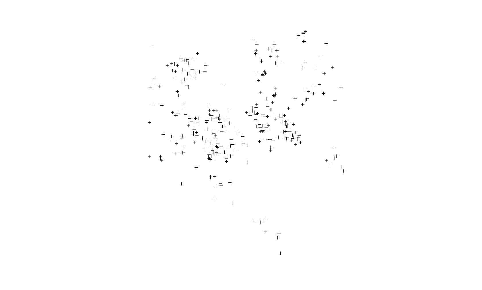
This is not a map. This is just a plot of the homicide locations. The latitude is on the Y axis and the longitude on the X axis. If you notice that there is some clustering of cases, you would be correct. Point-based cluster analysis can also be done on these data alone, but that is for a different blog post at a later time. (And you have to take other things into consideration.)
Next, I’m going to create a map of the points above (using the tmap package) but also show the boundaries of the CSAs. This will look more like a map and show you the spatial distribution of the homicide cases in context. You’ll see why there are blank spaces in some parts.
Here is the code:
tmap_mode("plot") # Set tmap to plot. To make interactive, use "view"

homicide.dots.map <-
  tm_shape(map.counts) +
  tm_borders(col = "black",
             lwd = 0.5) +
  tm_text("OBJECTID",
          size = 1) +
  tm_shape(homicides) +
  tm_dots(col = "red",
          title = "2019 Homicides",
          size = 0.2, ) +
  tm_compass() +
  tm_layout(
    main.title = "Map of Homicides and Homicide Rate in Baltimore City, 2019",
    main.title.size = 0.8,
    legend.position = c("left", "bottom"),
    compass.type = "4star",
    legend.text.size = 1,
    legend.title.size = 1,
    legend.outside = T
  ) +
  tm_scale_bar(
    text.size = 0.5,
    color.dark = "black",
    color.light = "yellow",
    lwd = 1
  ) +
  tm_add_legend(
    type = "symbol",
    col = "red",
    shape = 21,
    title = "Homicide",
    size = 0.5
  ) +
  tmap_options(unit = "mi") +
  tm_add_legend(
    type = "text",
    col = "black",
    title = "CSA ID#",
    text = "00"
  )
homicide.dots.map
And here is the map:
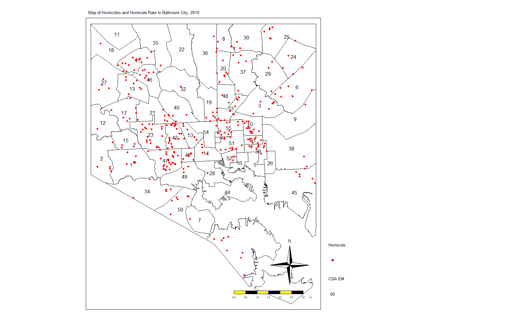
Again, we see the clustering of homicides in some areas. Let’s look at homicide rates. First, the code:
homicide.rate.map <-
  tm_shape(map.counts) +
  tm_fill(
    "rate",
    title = "Homicide Rate per 100,000",
    style = "fisher",
    palette = "OrRd",
    colorNA = "white",
    textNA = "No Homicides"
  ) +
  tm_borders(col = "black",
             lwd = 0.5) +
  tm_text("OBJECTID",
          size = 1) +
  tm_shape(homicides) +
  tm_dots(col = "red",
          title = "2019 Homicides") +
  tm_shape(jail) +
  tm_fill(col = "#d0e2ec",
          title = "Jail") +
  tm_compass() +
  tm_layout(
    main.title = "Map of Homicides and Homicide Rate in Baltimore City, 2019",
    main.title.size = 0.8,
    legend.position = c("left", "bottom"),
    compass.type = "4star",
    legend.text.size = 1,
    legend.title.size = 1,
    bg.color = "#d0e2ec",
    legend.outside = T
  ) +
  tm_scale_bar(
    text.size = 0.5,
    color.dark = "black",
    color.light = "yellow",
    lwd = 1
  ) +
  tm_add_legend(
    type = "symbol",
    col = "red",
    shape = 21,
    title = "Homicide",
    size = 0.5
  ) +
  tm_add_legend(
    type = "text",
    col = "black",
    title = "CSA ID#",
    text = "00"
  ) +
  tmap_options(unit = "mi")
homicide.rate.map
It stands to reason that the CSAs with the most points would also have the highest rates, so here is the map:

From here, we see that the CSAs with the highest rates are close together. We also see that those with the lowest rates are close together. And others are somewhere in between. If there was no spatial autocorrelation, we would expect these CSAs with high or low rates to be equally distributed all over the map. If there was perfect autocorrelations, all highs would be on one side and all lows would be on the other. What we have here is something in the middle, as is the case in most real-life examples.
LISA Analysis
In the next few lines of code, I’m going to do several things. First, I’m going to create a list of the neighbors to each CSA. One CSA, #4 at the far southern tip of the city, does not touch other CSAs. It looks like an island. So I’m going to manually add its neighbors to the list.
Next, I’m going to create a list of neighbors and weights. By weights, I mean that each neighbor will “weigh” the same. If a CSA has one neighbor, then the weight of that neighbor is 1. If they have four, each neighbor — to that CSA — weighs 0.25.
Next, I’m going to calculate the Local Moran’s I value. For a full discussion of Moran’s I, I recommend you visit this page: http://ceadserv1.nku.edu/longa//geomed/ppa/doc/LocalI/LocalI.htm
There are a lot of nuances to that value. But, basically, that value tells us how different from no spatial autocorrelation each CSAs is. Once you see it on the map, you’ll understand better.
Here’s the code:
map_nbq <-
  poly2nb(map.counts) # Creates list of neighbors to each CSA
added <-
  as.integer(c(7, 50)) # Adds neighbors 7 and 50 to CSA 4 (it looks like an island)
map_nbq[[4]] <- added # Fixes the region (4) without neighbors
View(map_nbq) # View to make sure CSA 4 has neighbors 7 and 50.

map_nbq_w <-
  nb2listw(map_nbq) # Creates list of neighbors and weights. Weight = 1/number of neighbors.
View(map_nbq_w) # View the list

local.moran <-
  localmoran(map.counts$rate, # Which variable you'll use for the autocorrelation
             map_nbq_w, # The list of weighted neighbors
             zero.policy = T) # Calculate local Moran's I
local.moran <- as.data.frame(local.moran)
summary(local.moran) # Look at the summary of Moran's I

map.counts$srate <-
  scale(map.counts$rate) # save to a new column the standardized rate

map.counts$lag_srate <- lag.listw(map_nbq_w,
                                  map.counts$srate) # Spatially lagged standardized rate in new column

summary(map.counts$srate) # Summary of the srate variable
summary(map.counts$lag_srate) # Summary of the lag_srate variable
Now, we’ll take a look at the Moran’s I plot created with this code:
x <- map.counts$srate %>% as.vector()
y <- map.counts$lag_srate %>% as.vector()
xx <- data.frame(x, y) # Matrix of the variables we just created
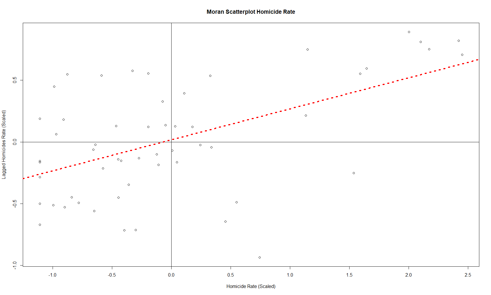
moran.plot(x, map_nbq_w) # One way to make a Moran PlotAnd here is the plot:
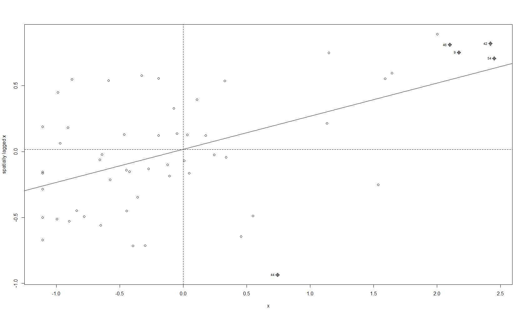
This plot tells us which CSAs are in the High-High (right upper quadrant), High-Low (right lower quadrant), Low-Low (left lower quadrant) and Low-High (left upper quadrant) designations for Moran’s I values. The High-High CSAs mean that their value was high and the values of the CSAs (their neighbors) were high also. That is expected since everything is like everything else close to it, right?
The Low-Low CSAs are the same. The ones that are outlier in this regard are the High-Low and Low-High, because these are CSAs that are high values (by values, we are looking at a calculation derived from standardized homicide rates) in a sea of low values, or low values in a sea of high values. The plot above has highlighted the ones that are not spatial outliers and have a significant p-value. (More on the p-value later.)
There is another way to make the same plot, if you’re so inclined:
plot(
  x = map.counts$srate,
  y = map.counts$lag_srate,
  main = "Moran Scatterplot Homicide Rate",
  xlab = "Homicide Rate (Scaled)",
  ylab = "Lagged Homicides Rate (Scaled)"
) # Another way to make a Moran Plot
abline(h = 0,
       v = 0) # Adds the crosshairs at (0,0)
abline(
  lm(map.counts$lag_srate ~ map.counts$srate),
  lty = 3,
  lwd = 4,
  col = "red"
) # Adds a red dotted line to show the line of best fit
And this is the resulting plot from that:
So those are the plots of the Moran’s I value. What about a map of these values? For that, we need to prepare our CSAs with the appropriate quadrant designations.
map.counts$quad <-
  NA # Create variable for where the pair falls on the quadrants of the Moran plot
map.counts@data[(map.counts$srate >= 0 &
                   map.counts$lag_srate >= 0), "quad"] <-
  "High-High" # High-High
map.counts@data[(map.counts$srate <= 0 &
                   map.counts$lag_srate <= 0), "quad"] <-
  "Low-Low" # Low-Low
map.counts@data[(map.counts$srate >= 0 &
                   map.counts$lag_srate <= 0), "quad"] <-
  "High-Low" # High-Low
map.counts@data[(map.counts$srate <= 0 &
                   map.counts$lag_srate >= 0), "quad"] <-
  "Low-High" # Low-High
This gives us this map:
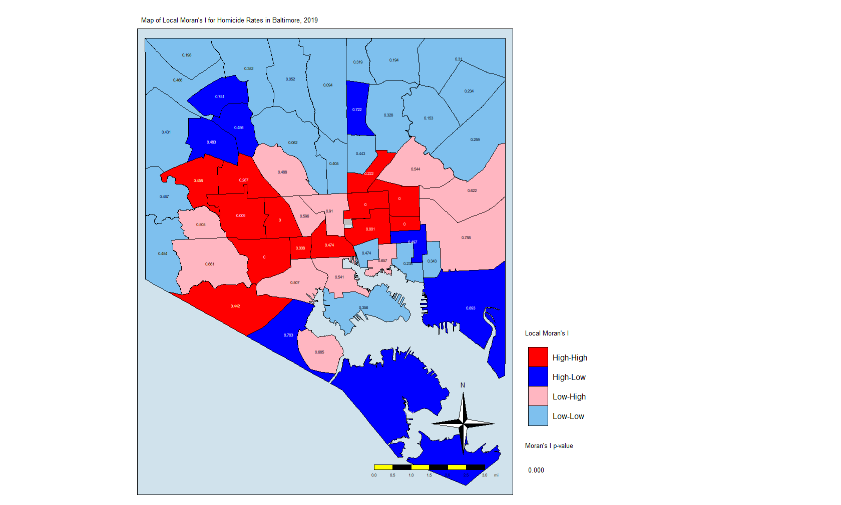
Here is the code for that map:
local.moran$OBJECTID <- 0 # Creating a new variable
local.moran$OBJECTID <- 1:nrow(local.moran) # Adding an object ID
local.moran$pvalue <-
round(local.moran$`Pr(z > 0)`, 3) # Rounding the p value to three decimal places
map.counts <- geo_join(map.counts,
local.moran,
"OBJECTID",
"OBJECTID")
colors <-
c("red", "blue", "lightpink", "skyblue2", "white") # Color Palette
local.moran.map <-
tm_shape(map.counts) +
tm_fill("quad",
title = "Local Moran's I",
palette = colors,
colorNA = "white") +
tm_borders(col = "black",
lwd = 0.5) +
tm_text("pvalue",
size = 0.5) +
tm_shape(jail) +
tm_fill(col = "gray",
title = "Jail") +
tm_compass() +
tm_layout(
main.title = "Map of Local Moran's I for Homicide Rates in Baltimore, 2019",
main.title.size = 0.8,
legend.position = c("left", "bottom"),
compass.type = "4star",
legend.text.size = 1,
legend.title.size = 1,
legend.outside = T,
bg.color = "#d0e2ec"
) +
tm_scale_bar(
text.size = 0.5,
color.dark = "black",
color.light = "yellow",
lwd = 1
) +
tm_add_legend(
type = "text",
col = "black",
title = "Moran's I p-value",
text = "0.000"
) +
tmap_options(unit = "mi")
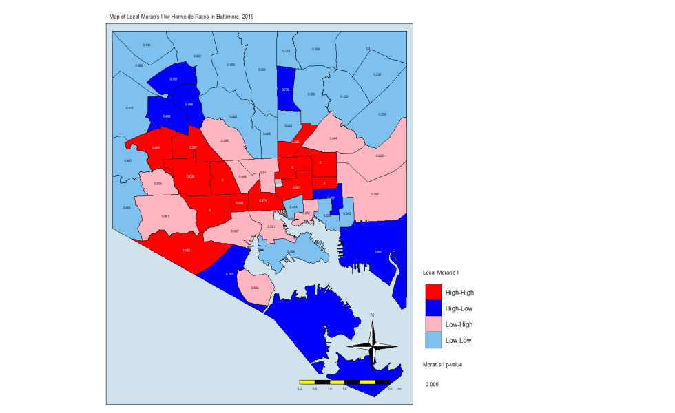
local.moran.mapThe CSAs in red are those that have high Moran’s I values and are surrounded by other CSAs with high values. The light blues are where there are low values and are are surrounded by lows. The dark blue are CSAs with high values but with low neighbors, and the light pink are CSAs with low values but high neighbors. The numbers inside each CSA is the p-value.
The Thing About Significance
If you’ve done your coursework on biostatistics, you’ll see that there is a lot of attention paid to p-values that are less than 0.05. In this case, only a few CSAs have such low p-values. But that may not be enough. In this explainer on spatial association, the author states the following:
An important methodological issue associated with the local spatial autocorrelation statistics is the selection of the p-value cut-off to properly reflect the desired Type I error. Not only are the pseudo p-values not analytical, since they are the result of a computational permutation process, but they also suffer from the problem of multiple comparisons (for a detailed discussion, see de Castro and Singer 2006). The bottom line is that a traditional choice of 0.05 is likely to lead to many false positives, i.e., rejections of the null when in fact it holds.
Source: https://geodacenter.github.io/workbook/6a_local_auto/lab6a.html
For this exercise, we are going to keep the p-value significance at 0.05 and create a map that uses the resulting CSAs. The code:
map.counts$quad_sig <-
  NA # Creates a variable for where the significant pairs fall on the Moran plot
map.counts@data[(map.counts$srate >= 0 &
                   map.counts$lag_srate >= 0) &
                  (local.moran[, 5] <= 0.05), "quad_sig"] <-
  "High-High, p <0.05" # High-High
map.counts@data[(map.counts$srate <= 0 &
                   map.counts$lag_srate <= 0) &
                  (local.moran[, 5] <= 0.05), "quad_sig"] <-
  "Low-Low, p <0.05" # Low-Low
map.counts@data[(map.counts$srate >= 0 &
                   map.counts$lag_srate <= 0) &
                  (local.moran[, 5] <= 0.05), "quad_sig"] <-
  "High-Low, p <0.05" # High-Low
map.counts@data[(map.counts$srate <= 0 &
                   map.counts$lag_srate >= 0) &
                  (local.moran[, 5] <= 0.05), "quad_sig"] <-
  "Low-High, p <0.05" # Low-High
map.counts@data[(map.counts$srate <= 0 &
                   map.counts$lag_srate >= 0) &
                  (local.moran[, 5] <= 0.05), "quad_sig"] <-
  "Not Significant. p>0.05" # Non-significant
Note that I am using the p-value in the local.moran calculation (position #5) in addition to where on the moran plot the CSAs fall. This really eliminates the non-significant (at p = 0.05) CSAs and leaves us with only eight CSAs. Here is the code for the map:
local.moran.map.sig <-
  tm_shape(map.counts) +
  tm_fill(
    "quad_sig",
    title = "Local Moran's I",
    palette = colors,
    colorNA = "white",
    textNA = "Not Significant"
  ) +
  tm_borders(col = "black",
             lwd = 0.5) +
  tm_text("pvalue",
          size = 0.5) +
  tm_shape(jail) +
  tm_fill(col = "gray",
          title = "Jail") +
  tm_compass() +
  tm_layout(
    main.title = "Map of Local Moran's I for Homicide Rates in Baltimore, 2019",
    main.title.size = 0.8,
    legend.position = c("left", "bottom"),
    compass.type = "4star",
    legend.text.size = 1,
    legend.title.size = 1,
    legend.outside = T,
    bg.color = "#d0e2ec"
  ) +
  tm_scale_bar(
    text.size = 0.5,
    color.dark = "black",
    color.light = "yellow",
    lwd = 1
  ) +
  tm_add_legend(
    type = "text",
    col = "black",
    title = "Moran's I p-value",
    text = "0.000"
  ) +
  tmap_options(unit = "mi")
local.moran.map.sig
And here is the map itself:
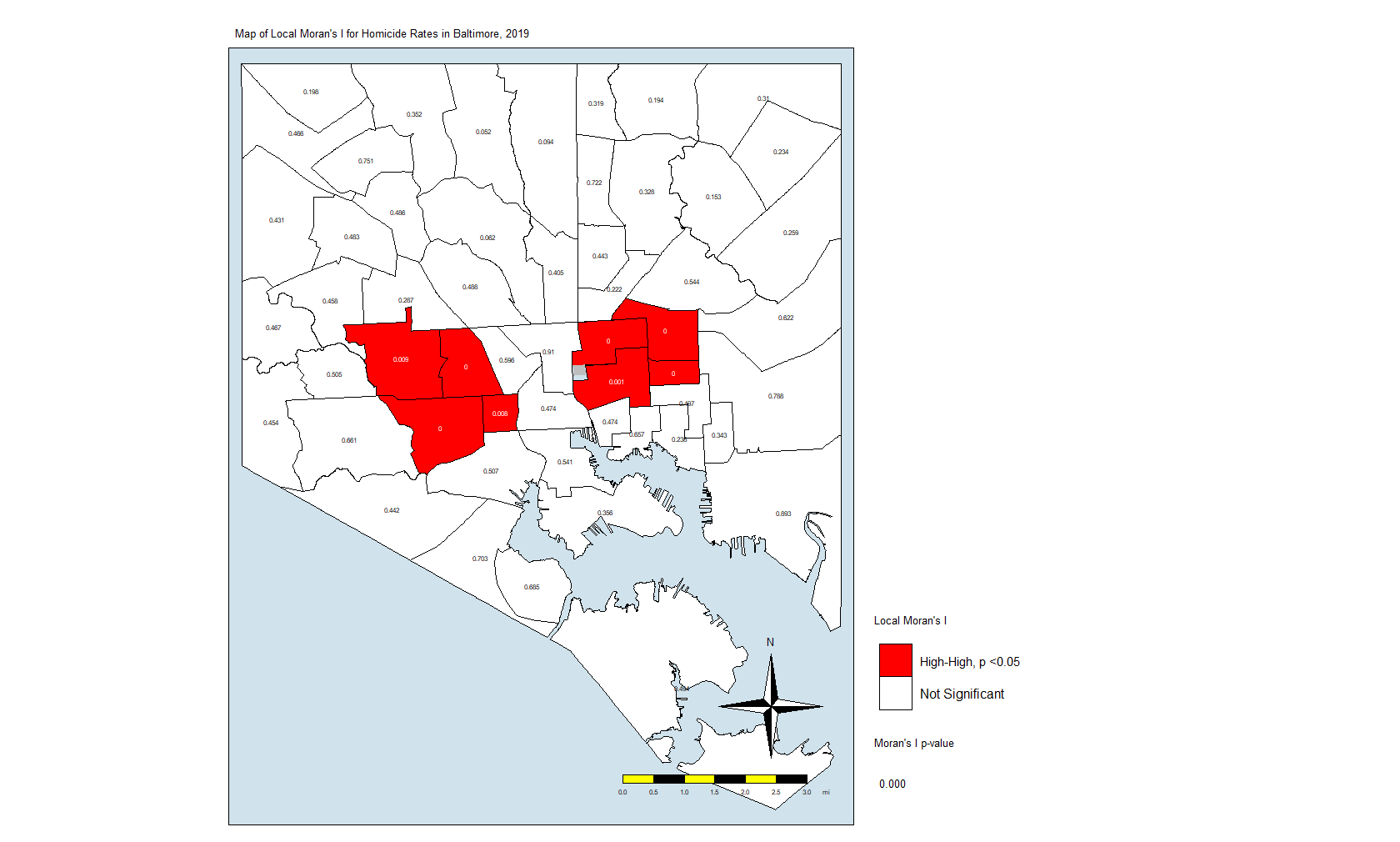
What this is telling us is that only those eight CSAs had a statistically significant Moran’s I value, and they were all in the “High-High” classification. This means that they have high standardized values (which are themselves derived from homicide rates) and are surrounded by CSAs with high values. There were no significant CSAs from the other quadrants on the Moran plot. (Remember that significance here comes with a big caveat.)
In Closing
What does this all mean? It means that the “butterfly pattern” seen in so many maps of social and health indicators in Baltimore still holds. The two regions in red in that last map make up the butterfly’s wings. Those CSAs are also the ones with the highest homicide rates.
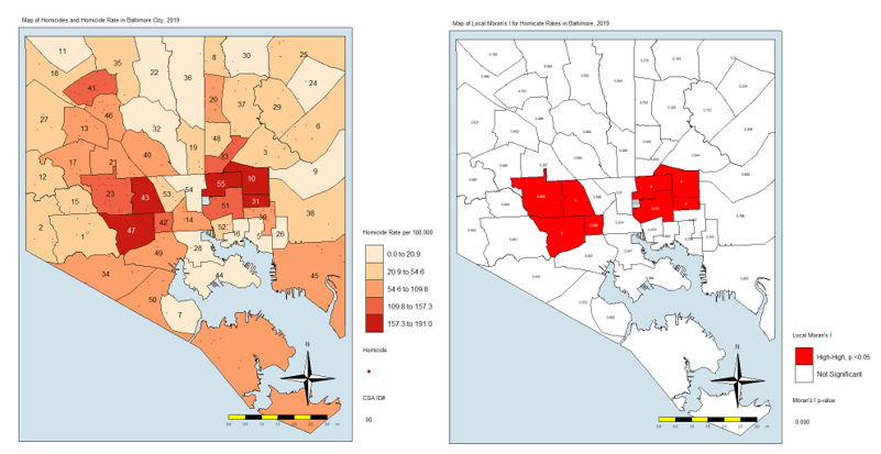
You could say that it is in those eight CSAs where homicides are the most concentrated. These are known as spatial clusters. If we had significant “Low-High” or “High-Low” CSAs, they would be known as spatial outliers. Significant “Low-Low” CSAs would also be spatial clusters.
As I mentioned above, we can also do other analyses, some of them looking at the individual locations of the homicides, the dots in the first plot and the first map. You could generate statistics that tell us whether those dots are closer together to each other than what you would normally see if they were just tossed on the map randomly.
A full geostatistical analysis includes these analyses, and you can see an example of the whole thing if you look at my dissertation. You may want to include the Local Moran’s I value or some other term (I used average number of homicides in neighbors) in a regression analysis. Or you could use composite index to account for different factors.

Huh, I thought the first law of geography was, “Whichever pump handle has the most cases in common gets removed”. 😉
The second law being, “Any point of interest that is central to one’s theory of source of disease is downhill from every nearby point, just to confound your data”.*
*I corollary is literally the case where we live, “All points are uphill from the departure point – both ways”. We’re on a complex saddle, so it is quite literally true, to leave, one goes uphill to the crest, then downhill to the destination, to return, go uphill, down a short bit, then uphill again.
As the car is down hard (bad catalytic converter, bad plugs and a bent unibody, well, walking to the supermarket is keeping the lard off. 🙂
LikeLiked by 1 person
If you really look at it, John Snow failed to control for socioeconomic status.
Yeah, everything is uphill when you have to walk.
LikeLike