Seeing Data in Time and Space

Alright… Real quick. I’ve been looking at ways to present in two dimensions data that are in three dimensions: location, time and rate. I’ve been looking at my homicide data (based on data compiled by The Baltimore Sun and others) and there was no good way to show it in two dimensions.
I wanted to show that some Community Statistical Areas (CSA) in Baltimore had gone from high homicide rates to low, and others from low to high. Usually, people would just use a complicated line graph. But, with 54 CSAs in Baltimore, that would mean 54 lines on a graph. That would be nuts.
For my dissertation, I used a tool in ArcGIS called a “space-time cube” in “emerging hot spot analysis.” That rendered a neat map of baltimore with cubes 13 levels high (one for each year from 2005 to 2017):
While I gained the ability to show which CSAs had high homicide rates (in red) and remained that way, and show that these CSAs were clustered in space (near each other) while those with lower homicide rates throughout the 13 years were also clustered, I lost the ability to show how poverty influenced these rates. That is, I couldn’t show that poorer CSAs had red throughout while wealthier ones had yellow or even blank (no homicides in that year) spaces.
I had almost forgotten about this problem until tonight, when I came upon a Hovmöller diagram by accident (looking at wind data). Look at this example form this paper:

As you can see, the wind speed was different by date (on the Y axis on the left) within and between reading stations (on the X axis on the bottom). Here we have geographic data (the location of the stations), time data (the date) and a measurement (the speed and direction represented by the scale on the right).
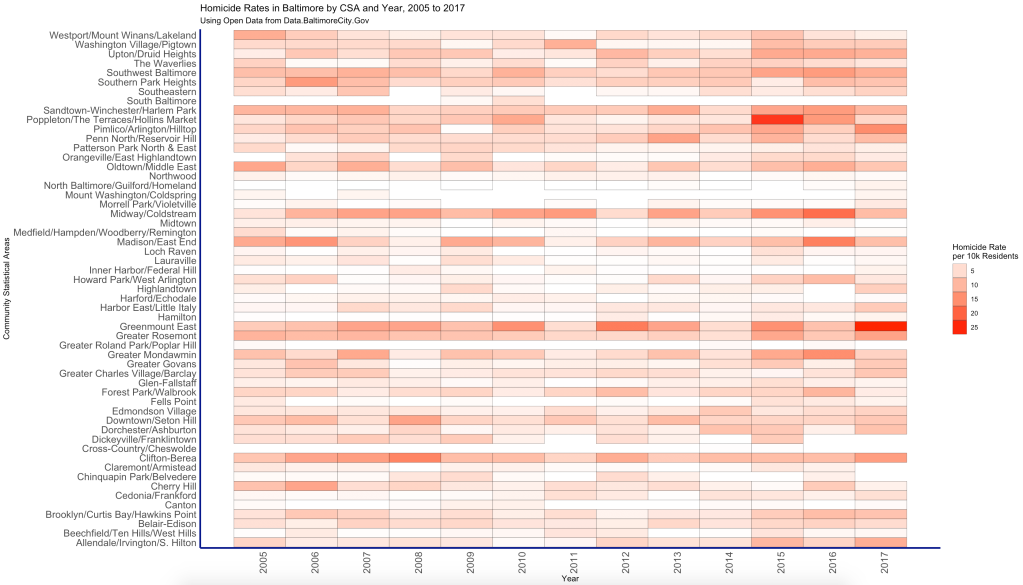
I’ve been dabbling in the R programming language, so I got to do some coding tonight, and I came up with this:
As you can see, we have the CSAs on the left in alphabetical order, and the years are on the bottom. (I flipped the graph because time is better viewed from left to right.) You can see that some CSAs are white throughout, meaning that their homicide rate per 10,000 residents was quite low. Others are red. And others vary as time goes by. For example, Cherry Hill (near the bottom) is darker red in 2005 and then gets lighter as the years go by. On the other hand, Fells Point enjoys several years of no homicides but then has had several since the current epidemic of homicides started in 2015.
Of course, this doesn’t tell the whole story. As I mentioned above, the space-time cube analysis tells the same story. What I’m interested in is the social determinants of health component. So a simple sorting of the CSAs by the percentage of households living under the poverty line does the trick:
Now the story is very clear. The poorer CSAs at the top have the higher homicide rates, and they tend to stay at high levels throughout the years. At the bottom of the diagram, you can see wealthier CSAs having a lot of empty spots where years went by without any homicides. They’re lighter because they had lower homicide rates, too. But do you see some exceptions?
At the bottom, Downtown/Seton Hill stands out as having a higher homicide rate per 10,000 residents compared to its “neighbors” on the poverty scale. Why? Downtown/Seton Hill is close Poppleton/The Terraces/Hollins Market, which is at the top of the diagram in terms of poverty and, in the last four years (2015 to 2018) has had the highest homicide rates in the city. So there is probably some spatial autocorrelation going on here. (Think of spatial autocorrelation as “things that are similar are close together in space and time.”)
At the top, Southeastern stands out as having a lot of white among a sea of red in its poverty neighborhood. Like Downtown/Seton Hill, Southeastern is influenced by nearby Canton and Fells Point, who rather wealthy CSAs that have enjoyed relative peace. Again, spatial autocorrelation is probably at play there as well.
I’m probably going to work on some statistical trend analysis of these data and then overlay them on a map. My goal is to be able to replicate what ArcGIS does with the space-time cubes and emerging hot spot analysis in R programming. (R is free and open source. ArcGIS, while very powerful and highly recommended if you’re going to do spatial analytics, can get expensive if you need to do a lot more than just make pretty maps.)
The things I do at one in the morning…
A big thanks to the folks at the Baltimore Neighborhood Indicators Alliance – Jacob France Institute for their phenomenal data on social indicators around Baltimore (and their geographic data as well).

