One-Way ANOVA Analyses, by Hand and in R

A student asked for help with a statistical analysis the other night, and I was happy to help. However, he threw me a curveball when he told me he needed to conduct an ANOVA test using only summary data. That is, all he had was the table of results (from a publication) and not the data. Doing an ANOVA by hand is not hard at all if you have the data. You just have to follow the steps and fill in the values for all the formulas, like so:
But what if you don’t have all that data? Well, there are other formulas that you can use. Yes, there are statistical packages and even plain-old Excel has gotten good at doing statistics, but where’s the fun if you don’t do it by hand?
So here’s what the student gave me:
| Group | Participants | Average Value | Standard Deviation |
| A | 14 | 23.2 | 7.2 |
| B | 9 | 31.6 | 5.8 |
| C | 12 | 25.5 | 8.1 |
The question here is whether or not these groups have the same mean, or does at least one group have a mean that is statistically significantly different from at least one of the other groups. Now, I could use R to create some dummy data with those average values and standard deviation, and then done the whole thing by hand. Or I could just do it by hand using some formulas:

But, just in case, how about I check my work in R?
The Quick Way
The quick way is using a package called “rpsychi” in R. The package is quite old, but it still works well to check tables in research papers and such to make sure the math was done right. For ANOVA, it does everything I did up there in a fraction of a second. All I had to do was feed it the data:
# Create your data
x.group <- c("A","B","C") # Names of your groups (OPTIONAL)
x.mean <- c(23.2,31.6,25.5) # The means you're given in the summary data
x.sd <- c(7.2,5.8,8.1) # The standard deviations you're given in the summary data
x.n <- c(14,9,12) # The size of each group in your summary data
x <- data.frame(x.group,x.mean,x.sd,x.n)
Then, with the data created, I load the package and run the test:
# Instal rpsychi if needed
if(!require(rpsychi)){install.packages("rpsychi")}
library(rpsychi)
with(x, # Dataframe name
     ind.oneway.second(x.mean, # Mean
                       x.sd, # Standard deviation
                       x.n, # Size of group
                       sig.level = 0.05) # Alpha of the test
)
That gives me the following ANOVA table:
$anova.table
                 SS df      MS     F
Between (A)  394.23  2 197.114 3.789
Within      1664.75 32  52.023
Total       2058.98 34
As you can see, it’s very much the same as what I calculated by hand. So how about confirming that the F value (3.789) is greater than my critical value?
# Now get your critical F value
Fcrit <- qf(.95, # Level of significance
            df1=2, # Numerator degrees of freedom, Between df
            df2=32) # Denominator degrees of freedom, Within df
That gave me a critical F of 3.294537. Since my calculated (3.789) is greater than the critical (3.294537) at the 95% significance level, we reject the Null Hypothesis (all group averages are equal) and go with the Alternative Hypothesis (at least one of the group averages is different from at least one of the other group averages).
The Not-So Quick Way, But More Complete of An Analysis
Alright, like I wrote above, there is a better way to do the analysis by generating some fake data from the values given in the table and then analyzing that. Of course, you need to keep in mind that your data are generated and not the actual data, so your analysis can only go as far as to confirm the ANOVA table you did by hand. There’s no troubleshooting after that without looking at the actual data.
So let’s generate data with the mean and standard deviations mentioned in the table above:
# First, create three groups with specific means and standard deviations

rnorm2 <- function(n,mean,sd) { mean+sd*scale(rnorm(n)) }
a <- rnorm2(14,23.2,7.2)
mean(a)  ## 23.2
sd(a)    ## 7.2

b <- rnorm2(9,31.6,5.8)
mean(b)  ## 31.6
sd(b)    ## 5.8

c <- rnorm2(12,25.5,8.1)
mean(c)  ## 25.5
sd(c)    ## 8.1
Now, let’s make the data frame (table) that we will be analyzing:
# Let's combine them

combined <- c(a,b,c)
length(combined)
mean(combined)

# Let's make the combined data into a dataframe that can be analyzed

max.len = max(length(a), length(b), length(c))
a = c(a, rep(NA, max.len - length(a)))
b = c(b, rep(NA, max.len - length(b)))
c = c(c, rep(NA, max.len - length(c)))

abc <- data.frame(a,b,c)
abc <- na.omit(stack(combo))
And now, let’s look at our summary of the fake data to see if it matches the table above:
# Let's look at some summary statistics of the data
if(!require(dplyr)){install.packages("dplyr")}
library(dplyr)
group_by(abc, ind) %>%
  summarise(
    count = n(),
    mean = mean(values, na.rm = TRUE),
    sd = sd(values, na.rm = TRUE)
  )
Here’s our output:
# A tibble: 3 x 4
  ind   count  mean    sd
  <fct> <int> <dbl> <dbl>
1 a        14  23.2   7.2
2 b         9  31.6   5.8
3 c        12  25.5   8.1
Looks just like the table, right?
Now, let’s visualize the data to see how the means of the groups might be different:
# Box Plots
if(!require(ggpubr)){install.packages("ggpubr")}
library("ggpubr")
ggboxplot(abc, x = "ind", y = "values",
          color = "ind", palette = c("#00AFBB", "#E7B800", "#FC4E07"),
          order = c("a", "b", "c"),
          ylab = "Values", xlab = "Group")

# Mean Plots
ggline(abc, x = "ind", y = "values",
       add = c("mean_se", "jitter"),
       order = c("a", "b", "c"),
       ylab = "Values", xlab = "Group")
Here are the graphs:
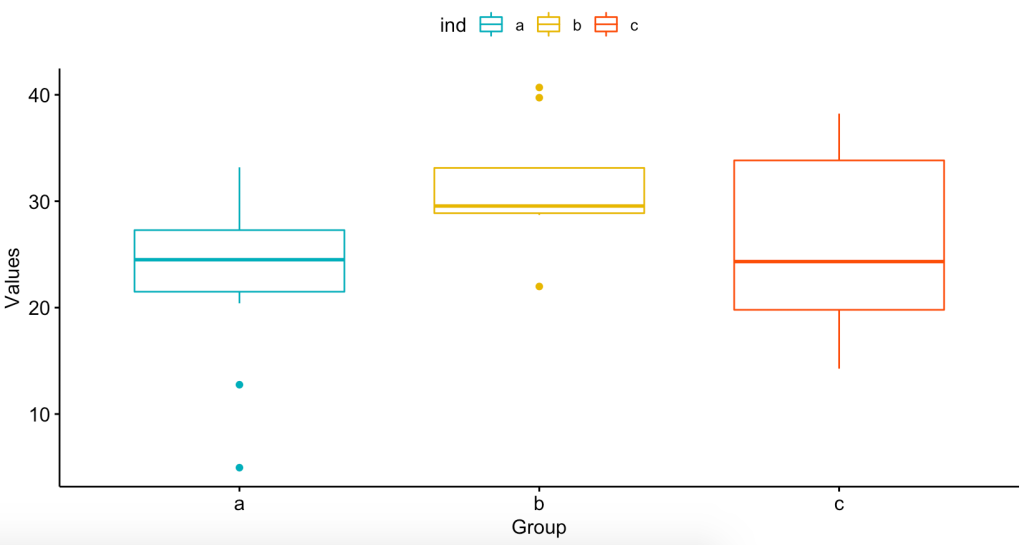
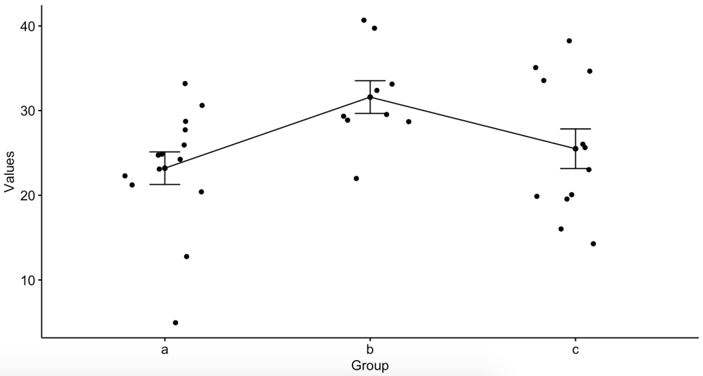
So now that we see that the means might not be the same, let’s do the ANOVA:
# Let's run the ANOVA

a.res <- aov(values ~ ind, data = abc)

# What does the ANOVA tell us?

summary(a.res)
What did the ANOVA tell us?
            Df Sum Sq Mean Sq F value Pr(>F)
ind          2  394.2  197.11   3.789 0.0334 *
Residuals   32 1664.8   52.02
---
Signif. codes:  0 ‘***’ 0.001 ‘**’ 0.01 ‘*’ 0.05 ‘.’ 0.1 ‘ ’ 1
Does it look familiar? Here’s what we got from the summary data analysis using the rpsychi package:
$anova.table
                 SS df      MS     F
Between (A)  394.23  2 197.114 3.789
Within      1664.75 32  52.023
Total       2058.98 34
And here is what I did by hand:

So how did I get the critical value of F at a 95% confidence level?
Fcrit <- qf(.95, # Level of significance
            df1=2, # Numerator degrees of freedom, Between df
            df2=32) # Denominator degrees of freedom, Within df
Fcrit
Done.
Conclusion
So, yeah, it’s easy to plug the numbers into some online calculator and get the results. But do you get the satisfaction of knowing that what is coming out of that black box is the real deal? What if the programmer of that online calculator is messing with you? Even if you use a statistical package, what if something went wrong in the programming of that statistical package?
At the end of the day, all of these complicated biostatistical analyses boil down to some basic math. It may seem like rocket science, but it’s not. It’s also not easy nor intuitive for a normal person… Lord knows I flunked my share of biostatistics exams and quizzes in my day. However, just knowing the basic math and the basic principles of what is being measured and compared allows you to see that you are getting the right result.
One More Thing
We saw from the ANOVA test that at least one of the group means is different from at least one of the others. But we need to check which group is the different one, and some of the assumptions made. First, which group (or groups) is (are) different:
> TukeyHSD(a.res)
  Tukey multiple comparisons of means
    95% family-wise confidence level

Fit: aov(formula = values ~ ind, data = abc)

$ind
    diff         lwr       upr     p adj
b-a  8.4   0.8273304 15.972670 0.0271192
c-a  2.3  -4.6727227  9.272723 0.6992832
c-b -6.1 -13.9157045  1.715704 0.1500429
Looks like groups A and B are different from each other (p-value 0.027). Now, let’s look at our assumptions that the data are homogenous and normally distributed:
# Homogeneity?
plot(a.res, 1)

# Normality
plot(a.res, 2)
This is what I got:


Because of that second graph, we do a Shapiro-Wilk test for normality using the residuals:
# Extract the residuals
a.residuals <- residuals(object = a.res )

# Run Shapiro-Wilk test
shapiro.test(x = a.residuals )
And from the result of W = 0.9715, with a p-value = 0.4857, we fail to reject the null hypothesis that the sample came from a normal distribution. Had this not been the case, we would have done a Kruskal-Wallis non-parametric test… Which is for a whole other discussion.
Big Thanks!
Big thanks to Dr.Eugene O’Loughlin and his series of explainer videos on doing statistics by hand, Dr. Usama Bilal and all his biostats tutoring of me as I struggled through the DrPH biostat series, and Dr. Marie Diener-West at Hopkins for doing such a great job at teaching biostats (i.e. herding cats).

Pingback: Poopooing the P-Value – EpidemioLogical