
Your Obsession with Data
Posted on April 2, 2020 2 Comments
As the pandemic continues, one of the questions that I see asked by people all over the country (and the world) is very much, “Where is my data?” For example, in one county in the US, people are clamoring that data be released at the ZIP code level. They want to know where the “hot spots” of COVID-19 are so that they can… Well, they don’t really say what they will do with that information.
The state where this county is located is already under a general quarantine order. People are to stay home unless they are essential personnel in the pandemic response or they perform some sort of essential work function for the public like preparing food, fixing cars or restocking supplies. Everyone else should stay home. So what would change if the average person — who should be home — knows how many cases there are in this or that ZIP code? What changes if they know that they are in or outside of a hot spot?
Some of the same people calling for those data say that they are “high risk” and want to know if it is safe for them in their geographic area. Again, if the order is to stay inside, then what would it change if they were in a hot spot or not? I couldn’t wrap my head around this until someone explained it to me.
Human beings like to think that they have control over stuff. Stuff just happens at random sometimes. Back in October of 2019, an animal was infected with coronavirus. A few of the viruses it was carrying landed on a human being somehow. A few of those had a genetic mutation that allowed them to enter the human cells and replicate. Then thousands of those burst out from this person’s mouth and nose and infected a second person. Two became four. Four became eight… And here we are today.
There is absolutely nothing that any mortal could have done to prevent that genetic accident. Maybe if stronger measures against “wet markets” were in place in China and other parts of the world the “jump” or “spillover” to humans would have been prevented. Maybe. Or maybe if could have been delayed. Maybe.
Now, as was the case with the millions of constitutional scholars that popped up during the impeachment trial, we have millions of epidemiologists who think that they can somehow control their lives and their environment — or glean some insight in to the epidemic — by knowing how many cases there are in a given geographic area. Or they measure their individual risk by looking at who is getting sick and thinking that they are not “those people.” It’s all about control, none of which we really feel like we have if all we do is stay home and play on the internet all day.
So I get it. You want data and you want to analyze it and interpret it your way without really having much training in it because you feel out of control and you want to have some control. Fortunately for us, and unfortunately for you, you’re not getting more than you need to know to be safe. You’re just going to have to come to terms with that and wash your hands and stay home while those of us with years of experience in handling these things do it for you.
That’s how these things work. Your pipe freezes and breaks, so you call the plumber. You don’t stand over the shoulder of the plumber and ask them to give you the data in their heads while they do their work, do you? Do you?
You do? Then we have nothing to talk about.
You don’t? Good. Let the professionals do their work. Have a little faith once in a while.
Now, if you’ll excuse me, I’m heading back once more into the fray.
The White House Knew
Posted on March 21, 2020 1 Comment
Just a quick note about the current pandemic. The White House knew that these things could happen and how bad they could be. Don’t let others tell you otherwise…
From ABC News, 2016:
In the coming days, Trump, along with his top advisers, will begin much more in-depth daily intelligence briefings, along with regular meetings on major diplomatic and international issues. It’s also expected that the White House and Trump’s national security team will conduct a “black swan exercise” in the coming months to simulate what it would be like to manage a major crisis in real time.
https://abcnews.go.com/Politics/donald-trumps-white-house-transition/story?id=43390484
From Foreign Policy Magazine, 2018:
In January 2017, while one of us was serving as a homeland security advisor to outgoing President Barack Obama, a deadly pandemic was among the scenarios that the outgoing and incoming U.S. Cabinet officials discussed in a daylong exercise that focused on honing interagency coordination and rapid federal response to potential crises. The exercise is an important element of the preparations during transitions between administrations, and it seemed things were off to a good start with a commitment to continuity and a focus on biodefense, preparedness, and the Global Health Security Agenda—an initiative begun by the Obama administration to help build health security capacity in the most critically at-risk countries around the world and to prevent the spread of infectious disease. But that commitment was short-lived.
https://foreignpolicy.com/2018/09/28/the-next-pandemic-will-be-arriving-shortly-global-health-infectious-avian-flu-ebola-zoonotic-diseases-trump/
…
The prevailing laissez-faire attitude toward funding pandemic preparedness within President Donald Trump’s White House is creating new vulnerabilities in the health infrastructure of the United States and leaving the world with critical gaps to contend with when the next global outbreak of infectious disease hits.
The investments made after the 2014 Ebola crisis have been slashed in recent proposed federal budgets from the Centers for Disease Control, the agency that works to stop deadly diseases in their tracks, and the U.S. Agency for International Development, which responds to international disasters, including the Ebola outbreak. Moreover, Timothy Ziemer, the top White House official in charge of pandemic preparedness, has left his job, and the biosecurity office he ran was summarily disbanded.
From Johns Hopkins University Center for Health Security, 2017:
To serve as baseline information for the incoming new Administration and Congress, the scholars at the Center for Health Security wrote a series of commentaries providing facts and assessments of what has been accomplished in key areas of health security and what needs to be done now. They highlighted some ambitious goals that could, if embraced by the new Administration, significantly advance our national ability to save lives, economies, and societies when faced with serious health security threats. Some of these goals have been aspired to for a long time, but there has not been the kind of national commitment to fully achieve them.
http://www.centerforhealthsecurity.org/who-we-are/annual_report/pdfs/2017-CHS-annual-report.pdf
Those are all articles written before 2019. I wanted to find articles from then that should have warned us about today. And here we are. Stay safe.
The Pandemics You Can Try to Stop
Posted on March 18, 2020
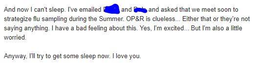
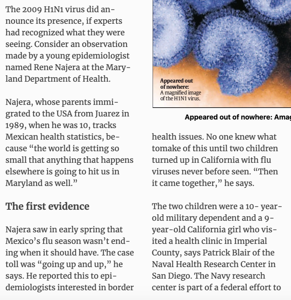
In mid-April 2009, I noticed that the influenza season in Mexico had not ended the way it should. I contacted friends and acquaintances in Mexico City and other parts of the country to ask them what they were seeing. Epidemiologist colleagues told me that they had noticed the same thing. A season that should have been trending down was not doing so, and local hospitals and clinics were being overrun by people with respiratory symptoms.
That night, I emailed my fiancee (now my wife) and told her that I had a bad feeling about what was going on. I told her that it made no sense for Mexico to still be seeing their season being so prolonged. The US season was winding down, though. I remember writing to her that I hoped I was wrong.

After that whole thing was done and over with in 2010 (because it swung around and hit us twice in 2009), I wondered if there was something that we could have done to stop it. By “we,” I mean us in public health. At the time, I was just a freshman epidemiologist with a couple of years of experience. In ten years time, I would be a doctor of public health, and we would be facing another pandemic… The next pandemic.
Can pandemics be stopped? In one word: Yes. But it is very complicated. For example, the HIV/AIDS pandemic could have been stopped if enough resources had been put into place the minute it was identified as a sexually-transmitted infection. HIV was infecting the “undesirables,” though, and enough leaders (religious and political) were calling it a godsend to get rid of said undesirables. It was a punishment from above, not the continuation of a zoonosis that had started decades earlier.
Respiratory infections are a whole other animal, though, especially the ones with relatively (RELATIVELY) low fatality rates. Those with higher rates, like Ebola, kill the hosts before the infection is spread too widely. (Global travel is challenging that, however.) Those that infect you, incubate, and then attack but leave you well enough to have you go to school or work have the ability to really cause disruptions.
I mean, look out the window right now if you’re March 2020.
Bacterial pandemics, like the ones that cholera has caused, are mostly under control by our ability to deploy control measures (clean water and vaccines) and antibiotics. But we’re also entering a sort of “post-antibiotic” era where bacteria are evolving faster than we can make antibiotics against them. So future bacterial pandemics will also require control measures that are not pharmaceutical in nature.
What we can do — and we should do at the end of this pandemic — is have a foolproof, well-researched, practiced yearly, top-of-the-line pandemic preparedness plan that spans the entire spectrum of everything we know has happened and could happen. From what a person will do in their everyday life to what small businesses will do when left with no workers and no employees, to what big groups and organizations will do to keep the disease from spreading. We can’t go blind into the next one — like we did into this one — because the next one could be the big one.
Then there are the epidemics and pandemics of non-communicable diseases, like obesity, diabetes and opioid use/abuse. Those are going to be super-difficult to figure out, perhaps more difficult than infectious disease. This is because we are social animals who’ve managed to separate into tribes and social strata. If something is happening to “them” and not “us,” and it will stay “over there” and not come “here,” we kind of look the other way.
Here’s an example… In Philadelphia, like in other cities in the United States, there is an epidemic of opioid use and opioid overdoses going on. Many of the people using and abusing opioids are using heroin, an injected opioid. (You can also smoke it, by the way.) When people inject heroin and other drugs, their risk for blood borne infections skyrockets. They share needles or trade drugs for sex (that is performed unsafely), and they get infections with Hepatitis B, Hepatitis C and HIV.
Look at what is happening in Minnesota.
Look at what happened in Indiana, that bastion of public health.
No doubt, Philadelphia is lining up to be the next epicenter of both overdose and blood born infections… If it isn’t already. To counter this, city health officials and health leaders have proposed a safe injection site. In a safe injection site, the user goes in, gets a clean needle and a place to rest. They get medical supervision while they use their drug of choice. Should something go sideways, they get immediate medical attention.
But drug addiction — against all evidence — is thought by many to be something that happens to “them,” the “others,” the undesirables. It doesn’t happen to “us,” the clean people, the God-fearing people. And if something is to be done for “those poor people,” it better not be done in our back yard, or my neighborhood, or anywhere that could possibly make me think that help is happening at all.
On Monday, March 16, 2020, supporters and detractors of a safe injection site in Philadelphia came together to give their opinion on a bill that would ban such help for “those people.” As you can imagine, the discussion was lively, including some gems like:
“Why would we want to be the first to experiment on this?… “It makes no sense whatsoever. I’m full of compassion for [people suffering from drug addiction], but I’m more full of compassion for my residents and all the residents symbolized by these civic associations.”
There are no safe injection sites in the United States, but there are plenty in other parts of the world. Those other sites have shown success in reducing overdoses and in guiding users into recovery programs. On top of receiving clean needles and medical supervision, they also are referred to care, and many of them take it. Some place in the United States, a place where these programs are needed, is going to be the first place, the “experiment.”
But the comments did not stop there.
Capozzi’s sentiment was echoed in the testimony of South Philly resident Anthony Giordano, who represented a community group called Stand Up South Philly and Take Our Streets Back.
“Safe injection sites are not safe,” he said. “Allowing people to consume illegal drugs of unknown composition in a so-called medical facility is beyond my comprehension. How is this safe? Helping people further harm themselves under the guise of a legitimate medical intervention just doesn’t make any sense.”
Some people tried to use science and reason:
“It amazes me that we’re sitting here talking about making a medical decision and we’re listening to public opinion,” she said. “We need to make this based on information like Dr. Farley suggested: medical consensus, meta-analyses and a medical opinion.”
Milas was unique among the four medical professionals because the opioid crisis had affected her a bit more personally. She had two sons die of opioid overdoses – one was 27 and other 31, she said.
“At the 100 legal supervised injection sites worldwide, there are no recorded deaths,” she testified. “Had my sons overdosed at a Safehouse-type facility, they would have had a 100 percent chance of survival.”
Roth piled on.
“The scientific evidence from peer-reviewed journals on these sites is clear,” she testified. “They reduce overdose mortality rates, HIV, environmental hepatitis risk, they improve access to health and social services, they help reduce substance use and help people enroll in treatment. Furthermore, they’ve helped improve community health and safety. In neighborhoods where a [safe injection site] exists, there are actually reductions in public injection and improperly discarded syringes, reductions in drug-related crime, and the demand for ambulance services for opioid-related overdoses goes down.”
You can read the rest of the South Philly Review article to see how one of the legislators used a very flawed non-scientific “study” to support his claims that safe injection sites are absolute evil. That’s where scientific discourse in public policy has gone… To unsubstantiated and flawed opinion surveys.
As I’ve stated before, several times, public health in the United States and in much of the world is all about politics. You better pray that the right political party is in power, or the right people are in power, so that the decisions that need to be made are informed by evidence and science more than the “what ifs” of public opinion. This is Democracy getting in the way of things, unfortunately.
As we saw in Wuhan, China, when authorities there felt the need to shut down cities, they did so without any apparent issues. (There might have been issues, but we’ll be darned if we ever find out.) That’s an authoritarian government for you in a very collectivist society. Can you imagine trying to shut down even a small town here in the United States? With people with guns? And SUVs?
Good luck.
So, yeah, we might not be able to stop this pandemic, or the next one. After all this, I’m going to focus on having what I call “premier” surveillance systems and response plans. We’re going to learn a lot from this pandemic, and I plan to make it my life’s work (on top of all of my other work) to make sure we don’t forget about this time, next time.
Until next time… Thanks for your time.
The Panic People Will Have
Posted on March 9, 2020 3 Comments

There are some words that really get people all riled up. “Pandemic” is one of them. While the technical definition of pandemic is a worldwide epidemic, regardless of severity, a lot of people associate the word with some sort of unmitigated disaster.
I don’t blame people for thinking that way. After all, most of us are told the story of the 1918 Spanish Influenza pandemic that killed millions around the world. We also hear of other pandemics that have done a number on the human populations, like the Black Death (Yersinia pestis) and the still ongoing pandemic of HIV/AIDS.
There was even some doctor teaching out in California who once got all snippy with me because he said that we (epidemiologists) should not be using the term “pandemic” when not a lot of people die. (And then said that I was salty for not being a doctor — in 2009 — and not having any kind of authority to correct him.) He wanted some other term to be used, but he fell short of actually suggesting something that mean “a worldwide epidemic.”
This latest pandemic of coronavirus is different from the last one (2009 H1N1 influenza) because social media has become such an enormous source of information — and misinformation — for so many people. Too many people are getting their news from other people who have zero knowledge of journalism, let alone science. So you end up with people doing some very “interesting” things.
First, they came for the water. I went to the store a couple of weeks ago, and they were already out of bottled water. One of the employees said that a lot of people had shown up early to buy up every case and container of drinking water they could find. Interestingly, and perhaps showing people’s lack of science knowledge, they left the distilled water behind. Distilled water is purified water and perfectly safe to drink. For some reason, according to the employee, people were not buying it because they thought they could not drink it.
Weird, right?
Then they came for the toilet paper. I keep seeing news articles and videos of people fighting each other to buy up extra toilet paper. This one really puzzles me. I mean, it’s a joke that people will buy bread, milk and toilet paper before a big snowstorm, but they are doing this at this time because… Because they’re going to be pooping a lot at home if they have to stay home for a couple of weeks?
People are at such a panic that the stock market is taking a hit. Because so many coronavirus cases have been on cruise ships and in people traveling abroad, the touring industry is taking a hit. Because all those ships and all those planes are not using as much fuel, the oil industry is taking a hit. And because people won’t gather at large events, the sports and entertainment industries are taking a hit.
All of this almost makes me want to take a hit.
Humans are animals. Not only that, they’re also animals who run in packs. If one starts running in one direction, the chances are that others will start going in the same direction. Before you know it, you’re facing a stampede. Only a few will stand aside and watch the show, sometimes to their own detriment. And even fewer will run in the other direction — towards danger — to see if there is something they can do to help stop what is making people afraid.
As people are running to buy toilet paper and hand sanitizer, others are running with them. As they run away from ships and planes where the disease is being spread, others are running with them. And as they run to the warm embrace of social media, others are running with them.
Me? I’m running in the other direction. Not only is it something I’ve always seem to do, it is also my job.
You can thank my mom for that.
Local Indicators of Spatial Association in Homicides in Baltimore, 2019
Posted on March 3, 2020 2 Comments
Last year was yet another record year for homicides in Baltimore with 348 reported homicides for the year. While this number was the second-highest in terms of total homicides, it was probably the highest in terms of rate per 100,000 residents since Baltimore has been seeing a decrease in population. (The previous record was in 2015 and 2017.) The epidemic of violence and homicides that began in 2015 continues today.
When we epidemiologists analyze data, we need to be mindful of the spatial associations we see. The first law of geography states that “everything is related to everything else, but near things are more related than distant things.” As a result, clusters of cases of a disease or condition — or an outcome such as homicides — may be more a factor of similar things happening in close proximity to each other than an actual cluster.
To study this phenomenon and account for it in our analyses, we use different techniques to assess spatial autocorrelation and spatial dependence. In this blog post, I will guide you through doing a LISA (Local Indicators of Spatial Association) analysis of homicides in Baltimore City in 2019 using R programming.
First, The Data
Data on homicides was extracted from the Baltimore City Open Data portal. Under the “Public Safety” category, we find a data set titled “BPD Part 1 Victim Based Crime Data.” In those data, I filtered the observations to be only homicides and only those occurring/reported in 2019. This yielded 348 records, corresponding to the number reported for the year.
Data on Community Statistical Areas (agglomerations of neighborhoods based on similar neighborhood characteristics came from the Baltimore Neighborhood Indicators Alliance (BNIA). They are a very good source of data on Baltimore with regards to social and demographic indicators. From their open data portal, I extracted the shapefile of CSAs in the city.
Next, The R Code
First, I load the libraries that I’m going to use for this project. (I’ve tried to annotate the code as much as possible.)
library(tidyverse)
library(rgdal)
library(ggmap)
library(spatialEco)
library(tmap)
library(tigris)
library(spdep)
library(classInt)
library(gstat)
library(maptools)
Next, I load the data.
csas <-
  readOGR("2017_csas",
          "Vital_Signs_17_Census_Demographics") # Baltimore Community Statistical Areas
jail <-
  readOGR("Community_Statistical_Area",
          "community_statistical_area") # For the central jail
pro <-
  sp::CRS("+proj=longlat +datum=WGS84 +unit=us-ft") # Projection
csas <-
  sp::spTransform(csas,
                  pro) # Setting the projection for the CSAs shapefile
homicides <- read.csv("baltimore_homicides.csv",
                      stringsAsFactors = F) # Homicides in Baltimore
homicides <-
  as.data.frame(lapply(homicides, function(x)
    x[!is.na(homicides$Latitude)])) # Remove crimes without spatial data (i.e. addresses)
Note that I had to do some wrangling here. First, there is an area on the Baltimore Map that corresponds to a large jail complex in the center of the city. So I added a second map layer called jail to the data. I also corrected the projection on the layers. (This helps make sure that the points and polygons line up correctly since you’re overlaying a flat piece of data on a spherical part of the planet.) Finally, I took out homicides for which there was no spatial data. This sometimes happens when the true location of a homicide cannot be determined… Or when there is a lag/gap in data entry.
Next, I’m going to convert the homicides data frame into a spatial points file.
coordinates(homicides) <-
  ~ Longitude + Latitude # Makes the homicides CSV file into a spatial points file
proj4string(homicides) <-
  CRS("+proj=longlat +datum=WGS84 +unit=us-ft") # Give the right projection to the homicides spatial points
Note that I am telling R which variables in homicides corresponds to the longitude and latitude variables. Next, as I did before, I corrected the projection to match that of the CSAs layer.
Now, let’s join the points (homicides) to the polygons (csas).
homicides_csas <- point.in.poly(homicides,
                                csas) # Gives each homicide the attributes of the CSA it happened in
homicide.counts <-
  as.data.frame(homicides_csas) # Creates the table to see how many homicides in each CSA
counts <-
  homicide.counts %>%
  group_by(CSA2010, tpop10) %>%
  summarise(homicides = n()) # Determines the number of homicides in each CSA.
counts$tpop10 <-
  as.numeric(levels(counts$tpop10))[counts$tpop10] # Fixes tpop10 not being numeric
counts$rate <-
  (counts$homicides / counts$tpop10) * 100000 # Calculates the homicide rate per 100,000
map.counts <- geo_join(csas,
                       counts,
                       "CSA2010",
                       "CSA2010",
                       how = "left") # Joins the counts to the CSA shapefile
map.counts$homicides[is.na(map.counts$homicides)] <-
  0 # Turns all the NA's homicides into zeroes
map.counts$rate[is.na(map.counts$rate)] <-
  0 # Turns all the NA's rates into zeroes
jail <-
  jail[jail$NEIG55ID == 93, ] # Subsets only the jail from the CSA shapefile
Here, I also created a table to see how many points fell inside the polygons. I allowed me to look at how many homicides were in each of the CSAs. Here are the top five:
| Community Statistical Area | Homicide Count |
| Southwest Baltimore | 29 |
| Sandtown-Winchester/Harlem Park | 25 |
| Greater Rosemont | 21 |
| Clifton-Berea | 16 |
| Greenmount East | 15 |
Of course, case counts alone are not giving us the whole information. We need to account for the differences in population numbers. For that, you’ll see that I created a rate variable. Here are the top five CSAs by homicide rate per 100,000 residents:
| Community Statistical Area | Homicide Rate per 100,000 Residents |
| Greenmount East | 191 |
| Sandtown-Winchester/Harlem Park | 189 |
| Clifton-Berea | 176 |
| Southwest Baltimore | 172 |
| Madison/East End | 167 |
As you can see, the ranking based on homicide rates is different, but it is more informative. It accounts for the fact that you may see more homicides in a CSA simply because that CSA has more people in it. Now we have the rates. I then joined the counts and rates to the csas shapefile. This is what we’ll use to map. I also made sure that all the NA’s in the rates and counts are zeroes. Finally, I used only the CSA labeled “93” for the jail. This, again, is to make sure that the map represents that area and we know that it is not a place where people live.
The Maps
Look at the following simple plot of homicide locations in Baltimore:
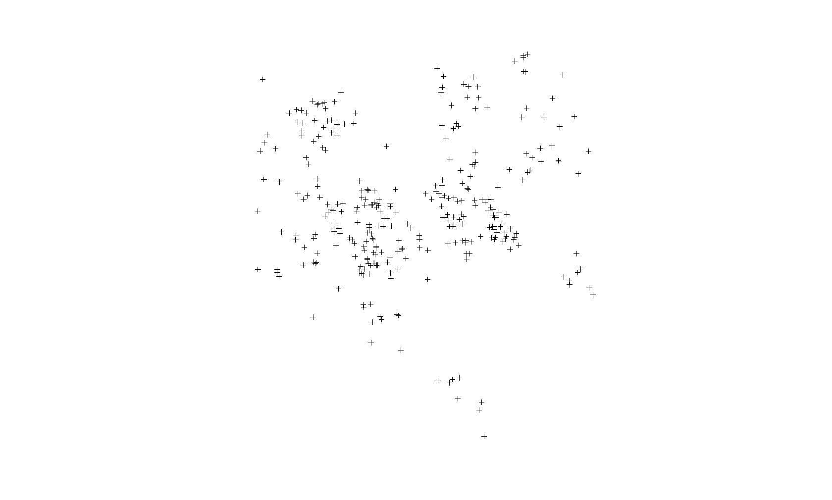
This is not a map. This is just a plot of the homicide locations. The latitude is on the Y axis and the longitude on the X axis. If you notice that there is some clustering of cases, you would be correct. Point-based cluster analysis can also be done on these data alone, but that is for a different blog post at a later time. (And you have to take other things into consideration.)
Next, I’m going to create a map of the points above (using the tmap package) but also show the boundaries of the CSAs. This will look more like a map and show you the spatial distribution of the homicide cases in context. You’ll see why there are blank spaces in some parts.
Here is the code:
tmap_mode("plot") # Set tmap to plot. To make interactive, use "view"

homicide.dots.map <-
  tm_shape(map.counts) +
  tm_borders(col = "black",
             lwd = 0.5) +
  tm_text("OBJECTID",
          size = 1) +
  tm_shape(homicides) +
  tm_dots(col = "red",
          title = "2019 Homicides",
          size = 0.2, ) +
  tm_compass() +
  tm_layout(
    main.title = "Map of Homicides and Homicide Rate in Baltimore City, 2019",
    main.title.size = 0.8,
    legend.position = c("left", "bottom"),
    compass.type = "4star",
    legend.text.size = 1,
    legend.title.size = 1,
    legend.outside = T
  ) +
  tm_scale_bar(
    text.size = 0.5,
    color.dark = "black",
    color.light = "yellow",
    lwd = 1
  ) +
  tm_add_legend(
    type = "symbol",
    col = "red",
    shape = 21,
    title = "Homicide",
    size = 0.5
  ) +
  tmap_options(unit = "mi") +
  tm_add_legend(
    type = "text",
    col = "black",
    title = "CSA ID#",
    text = "00"
  )
homicide.dots.map
And here is the map:
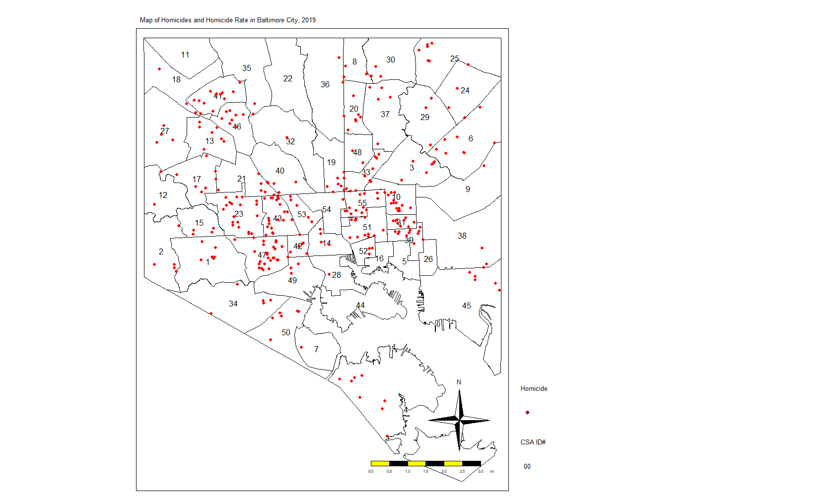
Again, we see the clustering of homicides in some areas. Let’s look at homicide rates. First, the code:
homicide.rate.map <-
tm_shape(map.counts) +
tm_fill(
"rate",
title = "Homicide Rate per 100,000",
style = "fisher",
palette = "OrRd",
colorNA = "white",
textNA = "No Homicides"
) +
tm_borders(col = "black",
lwd = 0.5) +
tm_text("OBJECTID",
size = 1) +
tm_shape(homicides) +
tm_dots(col = "red",
title = "2019 Homicides") +
tm_shape(jail) +
tm_fill(col = "#d0e2ec",
title = "Jail") +
tm_compass() +
tm_layout(
main.title = "Map of Homicides and Homicide Rate in Baltimore City, 2019",
main.title.size = 0.8,
legend.position = c("left", "bottom"),
compass.type = "4star",
legend.text.size = 1,
legend.title.size = 1,
bg.color = "#d0e2ec",
legend.outside = T
) +
tm_scale_bar(
text.size = 0.5,
color.dark = "black",
color.light = "yellow",
lwd = 1
) +
tm_add_legend(
type = "symbol",
col = "red",
shape = 21,
title = "Homicide",
size = 0.5
) +
tm_add_legend(
type = "text",
col = "black",
title = "CSA ID#",
text = "00"
) +
tmap_options(unit = "mi")
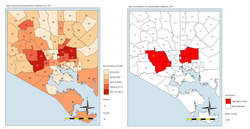
homicide.rate.mapIt stands to reason that the CSAs with the most points would also have the highest rates, so here is the map:

From here, we see that the CSAs with the highest rates are close together. We also see that those with the lowest rates are close together. And others are somewhere in between. If there was no spatial autocorrelation, we would expect these CSAs with high or low rates to be equally distributed all over the map. If there was perfect autocorrelations, all highs would be on one side and all lows would be on the other. What we have here is something in the middle, as is the case in most real-life examples.
LISA Analysis
In the next few lines of code, I’m going to do several things. First, I’m going to create a list of the neighbors to each CSA. One CSA, #4 at the far southern tip of the city, does not touch other CSAs. It looks like an island. So I’m going to manually add its neighbors to the list.
Next, I’m going to create a list of neighbors and weights. By weights, I mean that each neighbor will “weigh” the same. If a CSA has one neighbor, then the weight of that neighbor is 1. If they have four, each neighbor — to that CSA — weighs 0.25.
Next, I’m going to calculate the Local Moran’s I value. For a full discussion of Moran’s I, I recommend you visit this page: http://ceadserv1.nku.edu/longa//geomed/ppa/doc/LocalI/LocalI.htm
There are a lot of nuances to that value. But, basically, that value tells us how different from no spatial autocorrelation each CSAs is. Once you see it on the map, you’ll understand better.
Here’s the code:
map_nbq <-
  poly2nb(map.counts) # Creates list of neighbors to each CSA
added <-
  as.integer(c(7, 50)) # Adds neighbors 7 and 50 to CSA 4 (it looks like an island)
map_nbq[[4]] <- added # Fixes the region (4) without neighbors
View(map_nbq) # View to make sure CSA 4 has neighbors 7 and 50.

map_nbq_w <-
  nb2listw(map_nbq) # Creates list of neighbors and weights. Weight = 1/number of neighbors.
View(map_nbq_w) # View the list

local.moran <-
  localmoran(map.counts$rate, # Which variable you'll use for the autocorrelation
             map_nbq_w, # The list of weighted neighbors
             zero.policy = T) # Calculate local Moran's I
local.moran <- as.data.frame(local.moran)
summary(local.moran) # Look at the summary of Moran's I

map.counts$srate <-
  scale(map.counts$rate) # save to a new column the standardized rate

map.counts$lag_srate <- lag.listw(map_nbq_w,
                                  map.counts$srate) # Spatially lagged standardized rate in new column

summary(map.counts$srate) # Summary of the srate variable
summary(map.counts$lag_srate) # Summary of the lag_srate variable
Now, we’ll take a look at the Moran’s I plot created with this code:
x <- map.counts$srate %>% as.vector()
y <- map.counts$lag_srate %>% as.vector()
xx <- data.frame(x, y) # Matrix of the variables we just created

moran.plot(x, map_nbq_w) # One way to make a Moran Plot
And here is the plot:
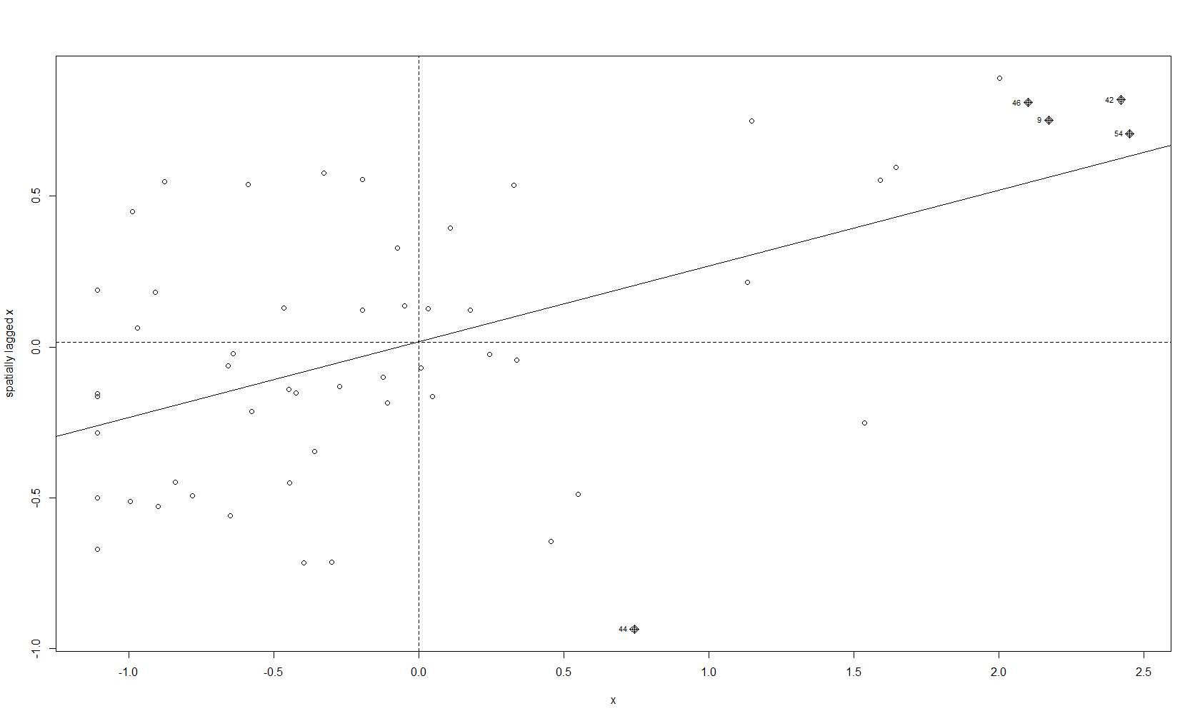
This plot tells us which CSAs are in the High-High (right upper quadrant), High-Low (right lower quadrant), Low-Low (left lower quadrant) and Low-High (left upper quadrant) designations for Moran’s I values. The High-High CSAs mean that their value was high and the values of the CSAs (their neighbors) were high also. That is expected since everything is like everything else close to it, right?
The Low-Low CSAs are the same. The ones that are outlier in this regard are the High-Low and Low-High, because these are CSAs that are high values (by values, we are looking at a calculation derived from standardized homicide rates) in a sea of low values, or low values in a sea of high values. The plot above has highlighted the ones that are not spatial outliers and have a significant p-value. (More on the p-value later.)
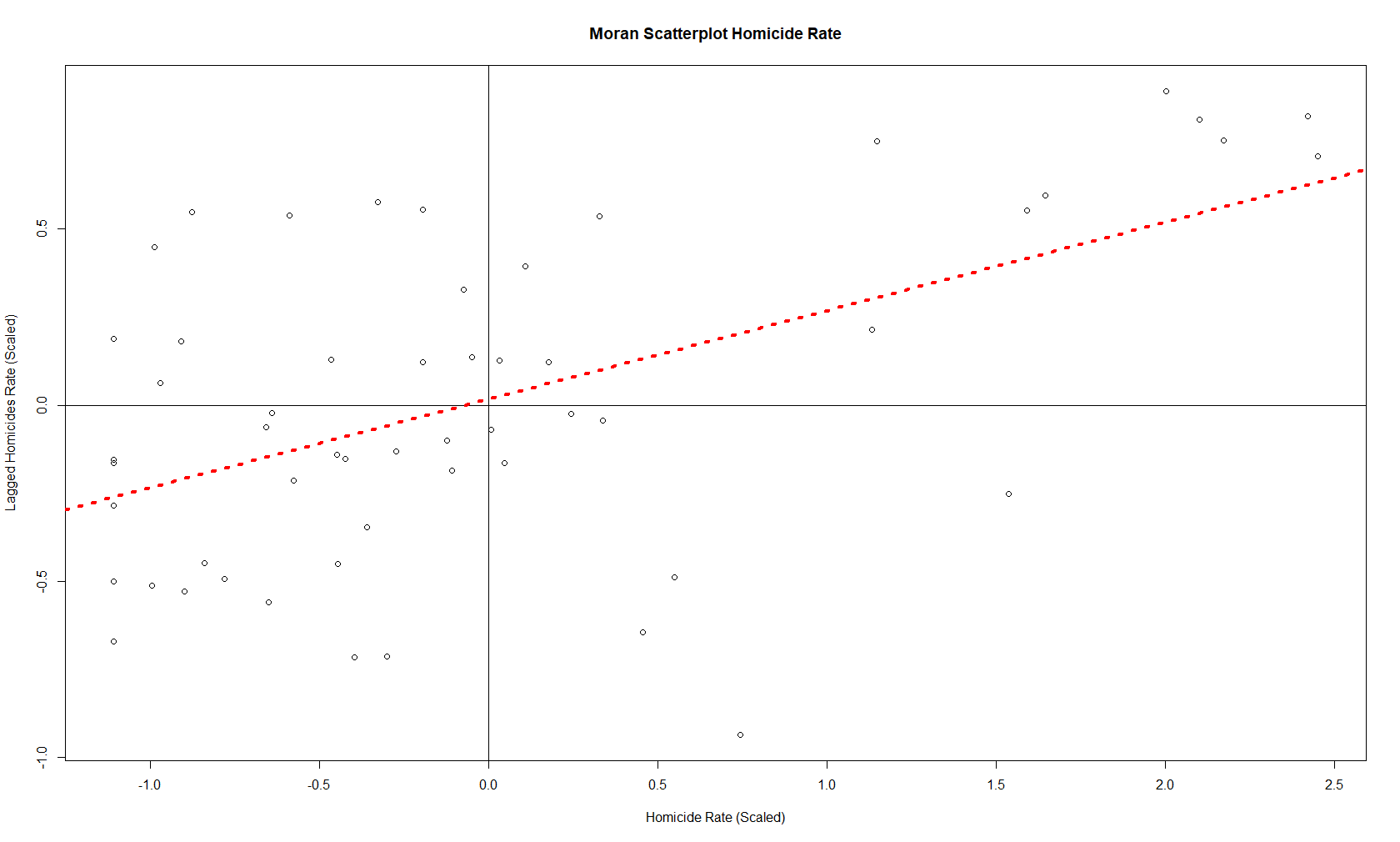
There is another way to make the same plot, if you’re so inclined:
plot(
  x = map.counts$srate,
  y = map.counts$lag_srate,
  main = "Moran Scatterplot Homicide Rate",
  xlab = "Homicide Rate (Scaled)",
  ylab = "Lagged Homicides Rate (Scaled)"
) # Another way to make a Moran Plot
abline(h = 0,
       v = 0) # Adds the crosshairs at (0,0)
abline(
  lm(map.counts$lag_srate ~ map.counts$srate),
  lty = 3,
  lwd = 4,
  col = "red"
) # Adds a red dotted line to show the line of best fit
And this is the resulting plot from that:
So those are the plots of the Moran’s I value. What about a map of these values? For that, we need to prepare our CSAs with the appropriate quadrant designations.
map.counts$quad <-
  NA # Create variable for where the pair falls on the quadrants of the Moran plot
map.counts@data[(map.counts$srate >= 0 &
                   map.counts$lag_srate >= 0), "quad"] <-
  "High-High" # High-High
map.counts@data[(map.counts$srate <= 0 &
                   map.counts$lag_srate <= 0), "quad"] <-
  "Low-Low" # Low-Low
map.counts@data[(map.counts$srate >= 0 &
                   map.counts$lag_srate <= 0), "quad"] <-
  "High-Low" # High-Low
map.counts@data[(map.counts$srate <= 0 &
                   map.counts$lag_srate >= 0), "quad"] <-
  "Low-High" # Low-High
This gives us this map:
Here is the code for that map:
local.moran$OBJECTID <- 0 # Creating a new variable
local.moran$OBJECTID <- 1:nrow(local.moran) # Adding an object ID
local.moran$pvalue <-
round(local.moran$`Pr(z > 0)`, 3) # Rounding the p value to three decimal places
map.counts <- geo_join(map.counts,
local.moran,
"OBJECTID",
"OBJECTID")
colors <-
c("red", "blue", "lightpink", "skyblue2", "white") # Color Palette
local.moran.map <-
tm_shape(map.counts) +
tm_fill("quad",
title = "Local Moran's I",
palette = colors,
colorNA = "white") +
tm_borders(col = "black",
lwd = 0.5) +
tm_text("pvalue",
size = 0.5) +
tm_shape(jail) +
tm_fill(col = "gray",
title = "Jail") +
tm_compass() +
tm_layout(
main.title = "Map of Local Moran's I for Homicide Rates in Baltimore, 2019",
main.title.size = 0.8,
legend.position = c("left", "bottom"),
compass.type = "4star",
legend.text.size = 1,
legend.title.size = 1,
legend.outside = T,
bg.color = "#d0e2ec"
) +
tm_scale_bar(
text.size = 0.5,
color.dark = "black",
color.light = "yellow",
lwd = 1
) +
tm_add_legend(
type = "text",
col = "black",
title = "Moran's I p-value",
text = "0.000"
) +
tmap_options(unit = "mi")
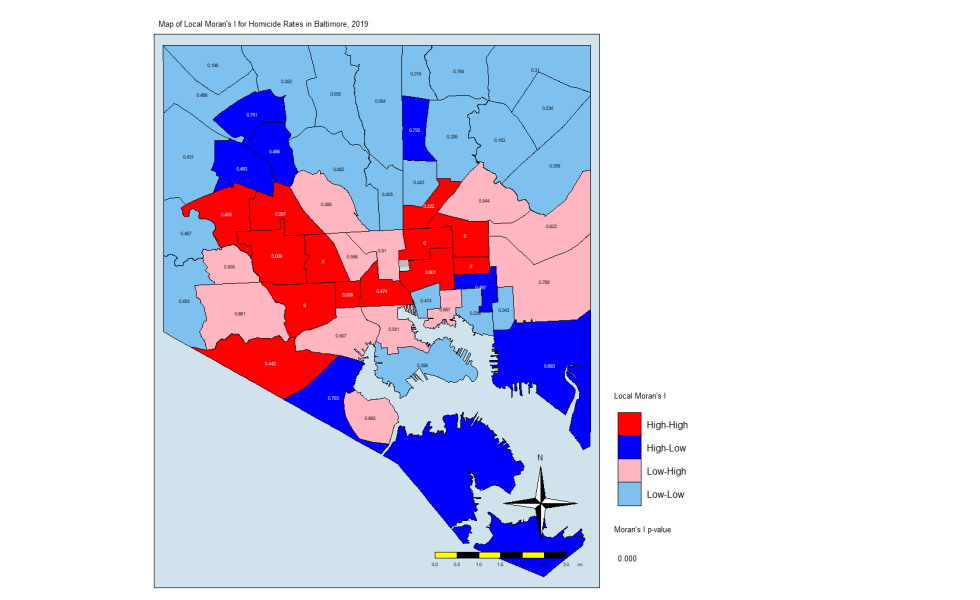
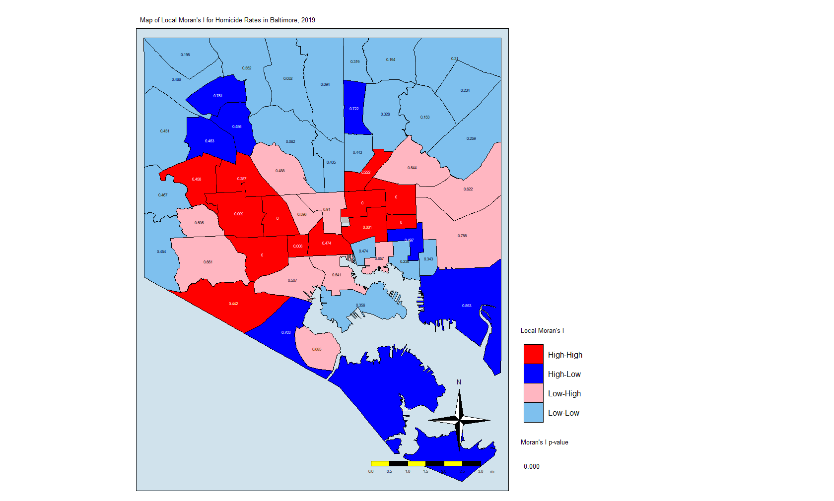
local.moran.mapThe CSAs in red are those that have high Moran’s I values and are surrounded by other CSAs with high values. The light blues are where there are low values and are are surrounded by lows. The dark blue are CSAs with high values but with low neighbors, and the light pink are CSAs with low values but high neighbors. The numbers inside each CSA is the p-value.
The Thing About Significance
If you’ve done your coursework on biostatistics, you’ll see that there is a lot of attention paid to p-values that are less than 0.05. In this case, only a few CSAs have such low p-values. But that may not be enough. In this explainer on spatial association, the author states the following:
An important methodological issue associated with the local spatial autocorrelation statistics is the selection of the p-value cut-off to properly reflect the desired Type I error. Not only are the pseudo p-values not analytical, since they are the result of a computational permutation process, but they also suffer from the problem of multiple comparisons (for a detailed discussion, see de Castro and Singer 2006). The bottom line is that a traditional choice of 0.05 is likely to lead to many false positives, i.e., rejections of the null when in fact it holds.
Source: https://geodacenter.github.io/workbook/6a_local_auto/lab6a.html
For this exercise, we are going to keep the p-value significance at 0.05 and create a map that uses the resulting CSAs. The code:
map.counts$quad_sig <-
  NA # Creates a variable for where the significant pairs fall on the Moran plot
map.counts@data[(map.counts$srate >= 0 &
                   map.counts$lag_srate >= 0) &
                  (local.moran[, 5] <= 0.05), "quad_sig"] <-
  "High-High, p <0.05" # High-High
map.counts@data[(map.counts$srate <= 0 &
                   map.counts$lag_srate <= 0) &
                  (local.moran[, 5] <= 0.05), "quad_sig"] <-
  "Low-Low, p <0.05" # Low-Low
map.counts@data[(map.counts$srate >= 0 &
                   map.counts$lag_srate <= 0) &
                  (local.moran[, 5] <= 0.05), "quad_sig"] <-
  "High-Low, p <0.05" # High-Low
map.counts@data[(map.counts$srate <= 0 &
                   map.counts$lag_srate >= 0) &
                  (local.moran[, 5] <= 0.05), "quad_sig"] <-
  "Low-High, p <0.05" # Low-High
map.counts@data[(map.counts$srate <= 0 &
                   map.counts$lag_srate >= 0) &
                  (local.moran[, 5] <= 0.05), "quad_sig"] <-
  "Not Significant. p>0.05" # Non-significant
Note that I am using the p-value in the local.moran calculation (position #5) in addition to where on the moran plot the CSAs fall. This really eliminates the non-significant (at p = 0.05) CSAs and leaves us with only eight CSAs. Here is the code for the map:
local.moran.map.sig <-
  tm_shape(map.counts) +
  tm_fill(
    "quad_sig",
    title = "Local Moran's I",
    palette = colors,
    colorNA = "white",
    textNA = "Not Significant"
  ) +
  tm_borders(col = "black",
             lwd = 0.5) +
  tm_text("pvalue",
          size = 0.5) +
  tm_shape(jail) +
  tm_fill(col = "gray",
          title = "Jail") +
  tm_compass() +
  tm_layout(
    main.title = "Map of Local Moran's I for Homicide Rates in Baltimore, 2019",
    main.title.size = 0.8,
    legend.position = c("left", "bottom"),
    compass.type = "4star",
    legend.text.size = 1,
    legend.title.size = 1,
    legend.outside = T,
    bg.color = "#d0e2ec"
  ) +
  tm_scale_bar(
    text.size = 0.5,
    color.dark = "black",
    color.light = "yellow",
    lwd = 1
  ) +
  tm_add_legend(
    type = "text",
    col = "black",
    title = "Moran's I p-value",
    text = "0.000"
  ) +
  tmap_options(unit = "mi")
local.moran.map.sig
And here is the map itself:
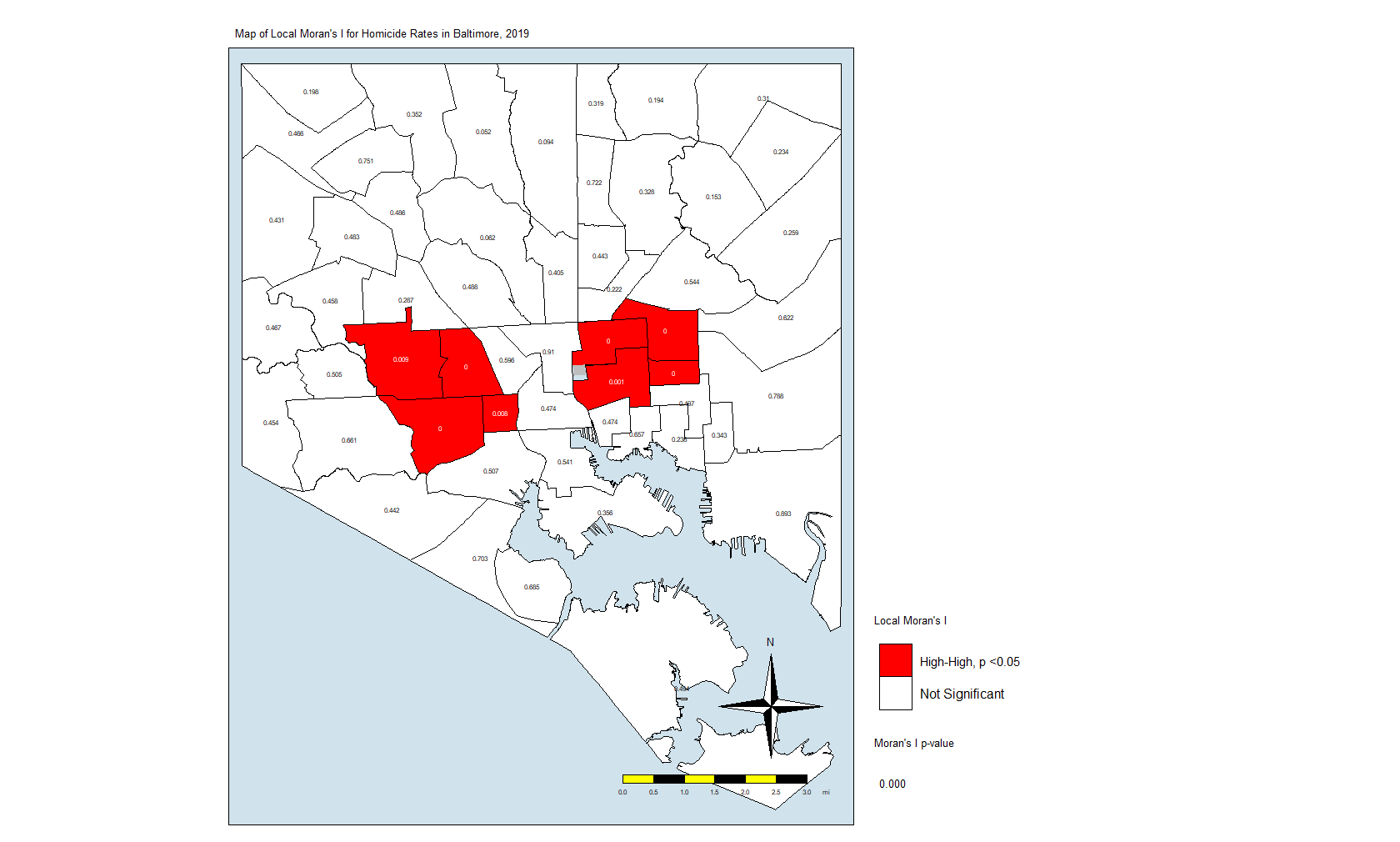
What this is telling us is that only those eight CSAs had a statistically significant Moran’s I value, and they were all in the “High-High” classification. This means that they have high standardized values (which are themselves derived from homicide rates) and are surrounded by CSAs with high values. There were no significant CSAs from the other quadrants on the Moran plot. (Remember that significance here comes with a big caveat.)
In Closing
What does this all mean? It means that the “butterfly pattern” seen in so many maps of social and health indicators in Baltimore still holds. The two regions in red in that last map make up the butterfly’s wings. Those CSAs are also the ones with the highest homicide rates.
You could say that it is in those eight CSAs where homicides are the most concentrated. These are known as spatial clusters. If we had significant “Low-High” or “High-Low” CSAs, they would be known as spatial outliers. Significant “Low-Low” CSAs would also be spatial clusters.
As I mentioned above, we can also do other analyses, some of them looking at the individual locations of the homicides, the dots in the first plot and the first map. You could generate statistics that tell us whether those dots are closer together to each other than what you would normally see if they were just tossed on the map randomly.
A full geostatistical analysis includes these analyses, and you can see an example of the whole thing if you look at my dissertation. You may want to include the Local Moran’s I value or some other term (I used average number of homicides in neighbors) in a regression analysis. Or you could use composite index to account for different factors.
The Big One?
Posted on March 2, 2020
In February 2009, I started to notice that the influenza season in Mexico was not ending like it usually did. I noticed that the number of people sick with influenza-like illness was continued to climb when it should have been going down. What ended up happening was the 2009 H1N1 influenza pandemic… My first pandemic as an epidemiologist and my second one as a human being.
I’m not that young anymore.
Those were some interesting times, for sure. We were working long hours at the health department, trying to come up with the best information to give to the policymakers. That was nothing compared to the healthcare providers and the laboratory staff who had to take care and test thousands and thousands of patients. And, of course, it doesn’t compare to the people who lost a loved one.
Still, the 2009 influenza pandemic was not as bad as it could have been. As it turned out, the H1N1 influenza virus was very virulent but not very pathogenic. While it went around the world in a matter of hours, it did not end up killing as many people as it could. It was no 1918.
So here I am in my third pandemic. This one — like the last one — is being billed as the “Big One” by people who don’t seem to remember history very well. In 2003, SARS seemed like the big one. In 2009, we know what happened then. In 2012, MERS seemed like the big one. Every time someone catches one of the many avian influenza viruses, they call it THE BIG ONE. But we keep on going.
No, I’m not minimizing the thousands of people who have died or are going to die from this novel coronavirus. I’m also not minimizing the disruptions it will cause. What I am saying is that we as a species will continue to move forward. Very few things can kill all 7.8 billion of us. And, if it does, we probably had it coming.
So let’s continue to wash our hands and be vigilant. Let’s not lose our minds and help this little virus hurt more people.
It’s not the big one. Not by a long shot.
On the Radio
Posted on February 20, 2020

I was asked to appear on a local radio show to talk about coronavirus a couple of weeks ago. The show was in Spanish, and it was a very quick discussion. If you speak Spanish, enjoy…
The Parent Ren, Part XII: Just Breathe
Posted on February 19, 2020

As Toddler Ren moves from the terrible twos and into the tyrannical threes, she has been learning that tantrums get the attention of the grown-ups. Combine that with her frustration that she hasn’t mastered English nor Spanish, and it makes for some moments that are trying, to say the least. I’m not going to lie to you: some of those times were very hard.
Lately, we have been doing a breathing technique. I take her in my arms and tell her to look at me. She raises those big sad eyes filled with fake tears (she really sells the suffering over not getting a chocolate bar) and looks at me. Then I tell her to take a deep breath with me. We take our deep breaths are things are better… For the both of us.
Sometimes, as parents, we forget to take a minute and understand what is going on with our children. We forget that they’ve only been on this planet for a short period of time and that their brains haven’t caught up with everything yet. Toddler Ren doesn’t understand all the nuances of language, and it is even harder for her to understand the nuances of Spanish when 99% of what she hears and speaks is English. Likewise, she doesn’t understand schedules and deadlines. She probably wonders why we don’t understand her, why can’t just do as she says.
As we have been practicing our breathing, I’ve come to understand how much I should have done that in my life. There were far too many times when I panicked — even for a few seconds — and acted without thinking, said things without thinking. I should have breathed — even for a few seconds — and let the prefrontal cortex do its thing.
But, hey, I have an opportunity here to make things right by teaching Toddler Ren that breathing is important, and that she should think and then act.
Right?
Colombia, 2015
Posted on January 22, 2020
It is June 2015 and I’m riding in the smallest of cars on a highway leading out of Barranquilla, Colombia. I’m in the car with an epidemiologist from the state health department, and we are on our way to a place far from the city in a small town in the jungle. The temperature outside must be in the triple digits (Fahrenheit), and I can feel the blast of cold air from the once-in-a-while functioning air conditioning in his car. He’s telling me all about Colombia and how it is not at all like they describe it in the movies. He tells me that everyone is not addicted to cocaine nor trafficking it to the United States. He explains to me that none of that would be a problem, either, if the Americans stopped being so addicted.

Fifteen years before, I’m in El Paso at a party for a friend and her friends who are not my friends. They’re all jumping in and out of the pool and having a blast. Her father is looking down from the balcony to the master bedroom, smiling. Earlier in the day, he had hugged me and told me how much he loved me and wished me the best. I would be leaving El Paso in a few weeks now that the job in Pennsylvania was all lined up. His daughter, my friend, was having her birthday celebration and invited me in part to say goodbye. I didn’t quite like her friends — a bunch of privileged kids with more money than they know what to do with — but I’m also a sucker for green eyes.
Two hours later, we’re all standing outside the bedroom as emergency medical technicians and paramedics are taking care of the patriarch inside the bedroom. He overdid it on the cocaine, or maybe the cocaine had something in it. Or maybe he’s been overdoing it for too long. Either way, he had a heart attack or an arrhythmia or something. We don’t know. We just see them roll him out in a gurney and onto an ambulance. He had an oxygen mask on his face, and the cardiac monitor read that his heart rate was in the high 100s and into the 200s at times. My friend cried all the way to the hospital. I would never see her again.
Back in Colombia, eight hours after leaving Barranquilla and six after arriving at our destination, we are sitting in a restaurant by the side of the road and by the side of the river. The Magdalena looked very brown, filled with silt. My colleague tells me it must have rained upstream, making the water that color. I nod and agree. I have seen the rivers in Mexico look the same way after big thunderstorms hit the mountains above the desert and wash all manner of things into the causeways cattle ranchers use to get to their land. I remember seeing a pickup truck being carried by a flash flood and wondering if the passengers made it.
We were joined at the restaurant by other people from the local health department. We had all just finished visiting a very, very, very poor neighborhood in Palmar. A woman there had become sick with dengue virus disease to the point that she died. She already had a complicated pregnancy, and the virus didn’t make it any better. She developed the hemorrhagic version of the disease, and she passed away at the hospital, away from her family because they could not make the trip to Barranquilla to see her. Only her body was returned and had been buried quickly.
We walked in the searing heat to every home in the neighborhood where the woman lived to talk to her family and her neighbors about dengue and how to prevent mosquito bites. Most of the homes had no screens on the windows. They didn’t need to, the walls were separated from the roofs and pretty much open to the elements. It was the best way to keep things cool in that heat. As the hot air escaped through the gap, the cool air from the dirt floors would rise and cool things off. To keep that effect going, they would throw water on the dirt floors. The water would come from cisterns in their backyard as they saved the running water for drinking and making food.

Thirty years earlier, I was growing up in a little town in northern Mexico. Like that place in Colombia, my ancestral hometown was hot, but it was a dry heat. The desert was all around us, and big Sierra Madre mountains rose on either side. It would rain heavily in late August and early September. It would rain scantly the rest of the time. June and July were hell on earth because it was so hot, but us kids didn’t care. We’d go to the irrigation ditches for the farms nearby and have the times of our lives. Both my grandmothers would use similar methods to those in Colombia to keep the houses cool in the summer. It was some variation on evaporative cooling.
When I asked my dad how that all worked, he explained to me that the water molecules would take the energy from the air. That lack of energy, lack of heat, was felt as coolness by our skin. It’s why sweating worked, too. Since the air was dry, the water vapor would be diluted in that hot air and now come back on to our skin. I’d learn about hot and humid days the hard way in Baltimore, and the really hard way in Barranquilla. It was so hot and humid there that the temperature could be in the mid-80s but the heat index would easily be in the 110s. For that reason, the people in Palmar used a lot of cool water and moving air to keep cool as best they could.

One of the women in one of the houses in that very, very, very poor neighborhood asked us why we thought the larvae in the water cisterns was bad. She told us she used to play with them when she was a child. We tried our best to explain to her the concept of a virus and how it was transmitted by mosquitoes, but I very much doubt she understood. She almost immediately told us about her neighbor across the street who was a hoarder. It was her understanding that the cat and dog feces in his house is what caused the dengue fever in her neighbor, the woman who died. Instead of talking big words and giving out reading material to people who could barely read that level of Spanish, she suggested we go over to the hoarder and clean out his mess, and euthanize the animals.
At the restaurant, later that afternoon, my colleagues tell me about how hard it is to bring something like dengue or chikungunya or that new “Zika” virus that everyone was talking about in Brazil under control in a population with no flooring and no refrigeration. When you lack basic necessities, you kind of don’t listen to a lot of people about a lot of other things. Your only worry is food and water and a safe place for your children and yourself. Everything else is secondary. Or, if you’re unlucky enough to be human, you seek refuge from the hardships in some chemical that addicts you to it and doesn’t let you go.
Sometimes, it is not your choice to be addicted. It just kind of happens.
A year later, I am in Puerto Rico, chasing the Zika epidemic along with colleagues who became friends. We work from 7am on Monday to 5pm on Friday, and then we get the weekends off to explore the island. One of our bosses gives us the strong suggestion that we make sure to spend all of our per diem stipend on local businesses. It revolts me to think that a place so economically depressed is part of the exceptional lone superpower in the world. It hurts me to think that Puerto Rico is abandoned because they look like me and speak my native language. So I spend as much as I can, and then some, hoping that money encourages others to spend and to have a little bit of a better life.
As we sit in that restaurant in Colombia, a small cat comes over and mews at me to give it a treat. I grab some of the fried fish and toss it at the cat. It mews some more, probably thanking me. Minutes later, it is laying on top of my foot, purring loudly. We sit around picking at the fish and talking about our adventures in epidemiology. One of my colleagues tells me that his son wants to go to medical school in the United States, so he asks for any advice. I tell him that I don’t know what the process is to go from Colombia to the US, but that I was pretty sure he would need a student visa and, for that, he would need to get accepted into a school in the US first.

Twelve years before that, while working at the little hospital in Pennsylvania, one of the physicians there asked me if I was at all interested in going to medical school. I tell her that I had thought about it once or twice. Frankly, I had thought about it a lot before working at the hospital as a lab tech. Once I saw the trials and tribulations of being a physician, the whole thing did not appeal to me anymore. I wanted to help people, not endlessly fill paperwork for hours on end after the patient had already left my care. Yeah, being called doctor sounded attractive, but the actual work of being one did not.
Still, she said that I would probably do well if I took the MCAT test, the test given to see if one is medical school material. I signed up to take it and bought a book at the bookstore to prepare for it. A lot of the concepts were familiar to me from my medical technology studies. Physics was the only subject that gave me trouble. A few months later, I was waiting at a testing center to take the exam along with about 300 other students. They were all so young and so nervous.
As I took the exam, I was not worried at all about my score. I was already convinced that I was not going to go to medical school. I just wanted to see what my score would be. That was not the plan for a lot of the other students, however. Many of them were visibly shaking as time ran out, and they had not answered all the questions. One stood up and walked out of the exam, crying very loudly, almost wailing. Others sniffled as they shared stories during the lunch break. They told the rest of us how everyone who was anyone in their family or their town or their church was a physician and how they had no other option in life. I felt very, very, very sad for them. They were babies just out of college, and they had such enormous weights on their shoulders. There were a lot of tears shed that day.
On our way back to Barranquilla, I asked my colleague what the plan was given that the people in the neighborhood around the dengue case had been so cold to our suggestions about controlling standing water and preventing mosquito bites. He told me that there was not much more than that to be done. Some people listen to the advice from experts while others did not. Some people did not listen because they could not listen; they were not in the right frame of mind to listen. Other people just didn’t want to listen.
And some people want to see the world burn, I guess?
Two weeks later, I joined a team from the local university who would go out to the jungle to help investigate an epidemic of chikungunya virus. We went to a place where the men all worked in the fields while the women stayed home. Very few women had the mosquito-borne disease while most of the men had it. It was clear that the men got it while working, and it was also clear that the women worked hard to get rid of standing water around the house. They listened to the advice that the local nurses and physicians gave them about mosquitos, but that still was not enough and many of the men who worked hard to bring home some food were laid out at home with seized muscles and intractable pain.

Along with us came a regiment of government soldiers. They told us that the rebels were in the jungle and that the rebels would not hesitate to rob us or kidnap us if they thought it was to their advantage. But it wasn’t like we didn’t already have to bribe a couple of police officers who stopped us on the way there. A bus full of men with medical bags and supplies attracts attention in the poorest of places.

We handed out vitamin D and acetaminophen to the people who were sick. The physicians had evidence that vitamin D helped with the aches and pains of the disease, and the acetaminophen made it tolerable enough for the men to get back to work. They also took blood samples to test for the disease and the antibodies their bodies made against it. By the end of the day, we all would be at the house of one of the women who offered to make us dinner… For a nominal fee, of course.

As we sat around and drank hot beer while eating chicken with rice and carrots, the physicians started showing me text messages from their colleagues in Brazil. Their colleagues had seen a new mosquito-borne disease there that was known to be Zika. Some of the entomologists in our group said that it was only a matter of time before it spread like wildfire. They told us no one in the Americas was immune to Zika. Not only that, but they said something that was kind of scary. They said some of their colleagues had reported more children being born with microcephaly than expected, and that all of their mothers had Zika disease during the pregnancy.
It would be months before CDC and other public and private laboratories would confirm that, yes, babies infected with Zika while in the womb would be born with severe microcephaly.
One year later, in Puerto Rico, my wife would tell me that we were expecting, and I was scared at the thought that I could bring Zika back with me and somehow infect her and the baby. We tested me as soon as I got back, even though I never had any symptoms. All the tests were negative. Eight months later, a wonderful baby girl would be born, and she was perfect in every way.

Dozens of children in the Caribbean and hundreds in South America were not as lucky. They are living in a nightmare, with special needs that will probably not be met by their poor parents or their corrupt governments ever in their lives. And most of them born that way — born at all — because things like birth control are taboo to some people. Some things you just don’t speak about, or you punish those who do severely.
Twenty-five years earlier, I would find a pill on the floor of my cousin’s bedroom. It was not just any pill. It was THE PILL. She had been on birth control for a while because her menstrual cycle was irregular. At the behest of a friend, she got the pills in Juarez, Mexico, across the border from El Paso. When my uncle found out, he beat the living twilight out of her. He made her swear to him and to God that she was not having sex, and he made her throw out the pill. A few weeks after that, her menstrual pain kept her from school for several days, and my uncle could not care less. Two years later, while still a teenager, she became pregnant.
A shotgun wedding would ensue.
This was the same uncle who criticized me for not being married at 27. He said I had wasted away my life and not behaved like a man. I told him that was his opinion, but that he was sorely mistaken. That summer, I had met a girl. Two years later, I would propose to her. Two years after that, we would get married. Seven years later, we would have our perfect child, and that perfect child will not be physically punished for taking care of herself or relieving her pain. She would be loved like few people are loved in the world… Like most people should be loved in the world.
That baby born to a teenage mother is now an adult, primed to make the same mistakes because we don’t learn and because points of views were reinforced with physical punishment and lack of understanding. Me, also born to a teenager mother, have come to see the world in a much different way, and they have not forgiven me for it. They said I was a goody-two-shoes, someone who wanted to make sense and bring balance to a world not meant to be brought into line by men but by their version of a supreme being that allows them to be the anathema to what is preached on Sundays to their very, very, very large church. Bad things happen to bad people, according to them, and it is not our job to make things right because that job is up to the big guy upstairs.
One of my last days in Colombia, I was riding a cab to my rented apartment from the university where I was teaching and doing my research. The driver pointed out to me that a young woman was being followed by a suspicious man. We were stuck in traffic and moving at their speed as they walked on the sidewalk by the side of the avenue. The man kept pace with the young woman, and the driver said the man was probably about to snatch her bag.
Well, that was enough for me to give him some cash and jump out of the car and jog towards her. I said hello and asked her for the time. She looked at me like I was a grasshopper on a salad, but she read the time from her cellular phone anyway. I looked over at the man who was walking behind her. He had stopped and was looking at us as he looked around, up and down the avenue. Riding between the cars was a pair of police officers on a motorcycle. I flagged them down.

I told them that I was a stupid tourist from Mexico and that I was looking for directions back to my apartment. They gave me directions. All the while, the young woman walked away from us. I casually nodded at the man. He had started walking in the opposite direction from where he was coming, but he was still looking back at us. When he saw me nod, he broke into a fast jog and crossed the avenue between the cars.
I never really said anything about him.
I thanked the officers and walked toward my apartment. The young woman was at a bus stop filled with people and jumped into one of the most crowded buses I’ve ever seen. I continued to walk, grabbing my cellphone and calling my wife. “Your husband did the whole superman thing again,” I said. We then chatted about our day and about what I did while I walked to the apartment. She told me all about the people she helped in her job as a physician assistant.
Nine years earlier, as we sat in her living room, I watched television while she studied for her physician assistant certification. I knew she was going to pass it. She didn’t have the weight of the world on her shoulders about it because she was confident that she had learned everything she needed to learn to pass the exam. I knew she would pass because I had come to learn that she was incredibly smart in the weeks we had been dating. She joked about me becoming a PA.
I told her that I could never be a PA. It came out totally the wrong way. She looked at me like in a way that told me that I had insulted her, that I had said it as if I would rather be a physician than a PA. It was then that I told her about the MCAT test, about not wanting to be buried in paperwork — or worried about lawsuits or patient ratings — instead of actually helping people. And I told her about my public health studies and how that master of public health degree would help me help entire populations of people at a time.
Three years earlier, a friend of mine from El Paso came up to visit me with her sister and her sister’s boyfriend. As we talked about our future plans, I told her about the physicians at my job who told me I should do more with my life. She said she had looked into public health, and that maybe that would be something I could do. Weeks later, I logged into the online self-paced course on the basics of epidemiology from CDC. Weeks after that, I applied to go to George Washington University and was soundly rejected. Days after that, I went to have a chat with someone in admissions and was admitted on a probationary basis. A year after starting to date the woman who would be my wife, I had my MPH degree and a job at a state health department.
A lot of women have guided me on my way through life.
I’m sitting tonight next to a little girl who will one day be a woman like her mom, or maybe even better. I have high hopes for her, and I love her like I love no one else in the known universe. Her brown eyes, clones of her mother’s stormy blue eyes, look at me and wonder why I smile as she rubs them. She’s tired from a long day at school, playing with her friends and learning about this life she’s barely started to get to know and understand. Oh, the places she will go… And I can’t wait to read her 3,800-word rants about her adventures and her thoughts on life. Just like you read mine just now… If you made it to the end.
A Vaccine Fact Generator? Yes, Please!
Posted on January 18, 2020
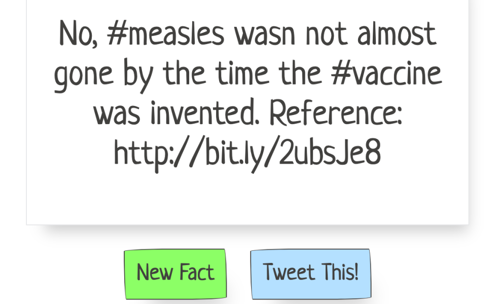
So a friend of mine got the idea about creating a “fact generator” for vaccine facts. The idea was to click on a button on a website, have a random fact about vaccines appear, and then let people share that fact via Twitter. Recently, an online course for people learning Javascript led students through how to build a “random quote generator.” I figured I could take the code and modify it.
First, I had to find the right code. Luckily, I ran into a page by “Jay,” where he created a random quote generator. I contacted Jay via Twitter and asked for his permission to use his code, and he agreed. So I modified it a little here and there, and now we have the Vaccine Fact Generator.
It uses some HTML and some Javascript brought together by Paper CSS to create a web application where the user clicks on a button and a random fact appears. Then, as I wrote above, they can click on another button and send that fact to the Twitterverse.

There are still a couple of things I want to do before I can call it v1.0: First, I want the links in the fact box to be clickable, and, second, I want the ability to also share to Facebook. Actually, either of those would be good enough for me to call it v1.0. Until then, I’ll keep incrementally adding facts and tweaking some settings.
